
Choosing a beautiful perfume bottle finish is easy. Choosing one that stays beautiful, fits your MOQ, and can be reproduced consistently is much harder.
The main perfume bottle decoration methods are color coating, frosting, screen printing, hot stamping, decals, vacuum metallization, electroplating, laser engraving, water transfer printing, and UV printing. I choose between them based on appearance, cost, MOQ, bottle shape, durability, and production risk.
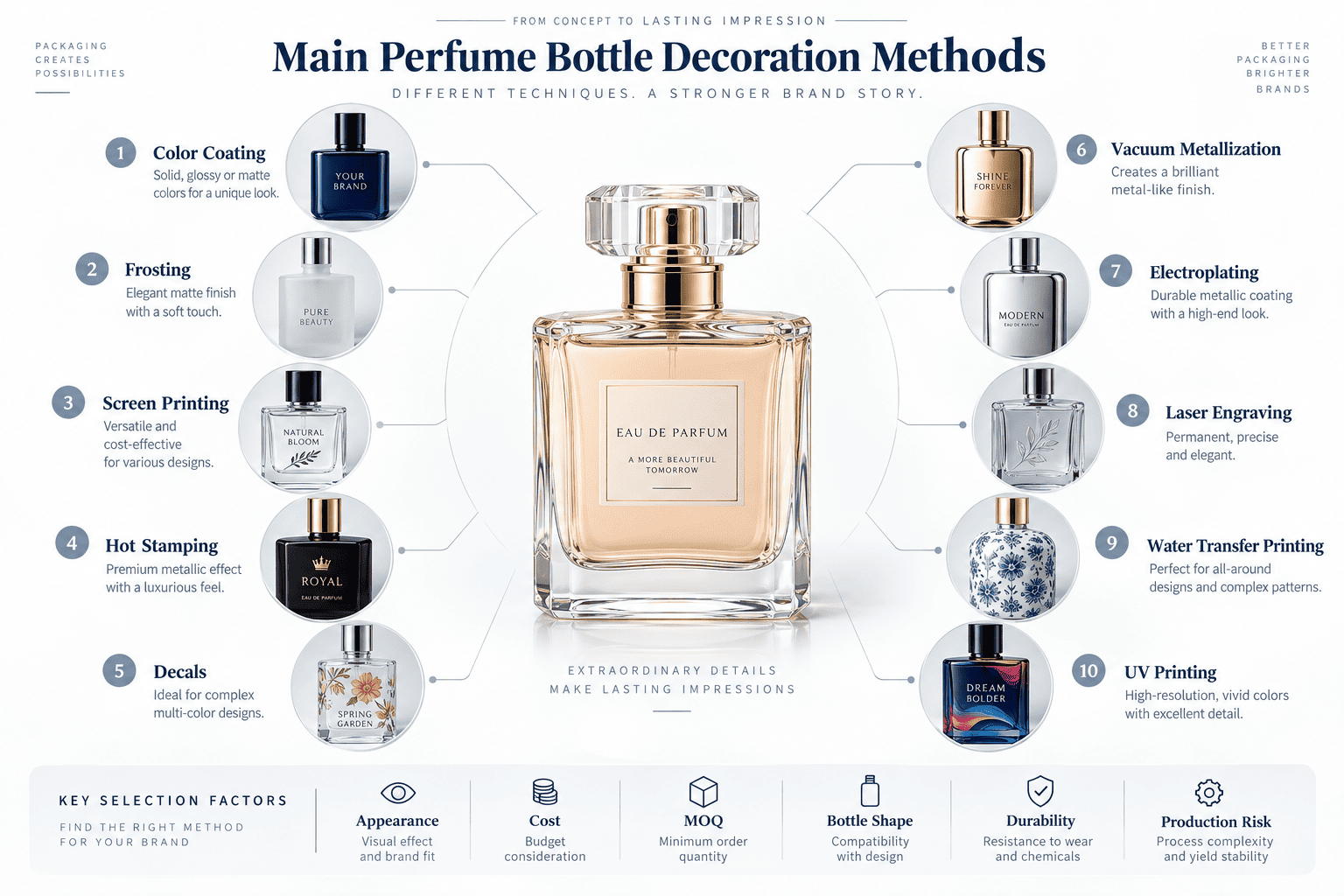
In my work with perfume brands, I rarely recommend choosing a decoration method only from a rendering. I look at the actual bottle, the artwork, the target quantity, and how difficult the finish will be to reproduce in the second and third production batch. This matters even more for smaller fragrance brands because one wrong decoration decision can increase both inventory cost and rejection rate.
1. Is Color Coating a Good Choice for Perfume Bottles?
Color coating can quickly turn a standard clear bottle into a custom-looking package, but weak paint adhesion can cause rubbing, scratching, and visible color loss later.
Color coating is one of the most flexible perfume bottle finishing methods. It works well for solid, transparent, gradient, matte, and glossy colors. I recommend it when a brand wants custom colors without paying for a new colored-glass mold.
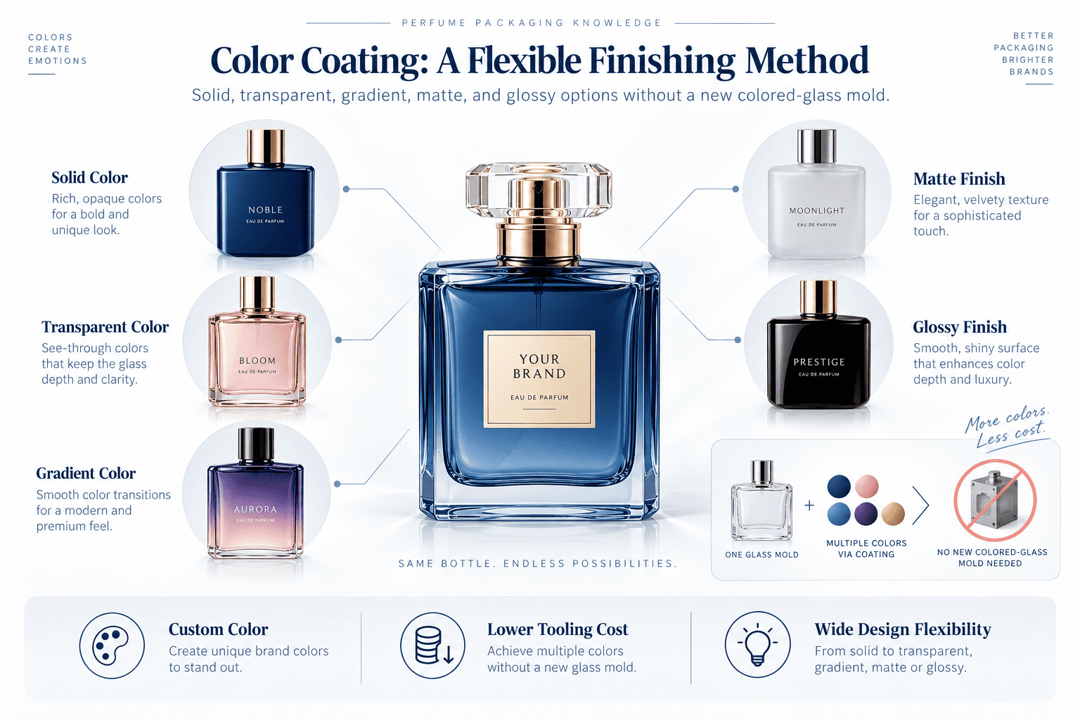
How Does Perfume Bottle Color Coating Work?
In our production, we normally start with a clear perfume glass bottle.
The surface has to be cleaned properly first.
Dust, oil, moisture, and other contamination can reduce the bond between the glass and paint.
After the surface is prepared, we spray the required coating onto the bottle and then dry or cure it.
I use color coating very often because one existing bottle can create many different product styles.
For example, the same glass bottle can become:
- [solid black][[1]]
- transparent pink
- matte white
- glossy blue
- gradient purple
- semi-transparent amber
This is very useful for small and medium perfume brands.
A brand can start with an existing bottle and create a more exclusive look through color, logo, cap, and box design.
Why Does Perfume Bottle Paint Sometimes Rub Off?
One problem I pay close attention to is color rubbing off.
Some customers describe it as floating color.
In many cases, the main issue is paint adhesion.
If the coating does not bond strongly enough with the glass, repeated touching or rubbing can slowly damage the surface.
The bottle may look perfect when production is finished.
After some time, however, the bottle can rub against the inner packaging, assembly tools, other surfaces, or the user's hands.
Then the color may start to come off.
I see this problem more clearly on dark solid colors.
Pure black is one example.
Dark blue is another.
The contrast is strong because the clear glass underneath becomes very visible once the dark coating is damaged.
Why Do We Add a Transparent Clear Coat?
For some deep solid colors, we can add a transparent top coat after the main color coating.
I often recommend this when we want to improve surface protection.
The clear coat can help reduce rubbing and minor scratching when the coating system is properly controlled.
It can also improve the visual effect.
The bottle normally looks glossier.
The color can also feel deeper and more transparent because light reflects through the clear layer.
I like this effect on black, navy blue, deep green, and other dark perfume bottles.
| Coating Structure | Appearance | Protection | Best For |
|---|---|---|---|
| Standard color coating | Matte or glossy | Standard | Basic customization |
| Color + clear top coat | Glossy and deeper | Better | Dark solid colors |
| Transparent coating | Colored but see-through | Medium | Elegant designs |
| Frosted color coating | Soft matte | Depends on system | Minimalist brands |
| Gradient coating | Color transition | Requires more control | Premium visual concepts |
Is Pantone the Final Production Color Standard?
No.
I use [Pantone][[2]] during the early design stage, but I do not use a digital rendering as the final production color standard.
Different screens display the same color differently.
A bottle rendering can look warmer on one screen and cooler on another.
Glass also changes the final appearance.
Bottle thickness, transparency, paint thickness, lighting, gloss level, and the liquid inside the bottle can all influence what we see.
This is why I use Pantone as a starting reference.
The final physical sample becomes the real production reference.
Why Do I Keep an Approved Master Sample?
For the first decoration sample, we normally send the customer a physical bottle.
We also keep one approved reference on our side.
When the customer reorders, I do not want the production team to match the color from a JPG or a computer screen.
We take out the previous physical reference.
Then we compare the new batch with it.
My target is to keep the color difference within a range that is not noticeable by the naked eye under normal inspection.
Different production batches can have small tolerances.
The important point is that customers should not easily see a difference when bottles from different batches are placed together.
Color Coating Cost, Risk, and Best Use
| Item | My Evaluation |
|---|---|
| Relative cost | Low to medium |
| Small MOQ friendly | Yes |
| Main advantage | Strong color flexibility |
| Main risk | Adhesion and color variation |
| Higher-risk colors | Black, dark blue, deep solid colors |
| Useful protection | Transparent clear coat |
| Initial color reference | Pantone |
| Final standard | Approved physical sample |
| Best for | Custom colors using stock bottles |
| Avoid when | The brand cannot accept minor batch tolerance |
For a growing perfume brand, color coating gives one of the best balances between customization and cost.
I just make sure we control the surface, coating adhesion, top coat, and physical color standard together.
2. Should I Use Frosting for a Luxury Perfume Bottle?
Frosting can make a simple glass bottle feel much more premium, but uneven frosting and visible fingerprints can reduce the final effect.
Frosting creates a soft matte perfume bottle surface. I recommend it for minimalist, niche, spa-inspired, unisex, and premium fragrance packaging when a brand wants a different look without opening a new glass mold.
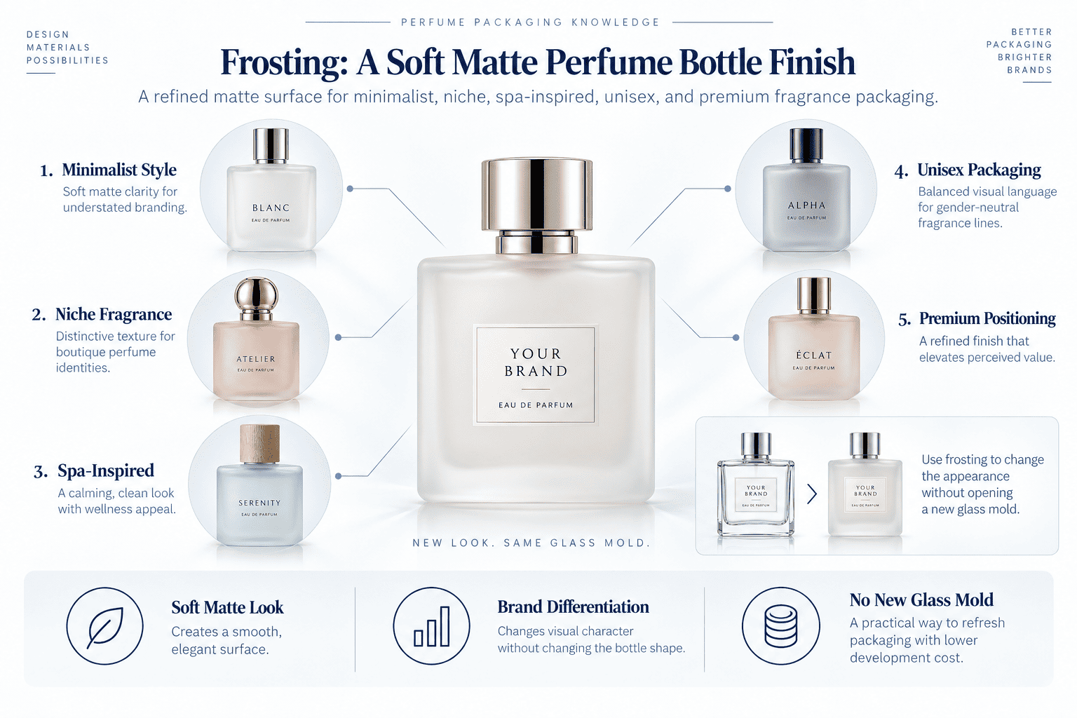
Why Does Frosting Make Glass Look More Premium?
Clear glass reflects light strongly.
A frosted surface diffuses the light.
This makes the bottle feel softer and less industrial.
I have seen very simple stock bottles become much more premium after adding frosting, a clean logo, and a good cap.
This is why I often recommend frosting when the packaging budget is controlled.
The brand gets a large visual change without changing the glass structure itself.
What Quality Problems Do I Check?
I first check surface consistency.
The bottle shoulder, base, neck, corners, and flat surfaces should look visually balanced.
Irregular shapes can be harder to control.
I also look at fingerprints.
Some [matte surfaces][[3]] show oil marks easily.
This is not always a defect, but the brand should see it during sampling.
I also test the next decoration process.
For example, if the customer wants black screen printing over frosting, I want to see the actual printed bottle.
If the brand wants gold hot stamping over frosting, I also test the combination.
The surface finish and logo process should be approved together.
Frosting Cost, Risk, and Best Use
| Item | My Evaluation |
|---|---|
| Relative cost | Low to medium |
| Small MOQ friendly | Yes |
| Main advantage | Premium matte appearance |
| Main risk | Uneven frosting and fingerprints |
| Best for | Minimalist and niche fragrance brands |
| Works well with | Screen printing and hot stamping |
| Avoid when | The brand needs a highly transparent bottle |
I like frosting because it creates visible value without making production too complicated.
For many small perfume brands, it is one of the first finishing methods I would consider.
3. Is Screen Printing the Best Method for Perfume Bottle Logos?
Screen printing is affordable and reliable for simple branding, but bottle curves, multiple colors, and mold seams can make a simple logo much harder to produce.
Screen printing is one of the most common perfume bottle decoration methods for logos, perfume names, and text. One-color printing is normally the easiest and cheapest, while two-color and three-color printing require more production steps and tighter position control.
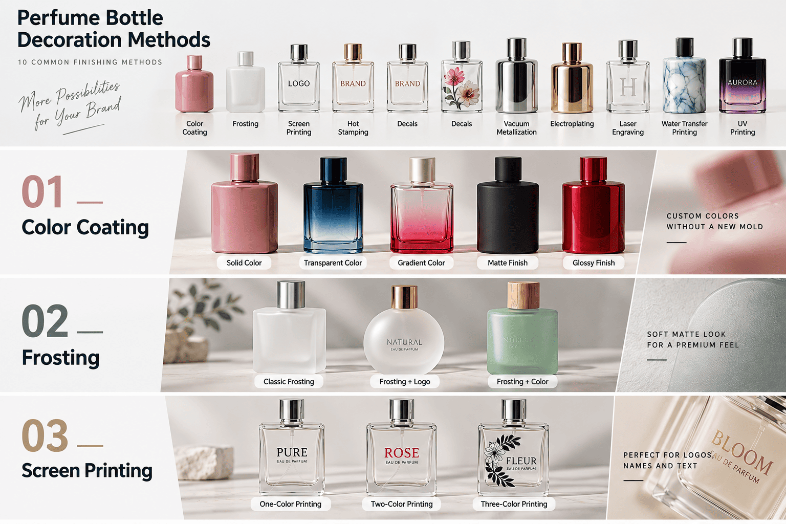
Why Do I Use Screen Printing So Often?
Screen printing works well for simple perfume branding.
I commonly use it for:
- logos
- fragrance names
- volume information
- simple graphics
- front text
- back text
It also works well with other finishes.
For example:
- frosted glass + black printing
- clear glass + white printing
- black bottle + white logo
- pink coating + gold logo
- gradient bottle + simple text
For many small brands, one clean printed logo is enough.
I do not think every perfume bottle needs complicated artwork.
Why Does Two-Color or Three-Color Printing Cost More?
The cost does not increase only because we use more ink.
Each color means another preparation and printing step.
The production team has to adjust each color.
Then we need to control the registration between colors.
If the second color moves slightly, the complete logo can look misaligned.
This means more colors normally create more labor, more setup work, and more production risk.
| Printing Design | Relative Cost | Difficulty | Registration Risk |
|---|---|---|---|
| 1 color | Low | Low | Low |
| 2 colors | Medium | Medium | Medium |
| 3 colors | Medium to high | Higher | Higher |
| Complex multi-color design | High | High | High |
If a brand identity really needs several colors, I can work with that.
However, if one color creates the same effect, I normally prefer the simpler option.
Why Are Tapered Perfume Bottles Difficult to Print?
Bottle shape changes screen-printing difficulty.
A straight cylindrical bottle or flat bottle panel is relatively easy.
A tapered bottle is different.
For example, some perfume bottles are wide at the bottom and narrow at the top.
The printing area is not based on one constant diameter.
When we print text or graphics on this type of surface, keeping every bottle in exactly the same position becomes harder.
The screen-to-glass contact changes as the surface angle changes.
This is why I never rely only on the artwork file.
We need to physically test it.
Why Do We Adjust the Printing Fixture After Sampling?
The first sample helps us find real problems.
For example:
- the logo may move
- one side may print thicker
- the pressure may be uneven
- the text may be too close to the bottle edge
- the artwork may cross the mold seam
After we see the real problem, we can adjust the screen, fixture, artwork size, printing position, or other settings.
Then we test again.
I see sampling as part of engineering.
The artwork tells us the design idea.
The physical bottle tells us what production actually needs.
Why Do I Avoid Printing on the Mold Seam?
Glass perfume bottles normally have mold seam lines.
I try not to put important logos or text directly on these lines.
If the seam passes through a brand name, the result can look less clean.
The printing itself may still be technically acceptable.
However, the packaging can look cheaper.
This is why I consider the seam position before finalizing the logo area.
For irregular bottles, we may rotate and test the bottle to find the cleanest front position.
Screen Printing Cost, Risk, and Best Use
| Item | My Evaluation |
|---|---|
| Relative cost | Low |
| Small MOQ friendly | Yes |
| Main advantage | Affordable logo customization |
| Cost increases with | Number of colors |
| Main risk | Position and color registration |
| Difficult shapes | Tapered and irregular bottles |
| Important detail | Avoid mold seam lines |
| Best for | Logos, text, simple graphics |
| Avoid when | Artwork has many detailed colors |
For most new perfume brands, screen printing is one of the most practical decoration methods.
I just design the artwork around the real bottle instead of treating the bottle like a flat piece of paper.
4. Is Hot Stamping Worth the Extra Cost?
Hot stamping creates a stronger luxury effect than normal metallic ink, but thin lines, curved surfaces, and poor foil transfer can create broken or incomplete logos.
Hot stamping transfers metallic foil onto a perfume bottle. I normally use it for gold, silver, and other metallic logos when the brand wants a stronger reflective effect than screen-printing ink can provide.
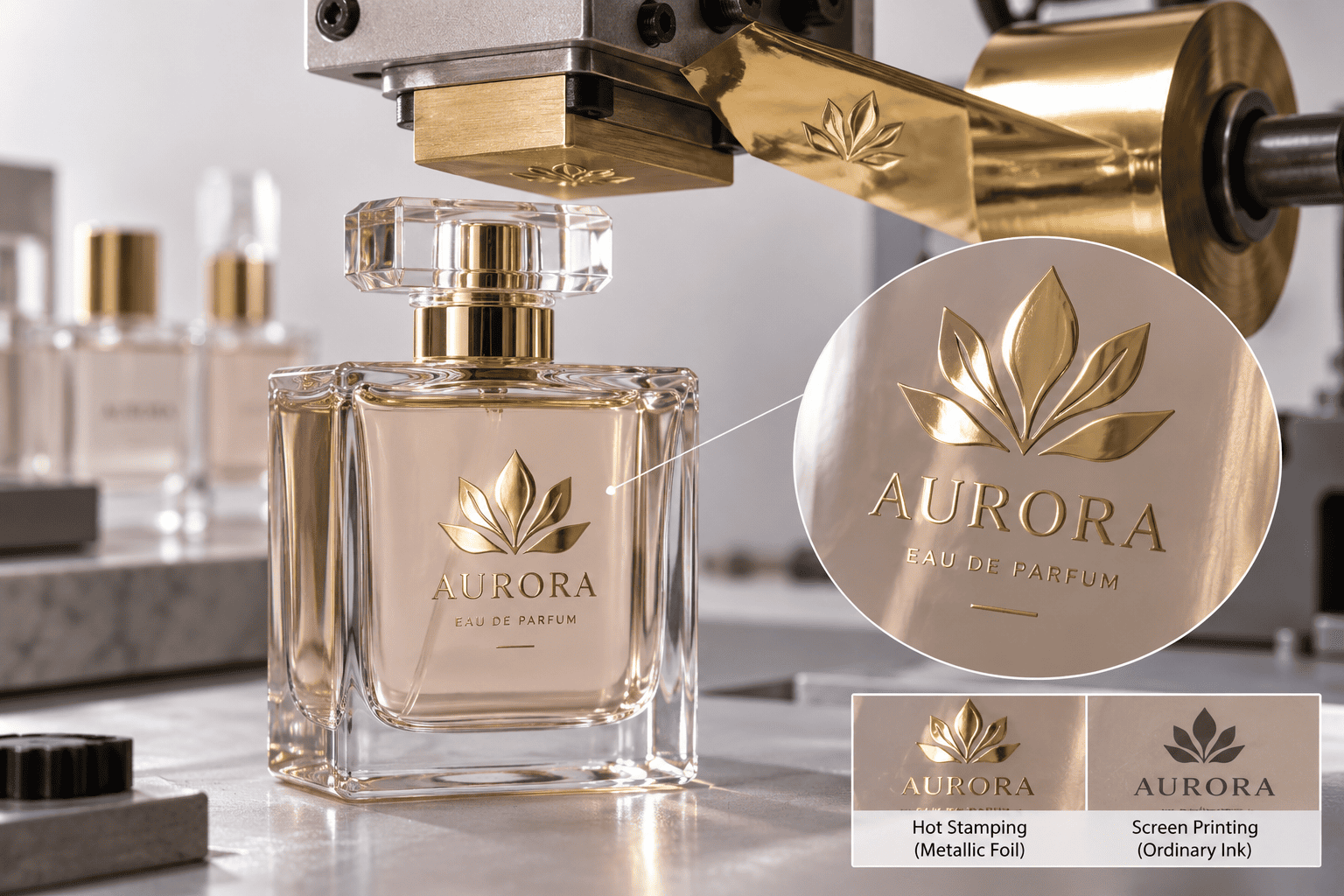
Why Do I Use Hot Stamping?
A small gold detail can change the perceived value of a perfume bottle.
I often use hot stamping for:
- logos
- monograms
- borders
- fragrance names
- premium text
Metallic screen-printing ink and hot stamping are not the same.
Metallic ink can look good.
Hot stamping normally creates a brighter and more reflective metallic effect.
What Are the Main Risks?
Bottle shape matters.
Flat or straight surfaces are usually easier.
Curved and irregular areas can be harder.
Very thin letters can also create problems.
Part of the foil may fail to transfer.
Edges may look broken.
Small details may disappear.
I always prefer to approve a physical sample before production.
Hot Stamping Cost, Risk, and Best Use
| Item | My Evaluation |
|---|---|
| Relative cost | Medium |
| Main advantage | Strong metallic reflection |
| Main risk | Broken foil and missing details |
| Best artwork | Logos, borders, simple text |
| Best for | Premium and luxury packaging |
| Avoid when | Artwork contains very fine details |
I think hot stamping is worth the extra cost when one small metallic detail creates a clear increase in perceived value.
5. Are Decals Better Than Direct Printing for Detailed Designs?
Detailed artwork can become difficult with normal screen printing, but using decals also adds positioning and transfer risks.
Decals are useful for perfume bottles with detailed, multi-color, or illustration-based artwork. I choose decals when the design is too complex for simple screen printing and the added production steps are justified by the visual result.
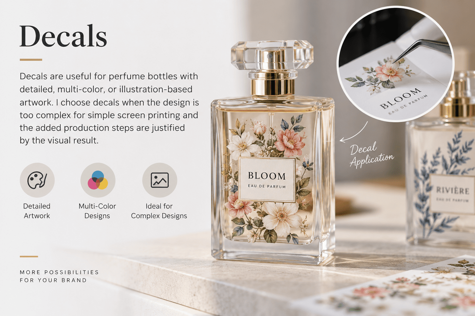
When Do I Choose Decals?
I first look at the artwork.
A one-color logo normally does not need a decal.
Flowers, illustrations, detailed decorative graphics, and complex multi-color patterns may be better suited to decals.
The method gives the designer more freedom.
However, the bottle shape still matters.
A detailed decal on a difficult curved surface can create production problems.
What Is the Main Risk?
Position control is important.
A small shift becomes obvious when the graphic needs to align with a bottle edge, front panel, embossing, or other decoration.
The customer also needs to approve the actual finished surface.
A digital rendering cannot show every transition between the graphic and glass.
Decal Cost, Risk, and Best Use
| Item | My Evaluation |
|---|---|
| Relative cost | Medium |
| Graphic flexibility | High |
| Main advantage | Detailed multi-color artwork |
| Main risk | Transfer and positioning defects |
| Best for | Illustrations and complex designs |
| Avoid when | A simple screen print can achieve the same effect |
I normally use decals because the artwork needs them, not simply because they offer more design possibilities.
6. Should I Use Vacuum Metallization on Perfume Bottles?
A fully metallic perfume bottle can have strong shelf impact, but reflective surfaces also make scratches and small defects easier to see.
Vacuum metallization creates gold, silver, chrome, and mirror-like finishes over a larger bottle area. I use it when the metallic surface is a major part of the brand identity rather than just a small decorative detail.
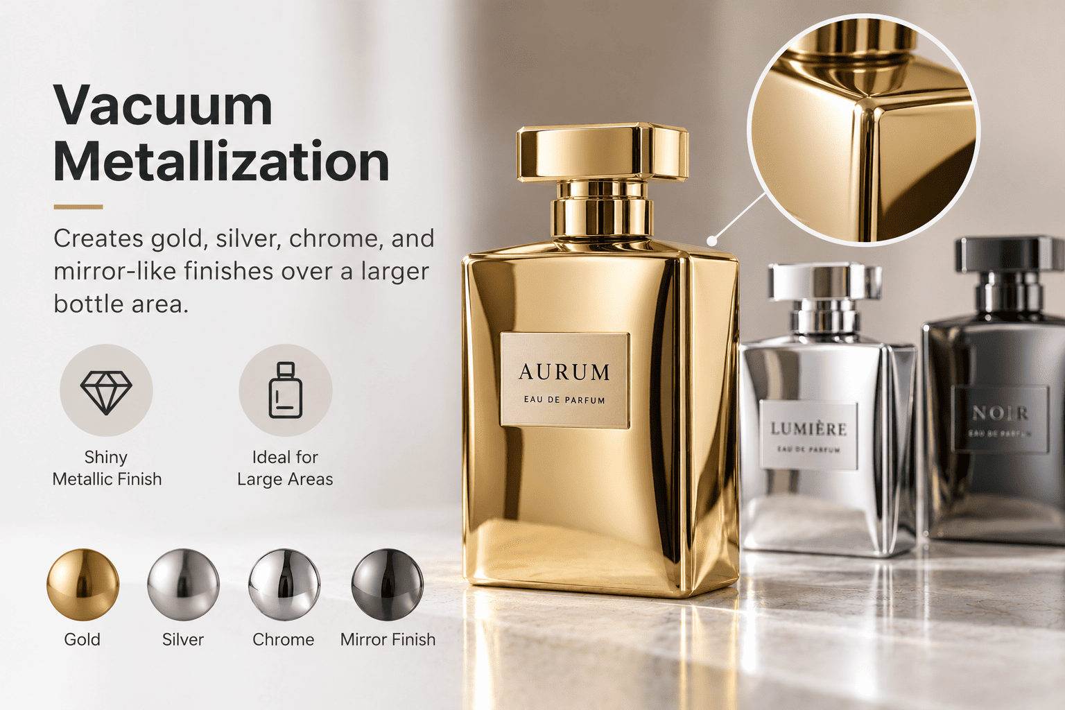
When Does Vacuum Metallization Work Well?
I normally consider this finish for:
- luxury perfume packaging
- Middle Eastern fragrance brands
- gift collections
- bold e-commerce products
- statement bottles
A full metallic bottle becomes a strong visual element.
This means the rest of the packaging should be controlled carefully.
If the bottle, cap, collar, logo, and box are all highly reflective, the result can become too busy.
Why Does Packing Matter?
Metallic surfaces show scratches easily.
A minor scratch on clear glass may be difficult to see.
The same scratch on a mirror gold bottle may be obvious.
This means I also think about:
- inner dividers
- bottle-to-bottle contact
- assembly handling
- transport protection
- packing materials
The real cost of the finish is not only the decoration price.
It can also increase inspection and packaging requirements.
Vacuum Metallization Cost, Risk, and Best Use
| Item | My Evaluation |
|---|---|
| Relative cost | Medium to high |
| Visual impact | Very high |
| Main risk | Scratches and visible defects |
| Packing requirement | Higher |
| Best for | Statement and luxury packaging |
| Avoid when | The budget does not allow extra protection |
I calculate the complete packaging impact before recommending a large metallic finish.
7. Is Electroplating Suitable for Premium Perfume Packaging?
Electroplating can create a beautiful metallic bottle, but large-area finishes can expose tiny particles, surface pits, and uneven coloring that were almost invisible before decoration.
Large-area electroplating needs careful glass preparation and inspection. Small particles on the original bottle can become visible dots or bumps after finishing, while irregular bottle shapes can develop uneven color around corners, shoulders, and recessed areas.
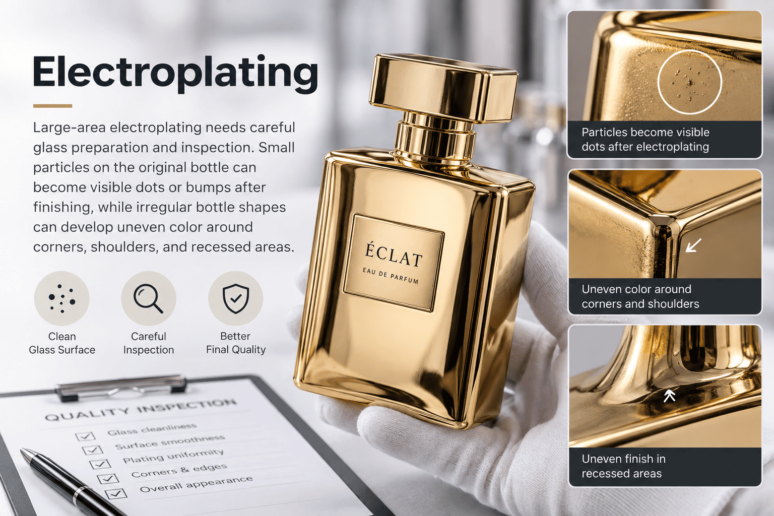
Why Is the Original Glass Bottle So Important?
When we work with a large electroplated surface, I pay close attention to the undecorated glass bottle.
The original surface needs to be very clean.
If small particles remain on the bottle, the final metallic finish can make them much easier to see.
The surface may show tiny dots.
Some areas may look slightly raised.
Some customers describe this as pitting.
On a clear bottle, the same particle may not attract much attention.
On a mirror-like metallic bottle, reflected light makes small defects obvious.
This is why I treat pre-cleaning and surface preparation as a key part of electroplating quality.
Why Do Small Particles Become More Visible After Electroplating?
The metallic layer does not remove a particle underneath it.
It covers it.
The raised area remains.
After the reflective finish is applied, light catches that raised point and makes it easier to notice.
This problem matters more with large-area finishes.
I pay extra attention when we produce:
- full gold bottles
- full silver bottles
- mirror chrome
- dark metallic colors
- highly reflective surfaces
| Original Surface | Possible Electroplated Result |
|---|---|
| Clean and smooth | More even finish |
| Small particles | Raised dots |
| Dust contamination | Visible surface defects |
| Minor glass defect | More obvious after reflection |
| Poor preparation | Higher cosmetic rejection |
The finish quality starts before electroplating.
Why Are Irregular Bottles Harder to Electroplate Evenly?
Bottle shape is another major issue.
Straight bottles are generally easier to control.
Irregular bottles may have:
- sharp corners
- deep curves
- raised structures
- narrow shoulders
- recessed sections
- changing surface angles
These areas may not show exactly the same metallic color.
Some parts may look slightly darker.
Some may look lighter.
Some corners may look thinner.
This does not mean an irregular bottle cannot be electroplated.
It means I need to define the appearance standard carefully and inspect the difficult areas more closely.
Where Do I Look During Electroplating Inspection?
I do not only look at the center of the front face.
I rotate the bottle.
I inspect:
- shoulders
- corners
- edges
- bottom areas
- recessed surfaces
- transition areas
- high-reflection areas
Many small defects appear in these places.
One corner can have a different color.
A recessed area may look darker.
An edge can look slightly thin.
These details can affect the premium appearance of the final product.
Why Is Manual Inspection Still Important?
Perfume packaging has many cosmetic defects that are easy for the human eye to notice.
For some orders, sampling inspection is enough.
For more demanding premium projects, I may recommend a higher inspection rate or full inspection.
Our workers can rotate each bottle under light and look for:
- dots
- pitting
- scratches
- particles
- uneven metallic color
- missing areas
- darker corners
- lighter corners
- visible surface defects
We can remove bottles that do not meet the agreed visual standard.
This is important because the consumer does not know the production process.
They only see the bottle.
If the bottle has several visible dots or an uneven corner, it can weaken the feeling of the entire brand.
Why Is Matching Metallic Components Difficult?
A perfume package may contain several materials.
The bottle may be glass.
The cap may be plastic.
The collar may be aluminum.
The decoration method used on each part can also be different.
Because of this, two parts called "gold" can look different when they are assembled together.
I always prefer to see the complete package.
I compare the bottle, cap, pump, collar, logo, and box together.
Electroplating Cost, Risk, and Best Use
| Item | My Evaluation |
|---|---|
| Relative cost | Medium to high |
| Luxury appearance | High |
| Surface preparation | Critical |
| Large-area risk | Dots, pitting, particles |
| Irregular bottle risk | Uneven color |
| Key inspection areas | Corners, edges, shoulders |
| Inspection | Sampling or full inspection |
| Best for | Premium metallic packaging |
| Avoid when | The bottle surface cannot meet the required cosmetic standard |
For me, high-quality electroplating starts with good glass preparation and ends with careful inspection.
The metallic process in the middle cannot fix a poor original surface.
8. Is Laser Engraving Good for Perfume Bottle Customization?
Laser engraving creates a permanent and subtle detail, but it does not give the same color impact as coating or screen printing.
Laser engraving works well for perfume bottle personalization, names, limited editions, codes, and simple logos. I mainly choose it when permanent customization or variable information creates more value than strong color decoration.

When Do I Recommend Laser Engraving?
It is useful for:
- personalized names
- corporate gifts
- limited editions
- wedding perfume bottles
- batch information
- boutique fragrance projects
For example, a perfume brand can offer a different customer name on every bottle.
Screen printing is not practical for that type of variable information.
Laser engraving can be a better choice.
What Are the Limitations?
The exact bottle still needs testing.
Glass composition, thickness, bottle shape, engraving depth, and laser settings can affect the result.
It is also visually subtle.
If the brand wants bright colors, coating or printing may be better.
Laser Engraving Cost, Risk, and Best Use
| Item | My Evaluation |
|---|---|
| Relative cost | Medium |
| Personalization | Excellent |
| Main advantage | Permanent customization |
| Main limitation | No strong color effect |
| Best for | Names, codes, limited editions |
| Avoid when | Strong visual color is required |
I normally choose laser engraving for personalization instead of general mass-market decoration.
9. Can Water Transfer Printing Create Complex Perfume Bottle Patterns?
Water transfer printing can create detailed full-surface effects, but pattern position and consistency need to match the brand's expectations.
Water transfer printing is useful for marble, abstract, wood, texture, and other complex surface patterns. I use it when the bottle itself needs to become part of the graphic design and normal direct printing cannot create the same effect.
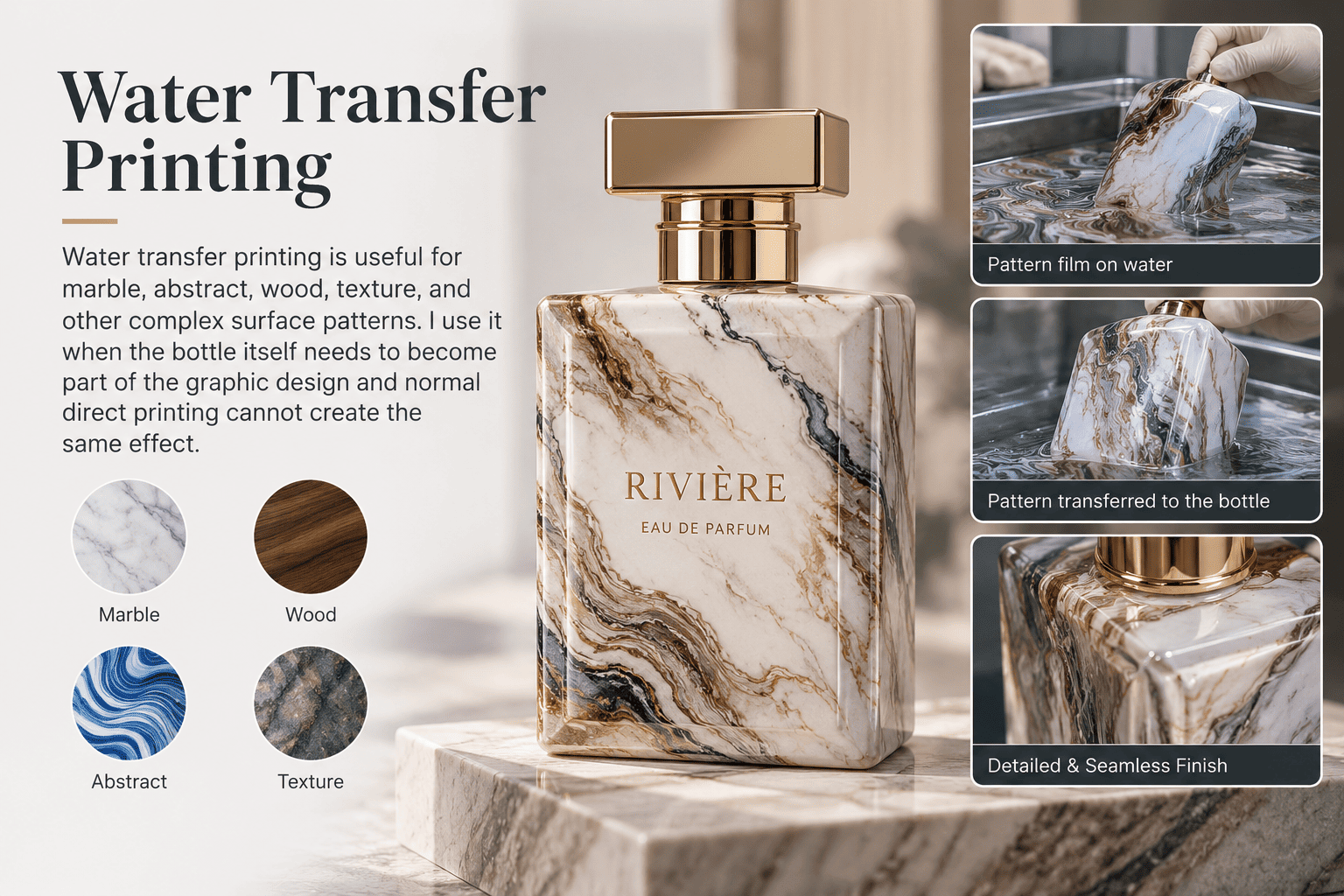
When Does It Make Sense?
Some brands want more than a front logo.
They want the whole bottle to carry a pattern.
Examples include:
- marble
- stone texture
- wood effect
- abstract graphics
- artistic patterns
This is where water transfer printing can become useful.
Does Every Bottle Look Exactly the Same?
Not always.
Some decorative patterns naturally include variation.
For a marble-style design, a slight change in pattern position can even make the bottle feel more natural.
However, if the brand expects every graphic element to sit in exactly the same place, this needs to be discussed before production.
I separate controlled design variation from actual defects.
Water Transfer Printing Cost, Risk, and Best Use
| Item | My Evaluation |
|---|---|
| Relative cost | Medium to high |
| Pattern flexibility | High |
| Main advantage | Large decorative coverage |
| Main risk | Pattern positioning |
| Best for | Artistic and full-surface effects |
| Avoid when | Exact pattern registration is critical |
For a small perfume brand, I normally test simpler processes first unless the surface pattern is central to the brand concept.
10. Is UV Printing a Good Option for Small Perfume Bottle Orders?
Traditional multi-color printing can become expensive for a small order, while UV printing offers more flexibility for detailed graphics and short production runs.
UV printing is useful for small-batch perfume bottles with detailed or multi-color artwork. It can reduce some traditional printing setup requirements, but the bottle surface, coating compatibility, ink adhesion, and shape still need to be tested before production.
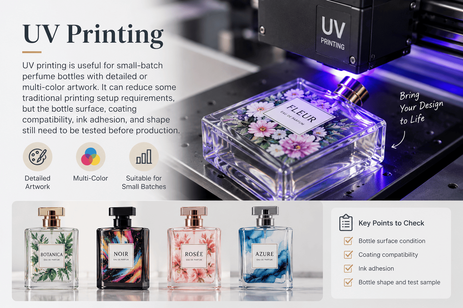
Why Do Small Brands Consider UV Printing?
A new fragrance brand may order only several hundred or several thousand bottles.
At the same time, it may want complex artwork.
Traditional multi-color decoration can involve several printing steps.
UV printing gives another option.
It can reproduce more colors and details without following exactly the same process as traditional screen printing.
What Do I Test First?
I test adhesion.
Not every glass surface or coating works the same way.
If the bottle already has color coating or another finish, the complete structure needs to be tested together.
Bottle shape also matters.
A complex shape can limit the printable area.
UV Printing Cost, Risk, and Best Use
| Item | My Evaluation |
|---|---|
| Relative cost | Medium |
| Small-order flexibility | High |
| Color flexibility | Very high |
| Main risk | Ink adhesion |
| Best for | Short runs and complex graphics |
| Avoid when | Surface compatibility cannot be confirmed |
A slightly higher unit cost can still make sense when the process helps a brand avoid a high setup cost or high MOQ.
How Do Glass Mold Seams Affect Perfume Bottle Decoration?
A mold seam is normal in glass production, but bad logo placement can make the line more visible and reduce the premium look of the bottle.
Glass mold seam lines come from the bottle-forming process. I normally keep logos away from these lines and consider polishing or fire polishing when a premium project needs better glass clarity and a cleaner appearance.
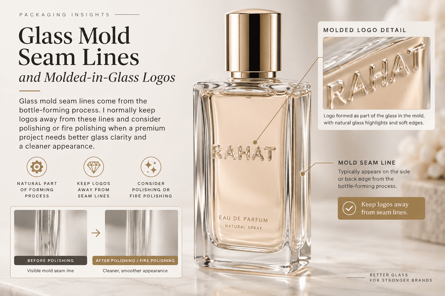
Why Do Glass Bottles Have Mold Seams?
A perfume glass bottle is formed inside a mold.
The mold has different sections.
The meeting area between these sections can leave a visible line.
Its appearance depends on:
- bottle shape
- mold condition
- forming control
- mold precision
- glass distribution
A small seam is not automatically a defect.
However, premium brands may be more sensitive to it.
Why Does the Seam Affect Decoration?
If I print a logo directly across the seam, the line can visually pass through the artwork.
This makes the brand name look less clean.
I therefore check the seam before deciding the final printing direction.
For an irregular bottle, we may physically rotate the bottle and test several front positions.
Can Polishing Improve the Bottle?
For some premium projects, we can consider additional glass finishing.
Mechanical polishing can improve selected areas.
Fire polishing can help create a smoother and clearer glass appearance when the bottle structure allows it.
I like fire polishing for projects where glass transparency is part of the premium design.
| Glass Treatment | Appearance | Relative Cost |
|---|---|---|
| Standard glass | Normal clarity | Low |
| Mechanical polishing | Cleaner selected areas | Medium |
| Fire polishing | Higher clarity and gloss | Medium to high |
I only add this process when the visible improvement supports the brand positioning.
How Much Does Perfume Bottle Decoration Cost?
Perfume bottle decoration does not have one fixed price because bottle shape, artwork, quantity, color count, finishing area, and quality requirements can change the production difficulty.
Simple screen printing and standard coating are normally among the lower-cost perfume bottle decoration methods. Hot stamping and decals sit in the middle, while large metallic finishes and complex surface treatments are usually more expensive and may also require stricter inspection and packaging.
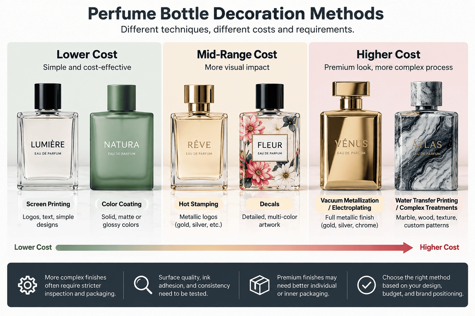
My Relative Cost Comparison
| Decoration Method | Relative Cost | Small MOQ Friendly | Main Risk |
|---|---|---|---|
| Color coating | $–$$ | Yes | Adhesion and color difference |
| Frosting | $–$$ | Yes | Surface consistency |
| Screen printing | $ | Yes | Position and registration |
| Hot stamping | $$ | Yes | Broken foil |
| Decals | $$ | Medium | Transfer defects |
| Vacuum metallization | $$–$$$ | Medium | Scratches |
| Electroplating | $$–$$$ | Medium | Surface defects and uneven color |
| Laser engraving | $$ | Yes | Limited color |
| Water transfer printing | $$–$$$ | Medium | Pattern position |
| UV printing | $$ | Yes | Ink adhesion |
I use the dollar symbols only as a relative guide.
They are not a quotation.
Two bottles using the same decoration process can still have very different prices.
What Changes the Decoration Cost?
I normally check these factors:
| Cost Factor | Why It Matters |
|---|---|
| Bottle shape | Irregular surfaces need more adjustment |
| Decoration area | Larger areas require more material and control |
| Number of colors | More colors mean more production steps |
| Quantity | Setup cost is spread across more bottles |
| Artwork detail | Fine graphics can increase difficulty |
| Surface preparation | Premium metallic finishes need cleaner glass |
| Inspection standard | Full inspection increases labor |
| Packaging protection | Delicate surfaces need more protection |
I prefer to see the real bottle and artwork before giving a final decoration quotation.
Which Perfume Bottle Decoration Is Best for a Small Brand?
A small brand does not normally need the most complicated bottle. It needs packaging that looks distinctive, fits the budget, and can be reordered without creating inventory pressure.
For most small perfume brands, I recommend starting with a stock glass bottle and adding one to three custom elements such as color coating, screen printing, hot stamping, frosting, or a custom cap. This usually gives a better balance between MOQ, cost, and brand identity.
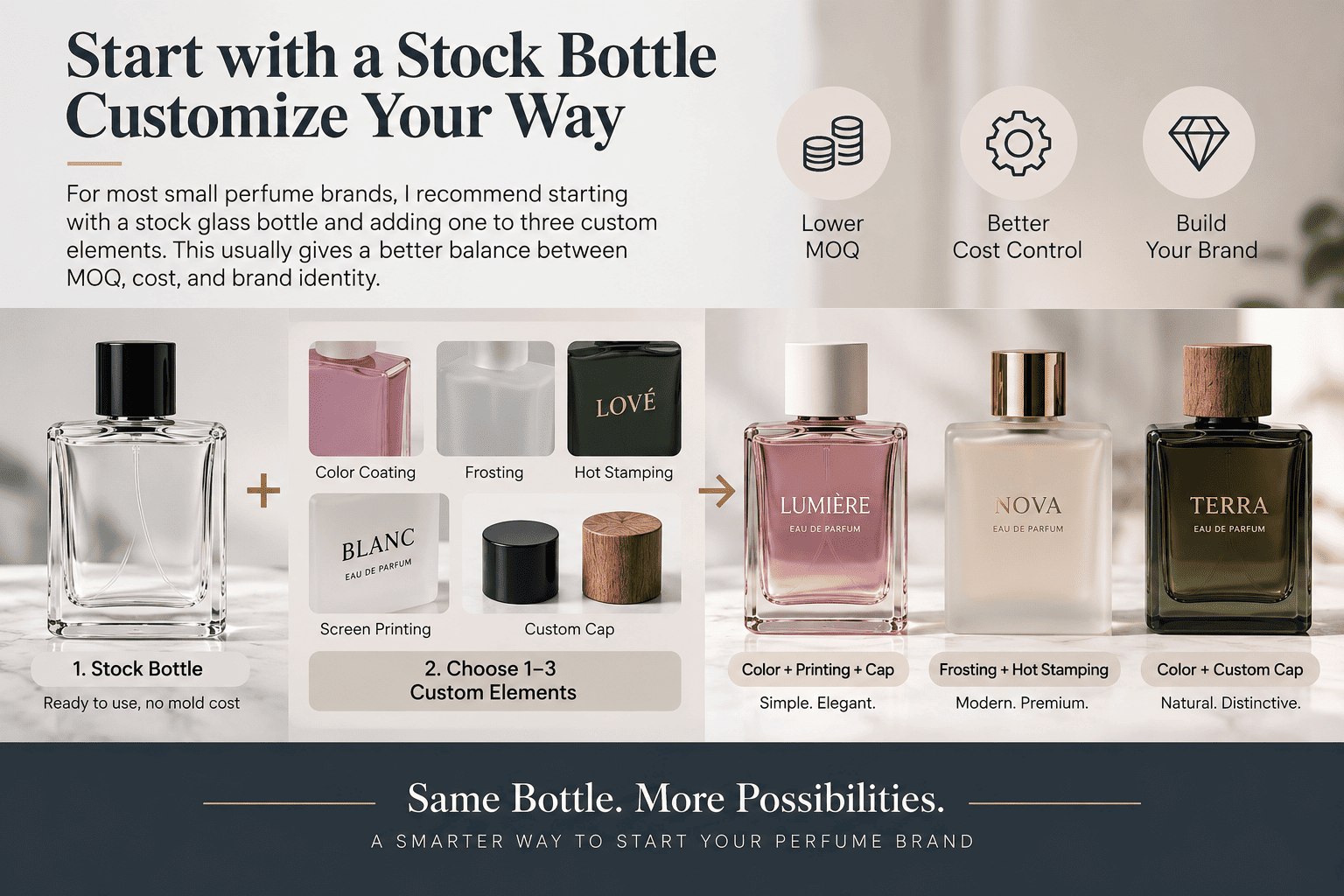
My Typical Starting Combinations
| Brand Style | Bottle Decoration I Would Consider |
|---|---|
| Minimalist | Frosting + one-color screen printing |
| Feminine | Soft coating + gold logo |
| Luxury | Dark coating + hot stamping |
| Middle Eastern | Metallic finish + decorative cap |
| Modern e-commerce | Custom coating + simple logo |
| Artistic niche | Decal or UV printing |
| Personalized | Laser engraving |
These are not fixed rules.
I use them as starting points.
Why Do I Prefer Stock Bottles for Early-Stage Brands?
A custom glass mold can be valuable.
However, a new fragrance brand also needs money for:
- fragrance development
- filling
- boxes
- caps
- marketing
- advertising
- sampling
- distribution
- content creation
If too much budget goes into the first bottle mold, the brand can face more inventory pressure.
We offer more than 500 stock perfume bottle styles.
For many projects, I can use an existing bottle and change its identity through decoration.
This can include spraying, frosting, hot stamping, decals, printing, metallic finishing, and other processes.
When the brand grows and sales become more predictable, a custom glass bottle can make more sense.
We can also support 3D sampling during new bottle development so the customer can evaluate shape and proportions before moving further into glass production.
How Should I Choose the Right Perfume Bottle Finishing Method?
Choosing by appearance alone is risky. I normally make the decision by comparing the visual effect with MOQ, cost, bottle geometry, durability, and quality-control difficulty.
I choose the simplest perfume bottle finishing process that can achieve the required brand effect. I only add another process when it creates enough visible value to justify the extra cost and production risk.
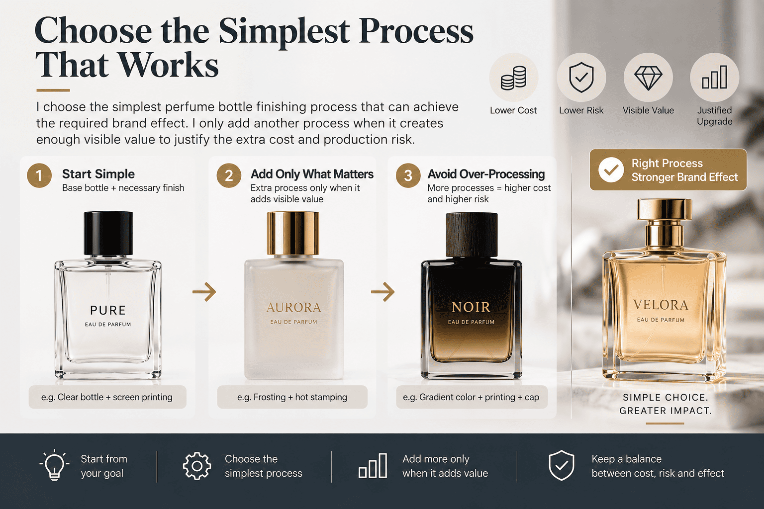
My Selection Framework
| Question | Why I Ask It |
|---|---|
| What should the brand feel like? | Defines the visual direction |
| How many bottles are needed? | Limits realistic processes |
| What is the target packaging cost? | Prevents overdesign |
| Is the bottle straight or irregular? | Changes decoration difficulty |
| How many logo colors are needed? | Affects printing cost |
| Does the surface need high durability? | Changes coating structure |
| Is repeat-order color important? | Requires a physical master sample |
| Is the brand premium? | May require tighter inspection |
| Does the bottle need full metallic coverage? | Increases surface-preparation needs |
I prefer to answer these questions before the designer finishes the final artwork.
This usually saves time later.
What Quality Tests Should I Do Before Mass Production?
A beautiful sample does not guarantee stable mass production. I need to know whether the coating, printing, metallic finish, glass appearance, and color can be reproduced consistently.
Before mass production, I recommend approving a physical master sample and checking coating adhesion, print position, color matching, metallic surface defects, glass appearance, scratches, mold seams, and packing protection. Premium projects may also require higher sampling rates or full cosmetic inspection.
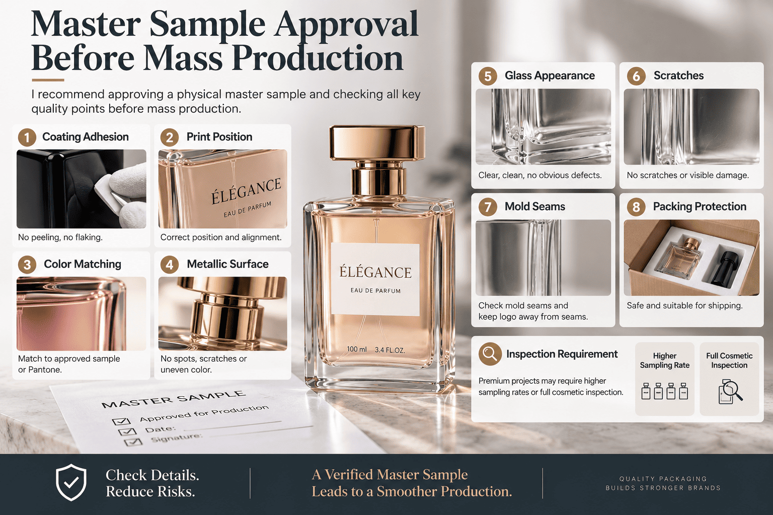
I Use the Physical Sample as the Main Standard
I do not use a rendering as the final production standard.
I also do not rely only on a Pantone reference.
The actual decorated bottle is more useful.
For repeat orders, we keep a reference sample and compare new production with the previous approved result.
I Check Different Risks for Different Decoration Methods
Color coating needs adhesion checks.
Dark colors need extra attention because rubbing is easier to see.
Screen printing needs position and registration checks.
Tapered bottles need more printing consistency checks.
Electroplating needs strong cosmetic inspection.
Small particles, pitting, uneven corners, and color differences can become very obvious on metallic surfaces.
Sampling Inspection or Full Inspection?
Not every project needs the same inspection level.
For standard commercial projects, sampling may be enough.
For premium packaging, a higher inspection level may make sense.
Some projects justify full inspection.
Manual inspection is still very useful because many perfume bottle defects are visual.
A worker can rotate the bottle under suitable light and check small details that directly affect the consumer's impression.
My Perfume Bottle Decoration Inspection Checklist
| Check | What I Look For |
|---|---|
| Color | Match against approved physical sample |
| Coating adhesion | No easy rubbing or peeling |
| Clear top coat | Correct gloss and surface protection |
| Screen printing | Correct position and complete text |
| Multi-color printing | Correct registration |
| Mold seam | Important artwork avoids the seam |
| Glass clarity | Suitable for brand positioning |
| Frosting | Uniform appearance |
| Hot stamping | No major missing or broken foil |
| Electroplating | No obvious dots, pitting, or particles |
| Metallic color | Visually even |
| Corners and edges | No obvious thin or dark areas |
| Irregular surfaces | Finish remains acceptable |
| Metallic components | Bottle, cap, and collar work together |
| Packing | Surface is protected from rubbing |
| Repeat order | Matches retained master sample |
| Final QC | Sampling or full inspection as required |
For me, quality control is not only about whether the bottle can hold perfume.
It is also about whether the packaging protects the positioning of the fragrance brand.
A tiny defect can seem unimportant during production.
The consumer may see it differently when they hold the bottle in their hand.
Is More Perfume Bottle Decoration Always Better?
More decoration can increase production cost without increasing perceived value. A clean bottle with two well-controlled finishes can look more premium than a bottle with five unrelated processes.
I prefer one strong visual idea and a few matching finishing methods. For a growing perfume brand, a good stock bottle with controlled coating, logo decoration, cap, and box can often create more value than an overcomplicated custom package.
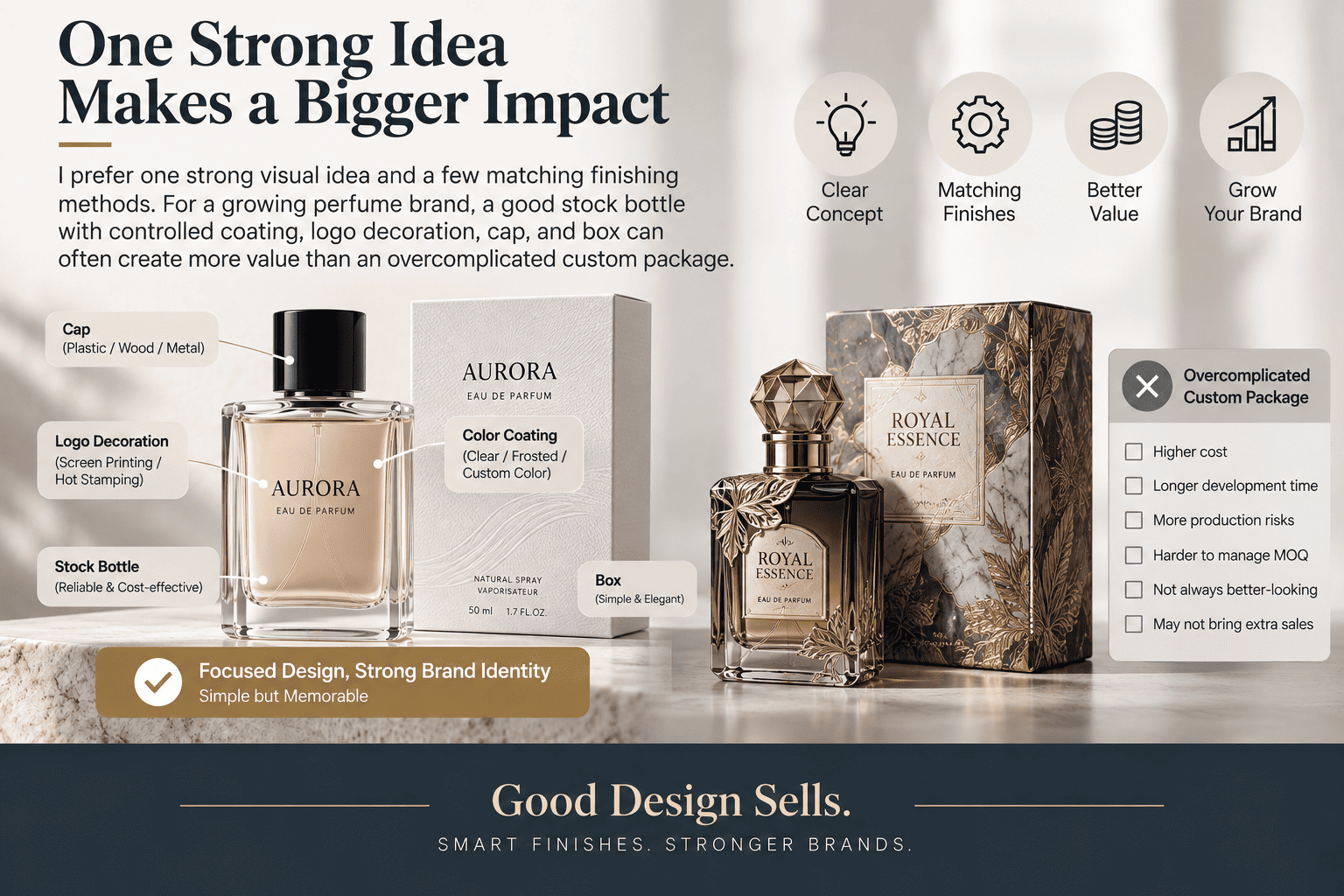
I Focus on Perceived Value
Consumers do not count how many factory processes a bottle uses.
They notice the total impression.
They notice:
- bottle proportions
- glass clarity
- color
- cap
- logo
- metallic matching
- surface quality
- packaging consistency
This is why I look at decoration as part of the complete perfume package.
Simple and Complex Packaging Can Serve Different Brands
| Plan A | Plan B |
|---|---|
| Custom glass mold | Stock glass bottle |
| Several complex finishes | Custom color coating |
| Custom metallic parts | Simple hot-stamped logo |
| Higher MOQ | Lower MOQ |
| Higher development cost | Lower initial investment |
| More inventory pressure | Easier market testing |
Plan A can make sense for an established fragrance brand.
Plan B can make more sense for a younger e-commerce brand.
I do not think customization means creating everything from zero.
For me, customization means making the customer recognize the package as part of the brand.
Sometimes that requires a custom glass mold.
Sometimes a stock bottle, the right color, a clean logo, a good cap, and a well-designed box already achieve the goal.
Conclusion
I choose perfume bottle decoration by balancing appearance, cost, MOQ, durability, bottle shape, and production risk, so the packaging can look premium and remain practical to reproduce.
[[1]]: https://forum.wordreference.com/threads/plain-black-vs-solid-black.3713173/ "solid black"
[[2]]: https://www.pantone.com/?srsltid=AfmBOorGrkfizsB3Wa775iWx-o99YG5NSLFLJ3P-aHzcxGc5J7_Md-Vb "Pantone"
[[3]]: https://en.wikipedia.org/wiki/Matte "matte surfaces"