
A beautiful fragrance can still send the wrong message when the bottle color does not match the scent, customer, or brand position.
I choose perfume bottle colors based on fragrance style, target customer, brand positioning, bottle finish, and production process. The right color should support the scent story, attract the right customer, photograph well, and remain stable during real use.
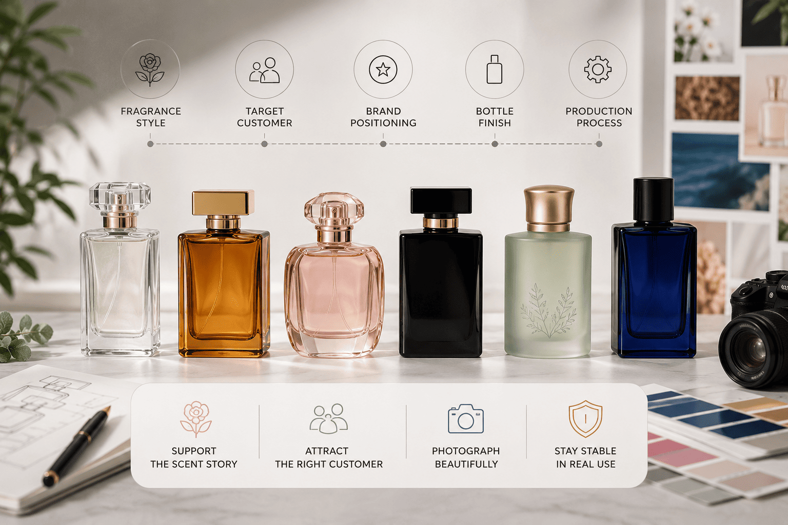
When I help perfume brands develop packaging, I never treat color as a small decoration choice. The bottle is often the first thing a customer sees. This is especially true for e-commerce fragrance brands. The customer cannot smell the perfume online, so the bottle color has to communicate part of the [fragrance story][[1]] before the customer reads the notes.
Why Is Perfume Bottle Color Important?
A perfume bottle can look attractive but still create the wrong expectation. When color and fragrance tell different stories, the customer may misunderstand the product.
Perfume bottle color helps communicate fragrance mood, target audience, price position, and brand personality. I use color to help customers understand the fragrance before they smell it and to make the product easier to remember.
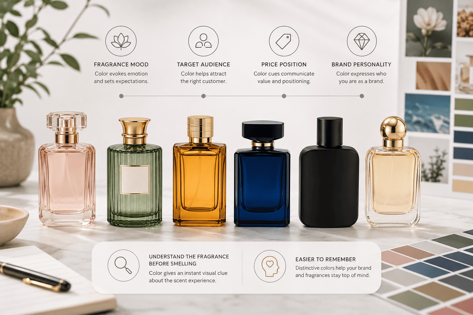
Color Creates Expectations Before Customers Smell the Perfume
I normally start by asking one simple question: what should the customer feel when they first see this bottle?
A light blue bottle often makes me think about freshness, water, air, citrus, or marine notes.
A pale pink bottle can suggest rose, floral notes, softness, sweetness, or romance.
A green bottle can suggest herbs, leaves, nature, freshness, or woody notes.
A black bottle usually communicates more strength. I often connect it with oud, leather, incense, amber, night fragrances, or a stronger luxury position.
These are not fixed rules. A perfume brand can break them. But I prefer to understand the normal customer expectation before I decide whether to follow it or break it.
| Bottle Color | Common Feeling | Fragrance Direction I Often Consider |
|---|---|---|
| Clear | Clean, simple, classic | Fresh, floral, citrus, unisex |
| Blue | Cool, fresh, calm | Aquatic, marine, citrus |
| Green | Natural, fresh, botanical | Herbal, green, woody |
| Pink | Soft, romantic, sweet | Rose, floral, fruity |
| Purple | Creative, mysterious | Floral, fruity, niche |
| Black | Strong, premium, mysterious | Oud, amber, leather |
| Brown | Warm, natural, deep | Woody, tobacco, amber |
| Red | Sensual, energetic | Spicy, fruity, oriental |
| White | Clean, modern, soft | Musk, floral, minimalist |
| Gold | Rich, decorative, luxurious | Amber, oud, premium lines |
Color becomes even more important when the perfume is sold online.
The customer cannot touch the bottle. The customer cannot feel the glass weight. The customer cannot spray the fragrance. The customer mainly sees the bottle shape, color, cap, logo, box, and product photography.
Because of this, I treat bottle color as part of the selling process.
I have seen [perfume concepts][[2]] where the scent was light, fruity, and young, but the packaging used heavy black coating and a lot of gold decoration. The bottle looked expensive, but it felt too serious for the fragrance.
I would rather make the packaging support the perfume story than simply make the bottle look expensive.
How Do I Match Perfume Bottle Colors With Fragrance Notes?
Many perfume founders choose a bottle color because they personally like it. I prefer to start with the fragrance because the scent already gives me useful visual directions.
I match perfume bottle colors with the fragrance family, main notes, mood, season, and wearing occasion. Fresh fragrances often suit clear, blue, green, or pale colors, while woody, spicy, oud, and amber scents often work with darker or warmer tones.
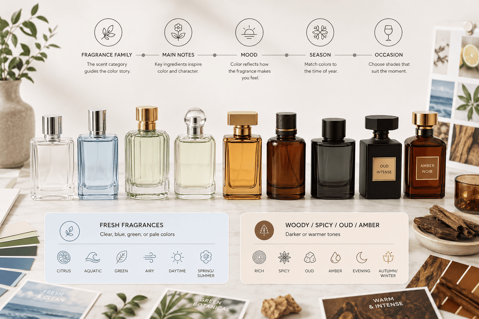
I Start With the Fragrance Family, Then I Refine the Mood
If the fragrance is citrus-based, I may start with clear glass, pale yellow, light green, or light blue.
If the fragrance is aquatic, blue and clear are natural directions. I may also use a blue gradient so the bottle feels less basic.
If the perfume is floral, I have more choices. Pink, lavender, white, cream, transparent purple, and soft gradients can all work.
For woody perfumes, I often consider brown, amber, dark green, gray, or clear glass with a wooden cap.
For oud, leather, tobacco, incense, amber, or spicy fragrances, I usually look at black, deep red, burgundy, brown, gold, or dark green.
| Fragrance Family | Color Direction | Finish I Often Consider |
|---|---|---|
| Citrus | Clear, yellow, light green | Transparent spray |
| Aquatic | Blue, cyan, clear | Gradient spray |
| Floral | Pink, purple, white | Frosted or transparent |
| Fruity | Red, pink, orange | Glossy spray |
| Herbal | Green, clear | Transparent or frosted |
| Woody | Brown, gray, dark green | Frosted or matte |
| Oud | Black, brown, gold | Opaque or glossy |
| Amber | Amber, burgundy, gold | Transparent or glossy |
| Musk | White, beige, clear | Frosted |
| Gourmand | Cream, caramel, brown | Opaque coating |
I do not stop at the fragrance family.
I also look at the emotional direction.
Two rose perfumes can use completely different bottle colors.
One rose perfume may be light, youthful, sweet, and easy to wear. Pale pink or transparent red may work well.
Another rose perfume may be deep, sensual, mature, and designed for evening use. Burgundy, dark red, smoked glass, or even black may fit better.
This is why I always ask what kind of person the brand wants to attract.
I also consider when the fragrance will be worn.
A summer fragrance often works well with lighter and cleaner colors.
A winter fragrance can naturally support amber, brown, burgundy, black, or dark green.
A daytime perfume may use softer colors.
A night fragrance may use stronger contrast or deeper tones.
I treat all of these as design tools. I do not treat them as strict rules.
A fresh fragrance can still use a black bottle if the brand has a strong reason. A rich oud fragrance can also use clear glass if the brand wants to show the natural color of the liquid.
The important point is that the decision should be intentional.
Should I Use Clear, Transparent, Frosted, Sandblasted, or Opaque Color?
Two perfume bottles can use almost the same color and still look completely different because the surface process changes the final effect.
I choose between clear, transparent sprayed, frosted, sandblasted colored, and opaque bottles based on the brand style, fragrance visibility, cost, decoration plan, and production requirements. The finish changes both the appearance and the quality-control points.
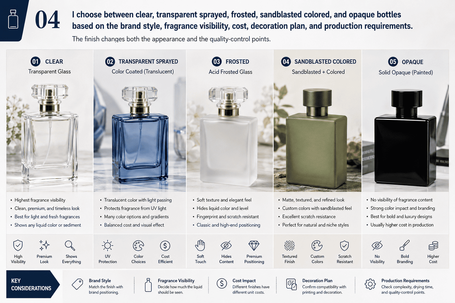
Clear Glass Gives Me the Most Flexibility
Clear glass is one of the safest starting points.
The customer can see the fragrance liquid. If the liquid is pale gold, amber, pink, or another attractive color, the fragrance itself becomes part of the packaging.
Clear bottles are also useful for fragrance collections.
A brand can use the same glass bottle for several perfumes and change the cap, label, printing, liquid color, or box.
This can reduce packaging complexity and inventory pressure.
Transparent Spraying Adds Color Without Hiding the Liquid
Transparent spray coating is one of the decoration methods I use often.
The glass is still visible, but the bottle gains a stronger color identity.
A transparent blue can feel fresh.
A transparent pink can feel romantic.
A deep green can feel natural and premium.
A gradient can create a stronger visual effect without changing the bottle mold.
For small perfume brands, this is a useful way to make an existing stock bottle look more customized.
Dark Solid Spray Colors Need Extra Quality Control
This is one production detail that I pay special attention to.
Dark solid sprayed bottles can have a risk of surface color rubbing off.
In our production communication, we often describe this as a floating-color problem.
Pure black is a very clear example.
If I take a finished black perfume bottle, rub the surface with my hand, and black color transfers onto my fingers, I know there is a coating adhesion problem.
For me, this is not only a factory issue.
It directly affects the [brand experience][[3]].
Imagine that a customer opens a premium perfume box, picks up the black bottle, and then notices black marks on their hand. The bottle may look beautiful in photos, but the customer will immediately question the quality.
From my experience, floating color mainly comes from two areas.
The first is the quality and adhesion of the coating material itself.
The second is whether the production process includes a protective clear top coat.
| Quality Point | What I Check | Why It Matters |
|---|---|---|
| Coating Quality | Ink and coating adhesion | Weak coating can rub off |
| Glass Preparation | Surface cleanliness | Oil and dust can reduce adhesion |
| Clear Top Coat | Transparent protective layer | Improves surface protection |
| Heat Curing | Correct curing condition | Helps stabilize coating |
| Hand Rub Test | Rub the surface by hand | Quickly exposes floating color |
| Approved Sample | Physical reference sample | Helps control bulk production |
For some glossy black bottles, I recommend spraying the black base first and then adding a transparent clear coat on top.
After high-temperature curing, the coating adhesion becomes much stronger.
In normal use, the surface is much less likely to show floating color or transfer color onto the hand.
Adding a clear top coat increases the decoration cost slightly.
For low-cost projects, the brand may decide not to add it.
For middle and premium fragrance brands, I often think the added cost is reasonable, especially when the bottle uses glossy black, dark red, navy, or another deep solid color.
The customer is paying for the finished product, not just the bottle shape.
Surface durability is part of that finished product.
Frosting Creates a Softer and More Minimal Look
Frosted bottles reduce shine and create a softer visual feeling.
I often use frosting for musk, floral, wellness, minimalist, or niche fragrance concepts.
Clear frosting can look very clean.
White frosting can feel modern.
Green frosting can feel natural.
Black frosting can feel strong but less glossy than normal black spraying.
The logo process also needs to match the surface.
Screen printing, hot stamping, decals, labels, and metal plates can all look different on frosted glass.
I normally check the bottle finish and the logo process together instead of choosing them separately.
Sandblasted Color Creates a Hazy Colored Effect
If a customer wants a hazy, misty, or soft colored bottle, I may suggest a sandblasted color process.
This effect is different from a normal glossy sprayed bottle.
The surface looks softer, and the color feels less sharp.
I think this works very well for niche perfume, musk, floral fragrance, natural concepts, and minimalist brands.
One important point is that sandblasted color can also be customized.
During production, we need to adjust the actual color against the Pantone reference.
I do not think it is enough to simply send a Pantone number and assume that every future production batch will automatically look the same.
The operator needs to compare the real glass bottle with the target color during production.
Then I recommend keeping an approved physical sample.
This sealed reference sample is very important for repeat orders.
| Sandblasted Color Step | What I Recommend |
|---|---|
| Color Selection | Confirm a Pantone reference |
| Color Adjustment | Match the color on actual glass |
| Sample Approval | Approve a physical bottle sample |
| Sample Retention | Keep one sealed reference sample |
| Repeat Order | Compare new production with the old sample |
| Batch Check | Inspect under consistent lighting |
I pay attention to this because different production batches can show small color differences.
Glass thickness can affect the visual result.
The amount of coating can affect it.
Production temperature and process settings can also affect it.
If the brand orders the same perfume bottle again six months later, I want the new batch to stay as close as possible to the original batch.
This matters for brands that mix old and new stock.
It also matters for product photography.
If the same perfume suddenly appears in two different shades of green, pink, or blue, customers may think the product changed.
This is why I always think about repeat production when I approve the first color sample.
Opaque Color Gives the Strongest Color Control
Opaque coating completely covers the glass underneath.
It works well when the brand wants a very specific black, white, beige, red, or pastel color.
The benefit is strong visual consistency.
The limitation is that customers cannot see the fragrance liquid or the remaining perfume level.
| Bottle Finish | Main Advantage | Main Limitation |
|---|---|---|
| Clear | Flexible and simple | Can look basic |
| Transparent Color | Adds identity while showing liquid | Needs color control |
| Frosted | Soft and premium | Changes logo appearance |
| Sandblasted Color | Hazy custom effect | Batch matching is important |
| Opaque | Strong controlled color | Hides the liquid |
| Gradient | Strong visual impact | More production control is needed |
What Perfume Bottle Colors Look More Premium?
Many perfume founders ask me which color looks the most expensive. I do not think one color can create luxury by itself.
Premium perfume bottles often use black, white, amber, deep green, burgundy, clear glass, or metallic accents. I judge luxury by the complete combination of color, coating quality, glass weight, cap, logo, and decoration quality.
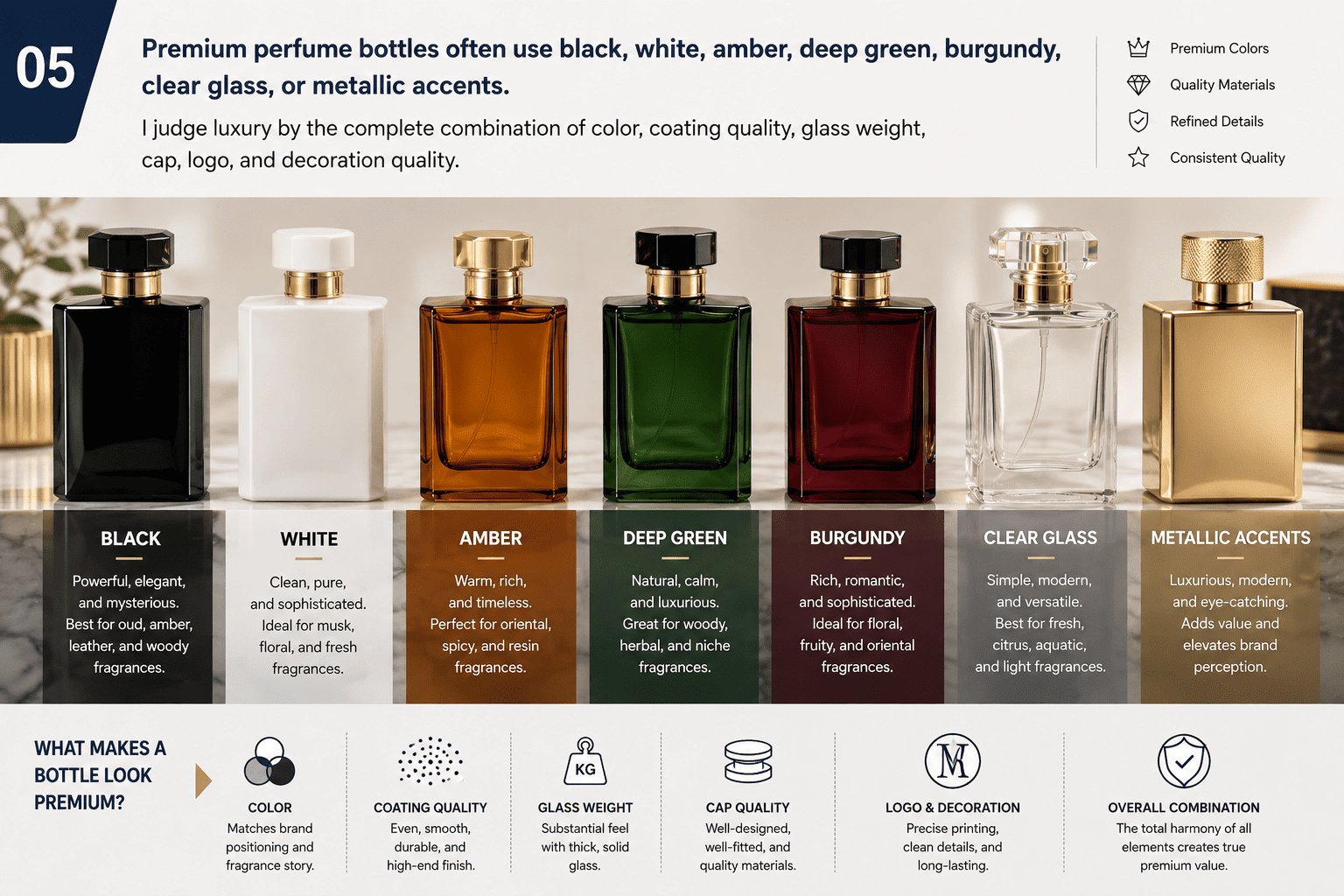
Premium Packaging Depends More on Execution Than Color
A black bottle can look premium.
A black bottle can also look cheap.
The difference often comes from execution.
If the black coating is smooth, stable, and consistent, the bottle can feel strong and premium.
If the coating rubs off when the customer touches it, the same black color immediately feels low quality.
This is why I do not only ask for "black."
I also ask whether the customer wants matte black or glossy black.
I check whether the project needs a clear top coat.
I consider the logo process.
I also look at the cap, collar, and box.
Gold works in the same way.
Gold is very common in perfume packaging because it can create a luxury feeling.
But too much gold can make a bottle look busy.
I often prefer to use gold as an accent.
A black bottle with a small gold logo can work well.
A clear heavy bottle with a champagne gold cap can look elegant.
A frosted white bottle with a small gold collar can feel clean and premium.
| Color Combination | Possible Positioning |
|---|---|
| Black + Gold | Strong, classic luxury |
| White + Gold | Clean and elegant |
| Clear + Silver | Modern and fresh |
| Deep Green + Gold | Natural premium |
| Amber + Black | Warm and mature |
| Beige + Champagne Gold | Soft niche luxury |
| Burgundy + Gold | Rich and sensual |
| Frosted Clear + Black | Minimal and modern |
I also do not think luxury has to mean dark colors.
Clear glass can look very premium when the bottle has a thick base and clean proportions.
Cream and beige can create a niche feeling.
Soft gray can work for unisex brands.
Deep green can feel natural and expensive.
The complete packaging needs balance.
If the bottle shape is already very complex, I may keep the color simple.
If the bottle shape is basic, I may use color, frosting, or a gradient to create more identity.
How Should Online Perfume Brands Choose Bottle Colors?
A bottle can look good in the hand but weak in an online listing. I think e-commerce perfume brands need to judge color from the screen as well as from the physical sample.
For online sales, I choose perfume bottle colors that photograph well, stay visible on mobile screens, contrast with the background, and remain recognizable in small thumbnails. The bottle also needs to work with the brand's social media style.
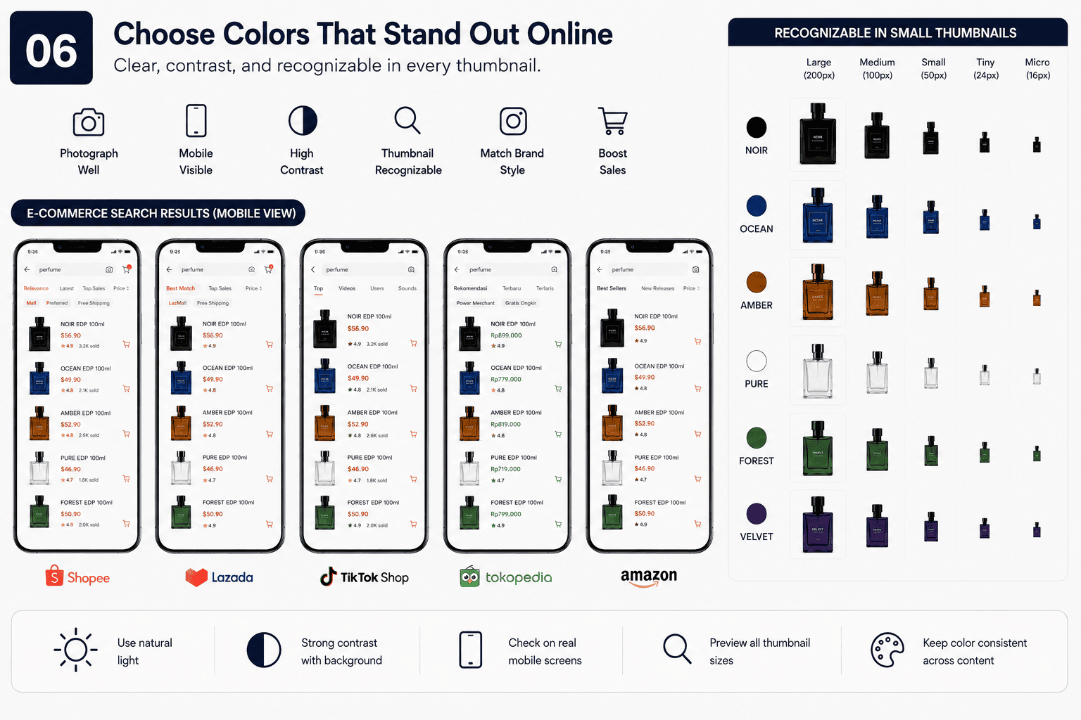
I Check the Bottle at Thumbnail Size
Many perfume brands focus on the large product image.
I also reduce the image and look at it as a small thumbnail.
This is important because many customers discover perfumes through TikTok, Instagram, marketplaces, ads, and mobile websites.
The customer may only see the bottle for one or two seconds.
A very pale transparent bottle can disappear on a white background.
A dark bottle with a dark logo can lose all detail.
A highly reflective surface may look inconsistent under different lighting.
I normally want enough contrast between the bottle, logo, and background.
If I use a dark bottle, I may choose white, silver, or gold printing.
If I use a light bottle, I may choose black, dark brown, gray, or another stronger logo color.
I also consider how the perfume liquid changes transparent bottles.
I Use Color to Separate a Fragrance Collection
Color is also useful when a brand sells several perfumes using the same bottle shape.
I can keep the packaging family consistent and change only the color.
| Fragrance | Bottle Color Direction |
|---|---|
| Fresh Citrus | Light Green |
| Marine | Blue |
| Rose Musk | Pale Pink |
| Vanilla Amber | Beige |
| Oud Intense | Black |
| Woody Spice | Brown |
This approach can help control packaging cost.
It can also make the collection easier to understand.
Customers may not remember every fragrance name.
They may remember "the blue one," "the green one," or "the black bottle."
That kind of visual memory is valuable for online brands.
I still recommend testing real samples in photography before mass production.
A computer rendering is useful during the design stage.
But physical glass shows reflection, transparency, coating, and color in a more realistic way.
How Can Small Perfume Brands Customize Bottle Colors With Lower MOQs?
A new perfume brand may want unique packaging, but a completely new glass bottle can require more investment than the brand is ready to make.
I usually recommend starting with an existing perfume bottle and customizing the surface with spray color, frosting, sandblasted color, printing, hot stamping, decals, labels, or different caps. This can create a unique result without developing a new mold immediately.
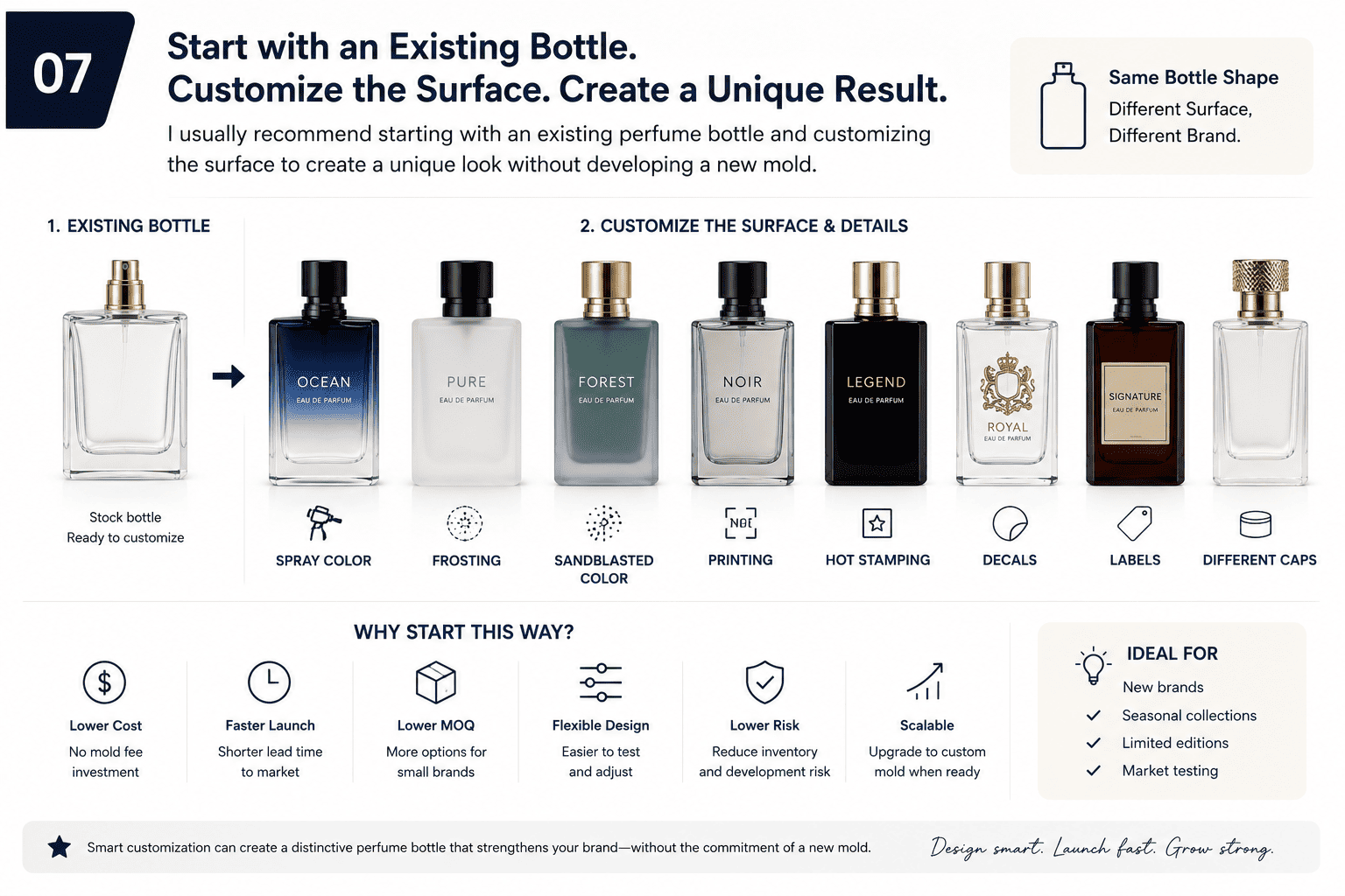
I Customize the Surface Before Developing a New Mold
I work with many growing perfume brands, and I often see the same situation.
The founder wants unique packaging.
The first order quantity is still limited.
The budget also needs to cover fragrance, boxes, labels, marketing, shipping, and inventory.
In this case, I often start with a stock perfume bottle.
At Hongyan Glass Bottle, we provide more than 500 existing perfume bottle styles.
I can then help the brand create a different look through color and decoration.
The same glass bottle can become:
- A glossy black bottle with a clear protective top coat
- A transparent pink bottle with a clear cap
- A sandblasted green bottle with a hazy finish
- A frosted white bottle with silver printing
- A gradient blue bottle with a metal cap
- A clear bottle with a wooden cap
- A burgundy bottle with champagne gold decoration
These bottles can look completely different even when the basic glass mold is the same.
This gives small brands more room to test the market.
Unique Packaging Does Not Always Need a New Glass Mold
I think many perfume founders connect customization with mold development too early.
A custom glass mold makes sense when the bottle shape itself is part of the brand identity.
But a brand can also build identity through bottle color, logo, cap, collar, label, and box.
For a first collection, I often prefer to control cost with an existing bottle and invest more attention in surface decoration.
If the brand later reaches stronger sales volume, we can consider a new bottle mold.
For a new shape, I can also support 3D sampling.
A 3D sample helps me check the overall size, proportions, bottle shape, cap relationship, and hand feeling before moving into full glass mold development.
| Customization Method | Visual Impact | Relative Cost | Suitable for New Brands |
|---|---|---|---|
| Spray Color | High | Low to Medium | Yes |
| Clear Top Coat | Low visually, high functionally | Low to Medium | Yes |
| Frosting | Medium | Low to Medium | Yes |
| Sandblasted Color | High | Medium | Yes |
| Screen Printing | Medium | Low | Yes |
| Hot Stamping | Medium | Medium | Yes |
| Decal | High | Medium | Yes |
| Custom Cap | High | Medium to High | Sometimes |
| New Glass Mold | Very High | High | Usually later |
| 3D Sample | Development Support | Medium | Yes |
My goal is not to make a perfume brand use the most expensive packaging.
My goal is to find a packaging solution that matches the brand's current stage.
For many small and medium perfume brands, an existing bottle with the right color, cap, and decoration is already enough to create a strong product.
What Mistakes Should I Avoid When Choosing Perfume Bottle Colors?
A bottle color can look perfect in a design file and still create problems during production. I always check the physical result before confirming mass production.
I avoid choosing perfume bottle colors only from a screen, ignoring coating adhesion, skipping physical samples, and forgetting batch consistency. I also check the bottle color together with the cap, collar, logo, label, and box.
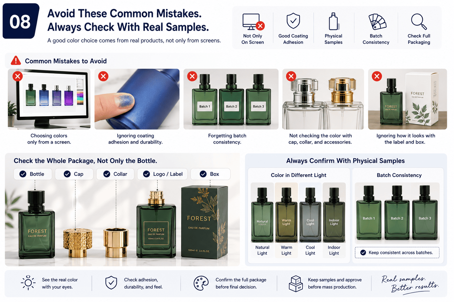
I Do Not Approve Color Only From a Computer Screen
Digital color and physical color are not the same.
A computer screen creates color with light.
A perfume bottle creates color through glass, coating, surface texture, and reflection.
Pantone references are very useful, but they are still only part of the process.
The final color needs to be checked on actual glass.
Bottle thickness can affect transparent colors.
The thick base may look darker than the thinner bottle wall.
The perfume liquid can also change the final visual result.
This is why I prefer to approve physical samples.
For sandblasted colored bottles, I also keep a sealed reference sample after color approval.
When the customer reorders, the factory can compare the new batch against the original sample.
This gives us a much better chance of keeping batch colors consistent.
I Always Check Dark Colors for Floating Color
For dark solid spray colors, I do one more simple check.
I touch and rub the bottle surface.
If I use pure black as an example, I do not want to see black color transfer onto my hand.
If that happens, I consider it a floating-color problem.
I then check the coating quality and adhesion.
I also check whether the production needs a transparent clear top coat.
For glossy black perfume bottles, adding a clear coat after the black base can significantly improve the coating stability after proper heat curing.
The process adds a small amount of cost.
For medium and premium perfume brands, I think it can be worthwhile.
The bottle needs to remain beautiful after the customer starts touching and using it.
I Check the Entire Packaging Set Together
I never judge the bottle color alone.
I want to see the cap, collar, sprayer, logo, label, and box together.
A warm beige bottle may look good alone, but it may feel strange with a very cold silver cap.
A red bottle and a red box can also be difficult because glass coating and printed paper may not reproduce red in exactly the same way.
Sometimes I prefer contrast instead of trying to make two different materials look perfectly identical.
I Avoid Using Too Many Decoration Processes
Another common mistake is trying to put every premium process on one bottle.
The founder may want spray color, frosting, hot stamping, screen printing, a metal plate, a decorative cap, decals, and a charm.
Each process can look good by itself.
Together, they may make the bottle too busy.
They also create more production steps and more quality-control points.
I usually choose one main visual feature.
Then I let the other decoration support it.
If the bottle has a strong gradient, I may keep the logo simple.
If the cap is very decorative, I may keep the bottle color clean.
If the bottle shape is already special, I may use clear glass or one solid color.
This usually creates a more professional result.
Conclusion
I choose perfume bottle colors by balancing fragrance, customer, brand style, cost, and production quality. A good color should look right and stay right after production.
[[1]]: https://www.fragrantica.com/designers/Fragrance-Story.html "fragrance story"
[[2]]: https://www.reddit.com/r/fragrance/comments/oa1i2r/concept_fragrances/ "perfume concepts"
[[3]]: https://www.acquia.com/glossary/brand-experience "brand experience"