Silk screen printing looks simple, but I have seen many perfume bottles lose quality because of small mistakes in artwork, ink, bottle cleaning, or drying.
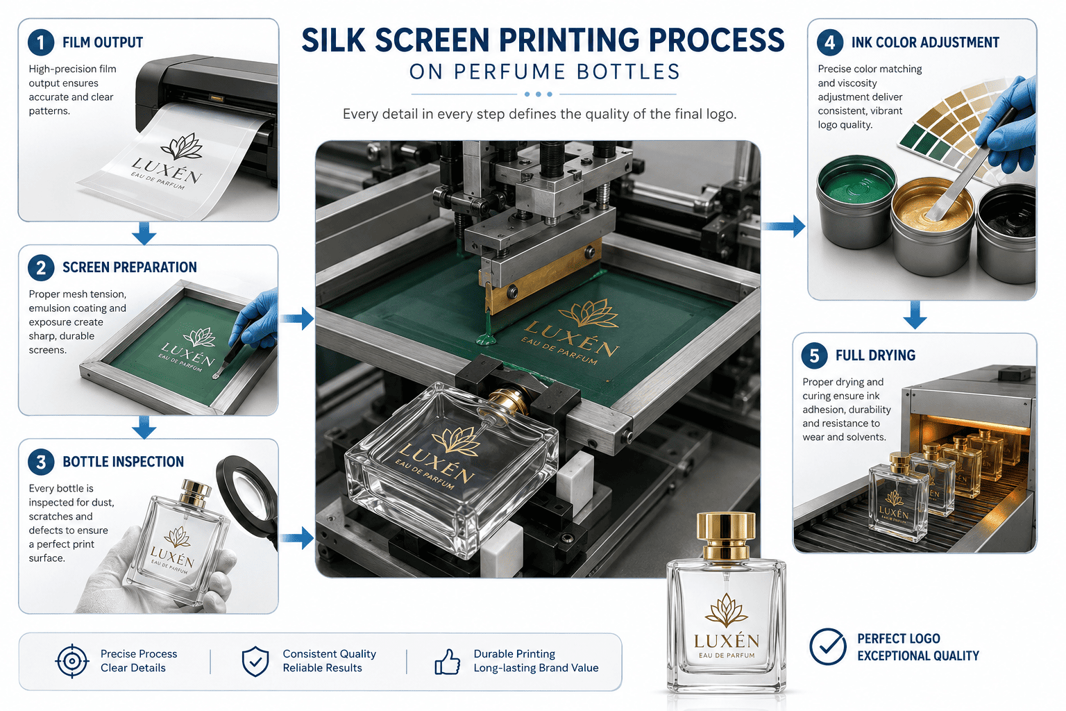
Silk screen printing transfers ink directly onto a perfume bottle through a prepared mesh screen. In my factory, I normally control five key steps: film output, screen preparation, bottle inspection, ink color adjustment, and full drying. Small details in these steps can strongly affect the final logo quality.
I have worked with silk screen printing on many perfume bottle projects. It is one of the most common decoration processes we use.
At first sight, this process looks very simple. We prepare a screen, put ink on it, and print the logo onto the glass.
But in actual production, there are many details behind these simple actions.
The bottle surface, mold seam, ink thickness, ink color, artwork size, drying time, and worker's experience can all change the final result.
For small perfume brands, I think understanding these details is useful because you can communicate with your supplier more clearly and avoid problems before mass production.
How Do We Actually Silk Screen Print a Logo on a Perfume Bottle?
The silk screen printing process does not start when the worker puts ink onto the bottle. In my experience, it starts much earlier with the logo artwork and the actual bottle shape.
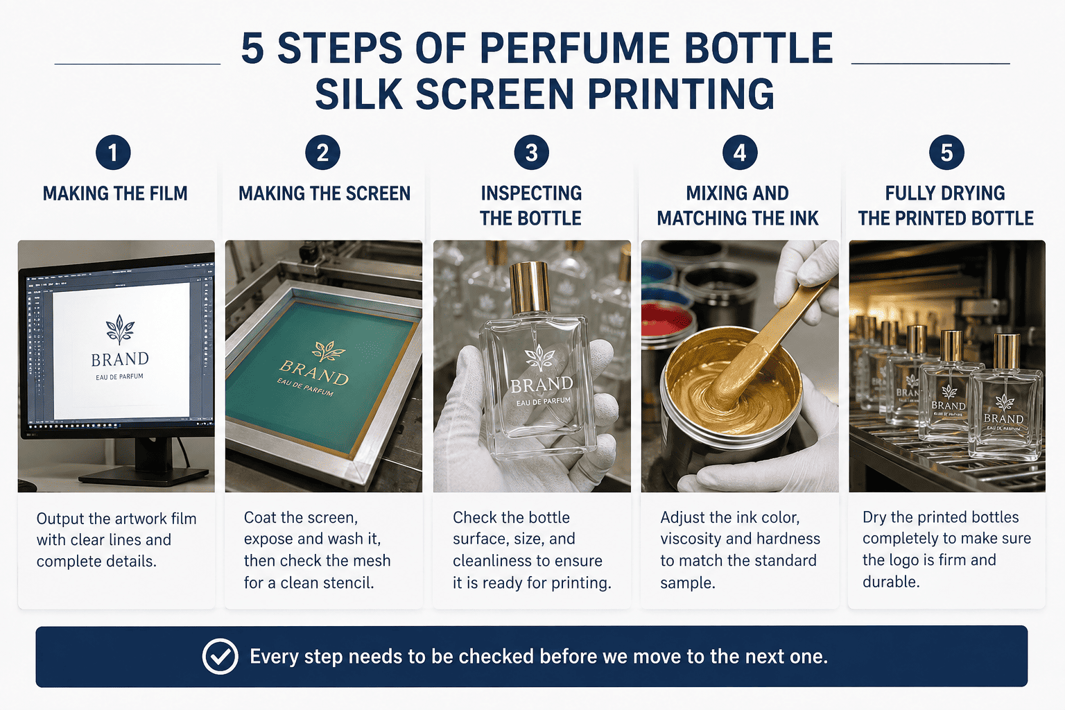
I normally divide perfume bottle silk screen printing into five steps: making the film, making the screen, inspecting the bottle, mixing and matching the ink, and fully drying the printed bottle. Every step needs to be checked before we move to the next one.
Step 1: I First Make the Film According to the Logo and Bottle
The first step we normally call making the [printing film][1].
This film is based on the customer's logo artwork.
But I do not simply take the logo file and make the film immediately.
I first need to check the logo size and its position on the actual perfume bottle.
For example, a logo may look beautiful in an AI file. But after I put it onto a 30 ml bottle, it may look too large.
Another logo may look too small compared with the bottle shoulder and base.
So I always look at the relationship between several things:
| Item | What I Check |
|---|---|
| Logo width | Whether it matches the front printing area |
| Logo height | Whether it looks balanced on the bottle |
| Printing position | Distance from bottle base, shoulder, and edges |
| Bottle shape | Flat, round, curved, or irregular |
| Mold seam | Whether the logo may touch the seam |
This stage is especially important for small bottles.
When a bottle is small, there is not much room to move the logo. A difference of only a few millimeters can affect the visual result.
This is why I prefer to confirm the artwork based on the real bottle, not only based on a computer drawing.
Step 2: We Make the Screen That Will Be Used in Production
After the film is confirmed, we prepare the actual mesh screen.
This screen is the real production tool that our worker will use during silk screen printing.
The logo area on the screen allows ink to pass through. The other areas block the ink.
The quality of this screen directly affects the edges of the printed logo.
If the screen is not prepared well, small text may not be clear. Fine lines may disappear. Some areas may also receive too much or too little ink.
In my experience, customers usually never see this step.
They only see the finished perfume bottle.
But for us, the screen is one of the most important tools in the entire process.
Step 3: I Check the Bottle Surface Before Printing
This is a step that I pay a lot of attention to.
Before we start silk screen printing, I check the condition of the bottle itself.
If it is a clear glass bottle, I check whether there is dust, oil, fingerprints, or other dirt on the surface.
If the bottle has already been color sprayed, I also check whether the spray coating is fully dry.
This detail is very important.
Sometimes a bottle looks dry from the outside, but the coating has not fully stabilized.
If we start screen printing too early, the pressure from the printing process and the new printing ink can affect the coating underneath.
The logo can become blurry.
The surface can also become dirty or sticky.
| Bottle Condition | Possible Result |
|---|---|
| Dust on surface | Missing spots in logo |
| Oil or fingerprints | Poor ink adhesion |
| Spray coating not dry | Logo may become blurry |
| Dirty printing area | Uneven logo |
| Weak base coating | Printing can peel together with coating |
This is one reason I do not like rushing decoration production.
Sometimes waiting longer before the next process actually saves more time later.
Step 4: The Printing Master Adjusts the Ink Color and Thickness
After the bottle is ready, our printing worker prepares the ink.
This step is not only about color.
We also need to control the thickness and flow of the ink.
The ink cannot be too thick, but it also cannot be too thin.
If the ink is too thin, the printed letters may not look full enough. The color can look weak. The edges can also become less clean.
If there is not enough ink during printing, the same problem can happen.
The logo may technically be there, but it does not have the rich and solid feeling that customers expect from premium perfume packaging.
Before production, we normally compare the mixed ink with the approved color reference.
This is what I mean when I say we need to match the color sample.
I do not want the worker to guess the color by eye.
We need a reference.
For some projects, this reference is a Pantone color. For repeat orders, the best reference can be an approved physical bottle from the previous production.
Step 5: We Let the Printed Ink Dry Fully
The last step sounds simple, but it is one of the easiest steps to rush.
After printing, the ink needs enough time to dry and cure.
If the ink is not fully dry, the logo is more likely to scratch, rub off, or become damaged during the next production step.
For me, full drying is not optional.
It is part of the printing process.
A bottle is not finished just because the logo looks dry on the surface.
The ink needs enough time to become stable.
When the drying is done correctly, the final printing is usually stronger and less likely to lose color or peel during normal handling.
Problem 1: Why Must You Pay Attention to the Mold Seam When Printing a Logo?
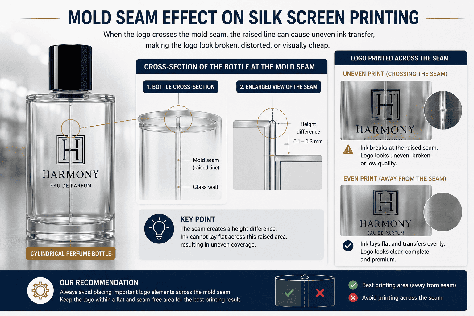
Many perfume bottles have [a mold seam][2] that comes from glass bottle production. Some seams are very light, while others are more visible and slightly raised.
I always check the mold seam before confirming a silk screen printing position. If part of the logo crosses a raised seam, the ink may not transfer evenly, and the finished logo can look broken, distorted, or visually cheap. This problem becomes more obvious on small perfume bottles.
This Is One of the Small Details That Can Ruin an Otherwise Good Bottle
I have seen this issue many times in actual production.
The bottle looks fine.
The logo design looks fine.
The printing color also looks fine.
But the printing position crosses the glass mold seam.
Then the final bottle immediately looks less refined.
A glass perfume bottle is normally made in a mold. Because of this process, the bottle can have a mold line where the mold sections meet.
Some bottles have very fine seams.
Some bottles have seams that are more obvious.
In certain bottle designs, the seam also has a slightly raised surface.
This creates a physical problem for silk screen printing.
The screen needs to contact the bottle surface in a controlled way. If the surface suddenly rises at the mold seam, the ink cannot transfer in exactly the same way.
This can cause several problems.
| Seam Problem | Possible Printing Result |
|---|---|
| Raised seam | Ink thickness becomes uneven |
| Logo crosses seam | Letters may break visually |
| Small text near seam | Text becomes hard to read |
| Thick seam | Screen contact becomes unstable |
| Logo centered incorrectly | Bottle looks visually unbalanced |
This issue is even more important when the perfume bottle is small.
A large 100 ml bottle may give us enough room to move the logo slightly left or right.
A small 10 ml, 15 ml, or 30 ml bottle may give us very little printing space.
In that case, I need to check the mold seam early when we make the film.
I do not want to discover this problem after the printing screen has already been made.
This is one of my practical insights from production: logo position should not be decided only by visual center. It also needs to respect the physical structure of the glass bottle.
Sometimes moving the logo only a few millimeters can make a big difference.
For me, a good printing position is a balance between design and production reality.
Problem 2: What Happens If the Printing Ink Is Too Thin or There Is Not Enough Ink?
The amount and thickness of printing ink directly affect how solid and premium the logo looks. A logo can have the correct position and color but still look cheap if the ink layer is weak.
If the ink is too thin or the ink amount is not enough, printed letters can look weak, uneven, and not fully filled. I normally control both ink consistency and ink quantity before production because a fuller ink layer usually gives the logo a cleaner and richer visual appearance.
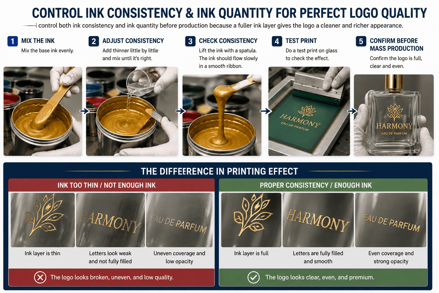
The Logo Needs to Look Full, Not Just Visible
This is another detail that I think many buyers do not notice until they compare two bottles side by side.
One bottle can have a logo that is technically correct.
The logo is there.
The spelling is correct.
The position is correct.
But the letters do not look full.
The black is not deep enough.
The white does not look solid.
The printed surface feels weak.
Then another bottle has the same artwork, but the ink coverage is better.
Immediately, the second bottle looks more expensive.
This difference can come from the ink.
When we adjust silk screen ink, we need to control its working condition.
If the ink becomes too thin, it can spread too easily.
If the ink amount is not enough, some areas of the artwork may not receive enough coverage.
| Ink Condition | Visual Effect |
|---|---|
| Too thin | Weak color and less solid logo |
| Too little ink | Incomplete letters |
| Uneven ink | Different density across logo |
| Wrong flow | Edges may become unclear |
| Correct condition | Full and clean printing |
The bottle background also affects this result.
For example, white printing on a dark sprayed bottle needs enough coverage.
If the white ink layer is too weak, the dark background can visually reduce its brightness.
The same thing happens with light colors.
For this reason, I do not judge a color only when we mix the ink.
I judge it after the ink is printed onto the real bottle.
This is an important difference.
Ink in a container and ink on a bottle are not the same visual reference.
I always prefer to make a printing test before large production.
The worker can then adjust the ink until the logo looks full and clean.
Problem 3: Why Does Printing Become Blurry If the Bottle Coating Is Not Fully Dry?
Color spraying and silk screen printing are often used together. The sequence looks simple, but the drying time between these two processes can strongly affect the result.
If a sprayed bottle has not fully dried before silk screen printing, the printing pressure and fresh ink can disturb the coating underneath. The logo may become blurry, dirty, or unstable. I prefer to let the base coating dry fully before starting the next decoration process.
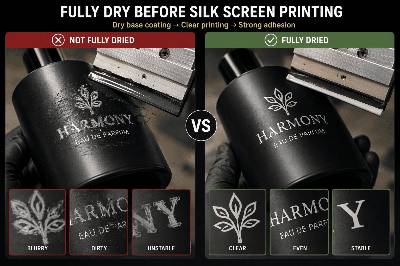
I Never Treat Drying Time as Wasted Time
In packaging production, everyone wants faster delivery.
I understand this very well.
My customers may have a perfume launch date.
They may already have boxes waiting.
They may need to ship bottles to a filling factory.
Because of this pressure, suppliers can sometimes be tempted to move bottles into the next process too early.
I think this is risky.
A bottle that has just been color sprayed needs enough drying time.
The surface may feel dry, but the coating underneath may still need more time.
If we apply silk screen printing too early, several things can happen.
The screen or fixture may leave marks.
The printing ink may interact badly with the coating.
The logo may become blurry.
The base color may also become damaged.
| Situation | Risk |
|---|---|
| Coating still soft | Surface can be marked |
| Printing too early | Logo may blur |
| Bottle stacked too soon | Coating may stick |
| Ink not compatible | Adhesion can become weak |
| Next process rushed | Defect rate can increase |
I think this is a good example of why decoration should be treated as a complete production system.
A perfume bottle may go through color spraying, frosting, printing, hot stamping, decal application, and assembly.
Each process affects the next process.
If the previous layer is unstable, the next layer cannot perform well.
From my experience, production speed should not only mean doing every step faster.
Good production speed also means avoiding rework.
If we save several hours by printing too early but later need to remake hundreds of bottles, we have not saved time.
We have lost time.
So when I plan silk screen printing after a spray coating, I always want the base layer to be stable first.
Problem 4: Why Can the Silk Printing Color Look Different From Your Pantone Color?
Pantone is a useful communication tool, but a Pantone number does not guarantee that the printed logo will look exactly the same on every perfume bottle surface.
I use Pantone as a color target, but I still check the actual ink on the real bottle. Clear glass, frosted glass, sprayed glass, dark coatings, and light coatings can all change how the same ink appears, so physical color approval is important before mass production.
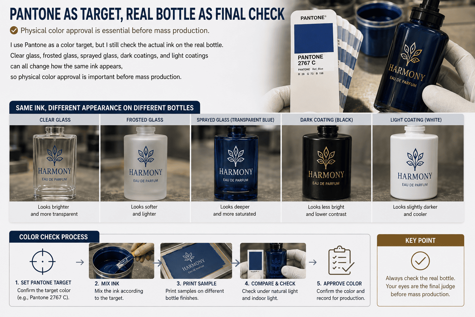
Color Matching Happens on the Bottle, Not Only in the Ink Cup
When our printing master adjusts the ink, we first need a color reference.
This can be a Pantone number.
It can also be a customer's existing sample.
Then the worker mixes the ink.
But I do not consider the job finished after the ink looks correct inside the container.
The real test is the bottle.
A printing color can change visually depending on what is under it.
For example, the same gold ink can look different on clear glass and black sprayed glass.
White ink can also look different on transparent glass and frosted glass.
This happens because the bottle surface changes how light reaches our eyes.
| Bottle Surface | Possible Color Effect |
|---|---|
| Clear glass | More light passes through |
| Frosted glass | Color may look softer |
| Black coating | Light colors need good coverage |
| White coating | Colors may look brighter |
| Colored coating | Background can affect perception |
Ink thickness also plays a role.
If the ink is too thin, the color may not look strong enough.
This is why color adjustment and ink consistency cannot be separated.
When I say we need to match the color, I mean more than simply mixing according to a formula.
I want to see the final color after it is printed on the actual bottle.
For a first order, I strongly prefer physical sample approval.
For a repeat order, I like to keep an approved bottle as a production reference.
This makes communication much easier.
A phone photo is useful, but screens, lighting, and camera settings can all change color.
A physical approved sample gives the factory a much clearer target.
Problem 5: Why Is Full Drying So Important After Silk Screen Printing?
The printing process is not finished when the logo first looks dry. The ink still needs enough time to stabilize before packing, assembly, or further decoration.
Full drying helps the printing ink achieve better adhesion and resistance to rubbing. If bottles are handled, packed, or assembled too early, the logo may scratch or lose color more easily. I always treat drying as a real production step, not as passive waiting.
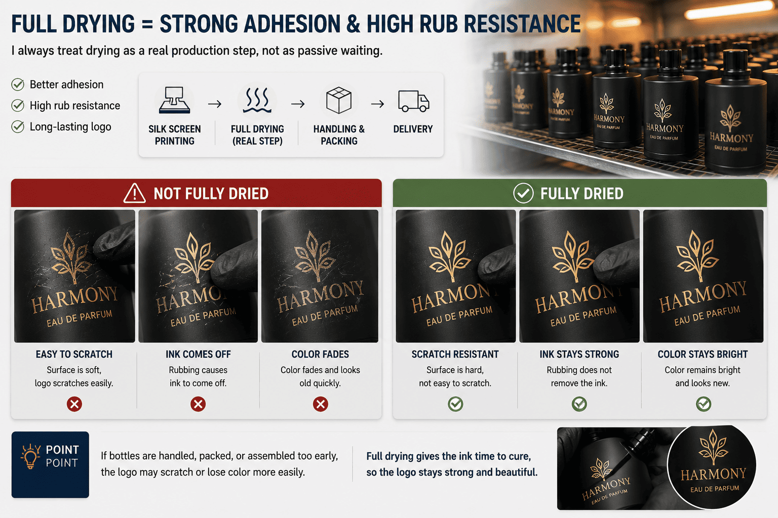
Ink Quality and Drying Conditions Both Affect Durability
For me, the durability of silk screen printing depends on more than one thing.
The ink quality matters.
The bottle surface matters.
The previous coating matters.
And drying also matters.
A supplier cannot use poor-quality ink and expect drying to solve everything.
At the same time, even good ink can perform badly if the process is rushed.
This is why I look at the full system.
| Factor | Effect on Printing Durability |
|---|---|
| Ink quality | Affects color retention and adhesion |
| Surface cleanliness | Affects bonding |
| Base coating | Affects stability |
| Drying time | Helps ink cure correctly |
| Handling time | Early contact may damage print |
| Storage condition | Can affect fresh decoration |
I have seen bottles that look perfect immediately after printing.
Then someone packs them too quickly.
The bottles rub against trays or each other.
After that, the printing has small scratches.
This problem could have been avoided.
For perfume brands, this matters because customers touch the bottle many times.
The bottle may sit in a handbag.
It may touch other cosmetic products.
It may also be wiped during use.
The logo needs reasonable durability for normal handling.
I also pay attention to the quality of the printing ink itself.
Different inks can have different performance in color retention and resistance to wear.
A very cheap ink may reduce decoration cost slightly, but it can create more complaints later.
For a brand, saving a very small amount on ink is usually not worth damaging the appearance of the finished perfume bottle.
Silk screen printing is often considered one of the simplest perfume bottle decoration methods.
I agree that the basic principle is simple.
But stable production is not simple.
From making the film to making the screen, checking the bottle, adjusting the ink, avoiding mold seams, controlling ink thickness, and allowing full drying, every small detail affects the result.
This is why I always prefer to make samples before mass production.
A sample helps me and my customer check the real logo size, printing position, seam relationship, color, ink fullness, and adhesion.
If we find a problem at the sample stage, we may only need to adjust a few bottles.
If we find the same problem after thousands of bottles are printed, the cost is completely different.
For small and medium perfume brands, I think this production control is even more important.
Our goal at Hongyan Glass Bottle is not only to sell a glass bottle. I want to help perfume brands build a complete packaging solution with reasonable cost and manageable quantities.
We keep more than 500 perfume bottle styles in stock, and we support decoration such as [color spraying][3], frosting, silk screen printing, gold plating, decals, and other finishing processes. We can also provide perfume packaging components and support 3D sampling for new bottle development.
For many new brands, I often suggest starting with an existing bottle and using decoration to create the brand identity.
A good silk printed logo can make a standard bottle look very different.
But the quality comes from controlling these small details one by one.
Conclusion
Silk screen printing looks simple, but I have learned that film, screen, bottle surface, mold seams, ink quality, color matching, and full drying decide whether the final bottle looks truly professional.