A perfume may smell excellent, but the wrong bottle color can make customers misunderstand its character, price level, and even the brand itself.
I can change perfume bottle color through spray coating, frosting, gradient coating, electroplating, flocking, acid etching, and water transfer printing. I choose the process by matching the color, fragrance character, brand positioning, target market, and production conditions instead of treating color as simple decoration.
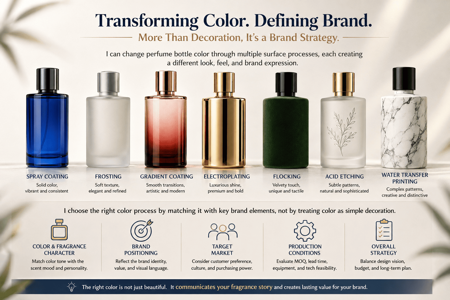
When I develop perfume packaging, I always think about one question first: does the bottle look like the fragrance it contains? I believe the fragrance, bottle color, surface texture, cap, logo, and box should speak the same [visual language][[1]]. If they do not, customers may receive the wrong message before they even smell the perfume.
What Are the Main Ways to Change the Color of a Perfume Bottle?
Choosing a beautiful color is easy. Choosing a color process that looks good, matches the fragrance, and can be produced consistently is much harder.
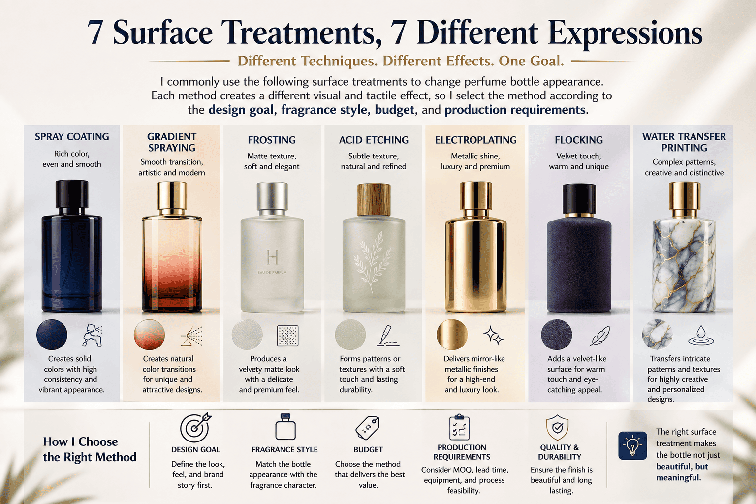
I commonly use spray coating, gradient spraying, frosting, acid etching, electroplating, flocking, and water transfer printing to change perfume bottle appearance. Each method creates a different visual and tactile effect, so I select the method according to the design goal, fragrance style, budget, and production requirements.
Spray Coating
[Spray coating ][[2]]is one of the most flexible methods I use.
I can start with a clear glass bottle and spray color onto the outside surface. This allows me to create many different colors without producing the glass itself in a custom color.
I can create opaque colors.
I can create translucent colors.
I can create glossy surfaces.
I can create matte surfaces.
I can also match a Pantone color when a brand already has an established visual system.
This is very useful for small and medium perfume brands because the brand can choose an existing bottle and create a different identity through decoration.
Gradient Spray
Gradient spray creates a smooth transition between colors.
I can make black move into clear glass.
I can make pink move into purple.
I can make amber move into transparent glass.
I can also create more complex combinations.
I think gradients are especially interesting for perfume because perfume itself changes with time.
The fragrance has top notes, middle notes, and base notes.
The smell is not static.
The color does not have to feel static either.
A gradient can visually suggest that movement.
Frosting and Acid Etching
Frosting makes the glass surface look matte.
Acid etching also creates a matte effect, but it changes the glass surface itself.
Both processes reduce strong reflections.
They can make a bottle feel softer, colder, cleaner, or more premium depending on the color and the other components.
Electroplating
Electroplating creates a metallic surface.
I often use gold, silver, gunmetal, rose gold, or other metallic effects.
Metallic surfaces can create a very strong shelf impact.
They can also make a bottle look more luxurious, colder, sharper, or more modern.
Flocking
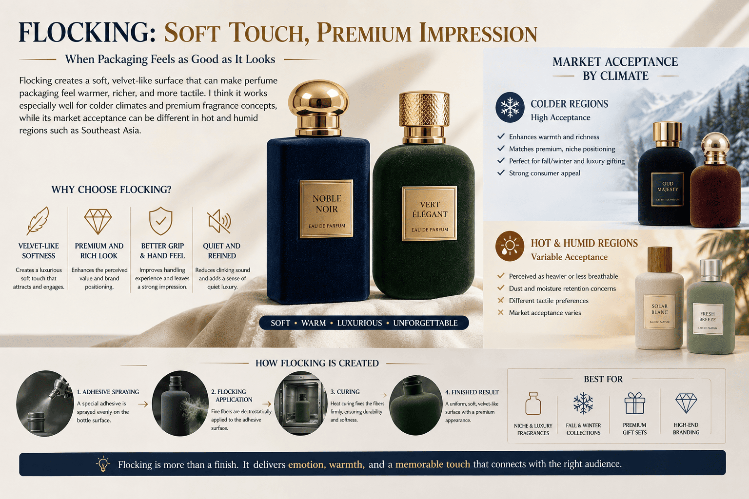
[Flocking][[3]] creates a soft velvet-like surface by adding fine fibers to the bottle.
This process is becoming more popular in some markets because it creates a very different tactile experience.
Customers do not only see the bottle.
They feel it.
That makes flocking interesting for brands that want a stronger sensory experience.
Water Transfer Printing
Water transfer printing can create patterns that are difficult to achieve through ordinary spraying or printing.
I can use marble patterns, wood grain, stone textures, abstract designs, or other surface graphics.
This is useful when the pattern itself is part of the brand identity.
| Process | Main Effect | Typical Feeling | Possible Use |
|---|---|---|---|
| Spray coating | Solid or translucent color | Flexible | Most perfume styles |
| Gradient spray | Light-to-dark transition | Dynamic, emotional | Niche and story-driven perfume |
| Frosting | Matte glass surface | Soft, clean, cold | Minimalist and premium brands |
| Acid etching | Fine permanent matte surface | Refined | Premium perfume |
| Electroplating | Metallic surface | Luxury, cold, sharp | Woody and luxury fragrance |
| Flocking | Velvet-like touch | Soft, warm, tactile | Floral and premium collections |
| Water transfer printing | Full-surface pattern | Artistic | Creative and themed perfume |
I never select these processes only because they are fashionable.
I first check whether the process helps communicate the fragrance.
That is the more important question.
How Should Perfume Bottle Color Match Brand Positioning?
A color can look attractive by itself, but it can still be wrong if it does not match the visual tone of the perfume brand.
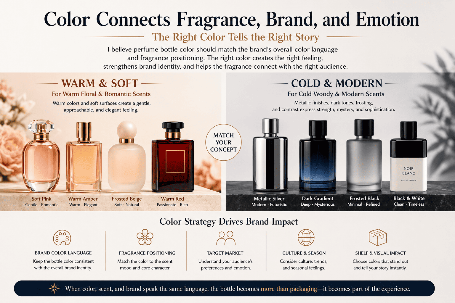
I believe perfume bottle color should match the brand's overall color language and fragrance positioning. Warm colors and soft surfaces can support warm floral scents, while metallic finishes, dark gradients, frosting, and black-and-white contrast can work better for colder woody or modern fragrance concepts.
I Start With the Brand Tone
When a customer asks me to change the bottle color, I do not immediately ask which Pantone number they want.
I first look at the brand.
I look at the logo.
I look at the box design.
I look at the website.
I look at the target customer.
Then I look at the fragrance itself.
If the brand has a warm visual identity, I normally do not suddenly introduce a very cold metallic bottle unless there is a clear reason.
If the brand is built around minimal black and white graphics, I also do not add a colorful gradient simply because gradient bottles are popular.
The bottle has to belong to the brand.
Warm Fragrances Need a Warm Visual Language
For warmer fragrances, I often use warm colors and softer surface treatments.
For example, I may use amber, rose, burgundy, warm beige, orange, red, or soft pink.
Spray coating is very useful here.
I can control the color and transparency easily.
Flocking is another interesting option.
A flocked bottle has a soft surface.
When customers touch it, the bottle feels warmer and more comfortable than a cold metallic surface.
This kind of treatment can work well for floral, sweet, romantic, vanilla, amber, or gourmand fragrance concepts.
The packaging starts to support the smell.
A customer may see a warm rose-colored bottle with a soft surface and already imagine a warm floral fragrance.
That connection is valuable.
Cold Woody Fragrances Need a Different Expression
For colder woody perfumes, I often move in another direction.
Metallic electroplating can work very well.
Silver can feel cold.
Gunmetal can feel strong and modern.
A dark metallic gray can feel industrial.
I can also use frosting with a gradient black effect.
For example, the bottle may start with deep black at the bottom and slowly become lighter near the top.
Another solution is black-and-white contrast.
A frosted white bottle with a black cap can look very clean.
A matte black bottle with a white logo can feel sharp and controlled.
These techniques can support woody, smoky, mineral, leather, incense, and dry aromatic fragrances.
| Fragrance Direction | Color Direction | Surface Process |
|---|---|---|
| Warm floral | Pink, rose, red | Spray coating, flocking |
| Amber / vanilla | Amber, brown, gold | Spray coating, metallic detail |
| Cold woody | Black, gray, silver | Frosting, electroplating |
| Mineral | Silver, white, gray | Metallic finish, frosting |
| Romantic floral | Soft pink, cream | Spray coating, flocking |
| Modern unisex | Black and white | Frosting, matte coating |
In my experience, the strongest packaging usually comes from consistency.
The fragrance and the visual design should not fight each other.
How Does Flocking Change the Feeling of a Perfume Bottle?
A normal glass bottle is hard and cold to the touch. Flocking completely changes that physical experience.
Flocking creates a soft, velvet-like surface that can make perfume packaging feel warmer, richer, and more tactile. I think it works especially well for colder climates and premium fragrance concepts, while its market acceptance can be different in hot and humid regions such as Southeast Asia.
Flocking Is More Than a Color Process
Flocking is interesting because it changes more than appearance.
It changes touch.
Most perfume bottles feel hard and smooth.
Glass naturally feels cold.
A flocked surface feels soft.
This gives the product another sensory layer.
I think this matters because perfume is already a sensory product.
Customers smell it.
They see it.
With flocking, they also experience a stronger texture.
This is why flocking can be useful for premium or emotional fragrance concepts.
Climate Can Affect Packaging Preference
I also think the target market matters.
A process that becomes popular in one region may not become equally popular everywhere.
Flocking can feel warm and comfortable in colder regions.
The velvet-like texture can support the feeling of warmth, softness, and luxury.
In hotter and more humid markets, I am more careful with this process.
For example, Southeast Asia has a very different climate and consumer environment from Northern Europe.
Customers may prefer packaging that looks lighter, cleaner, fresher, or easier to handle.
A heavy velvet feeling may not always connect with the local market in the same way.
I do not think this means flocking cannot be sold in Southeast Asia.
It means I would not use it only because it is becoming fashionable somewhere else.
I would first look at the target customer.
I would also look at the retail environment and brand story.
Texture Needs to Match the Fragrance
A soft bottle can help communicate a soft fragrance.
For example, a dusty pink flocked bottle may work with a warm floral perfume.
A deep burgundy flocked bottle may support rose, vanilla, or an intense sweet fragrance.
A cream flocked bottle may feel elegant and calm.
I would be more careful using the same surface for a very cold marine fragrance.
The touch and smell may tell two different stories.
Again, there are no absolute rules.
A brand can create contrast intentionally.
But the contrast should be part of the concept.
It should not happen by accident.
Why Is Gold Commonly Used for Luxury Perfume Packaging?
Luxury perfume needs to communicate value before the customer checks the ingredients, and gold is one of the fastest colors for creating that visual signal.
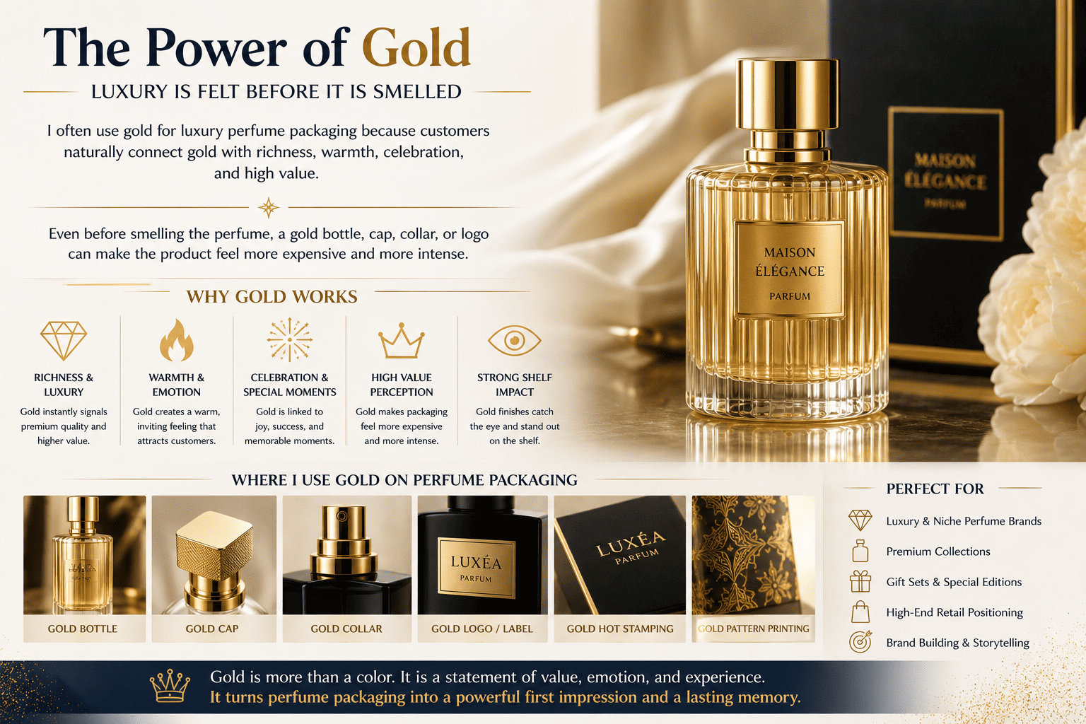
I often use gold for luxury perfume packaging because customers naturally connect gold with richness, warmth, celebration, and high value. Even before smelling the perfume, a gold bottle, cap, collar, or logo can make the product feel more expensive and more intense.
Gold Creates an Immediate Price Signal
When I look at luxury perfume packaging, gold appears again and again.
There is a reason for this.
Gold is easy to recognize.
Customers already connect it with jewelry, wealth, celebration, and valuable objects.
Because of that, gold can quickly raise the perceived value of perfume packaging.
A customer may not know the glass weight.
The customer may not know the production process.
The customer may not know the fragrance formula yet.
But the customer understands gold immediately.
Gold Also Creates a Warm Emotional Signal
I do not see gold only as a luxury color.
I also see it as a warm color.
Before customers smell the perfume, gold can already suggest heat, richness, intensity, and even sensuality.
This makes it useful for certain fragrance families.
For example, gold can work with amber, oud, vanilla, spicy, oriental, floral, or gourmand fragrances.
It can support the emotional direction of the scent.
I Do Not Use Gold Everywhere
At the same time, I do not believe that adding more gold automatically creates more luxury.
Sometimes a fully gold bottle looks expensive.
Sometimes it looks too heavy.
Sometimes a small gold detail works better.
I may use a clear bottle with a gold cap.
I may use a black bottle with a gold collar.
I may use a frosted bottle with a simple gold logo.
The visual balance matters.
| Gold Application | Visual Result | Suitable Positioning |
|---|---|---|
| Full gold bottle | Strong luxury | High-impact fragrance |
| Gold cap | Controlled luxury | Premium mainstream |
| Gold collar | Small luxury detail | Minimal premium |
| Gold logo | Refined accent | Niche perfume |
| Black + gold | Strong and rich | Oud, amber, evening |
| White + gold | Clean luxury | Floral, elegant fragrance |
I always check how the gold works with the fragrance and the full package.
Gold should support the concept.
It should not replace the concept.
How Can Gradient Color Express the Top, Middle, and Base Notes?
Perfume changes after it touches the skin, but a solid bottle color does not always show this sense of movement.
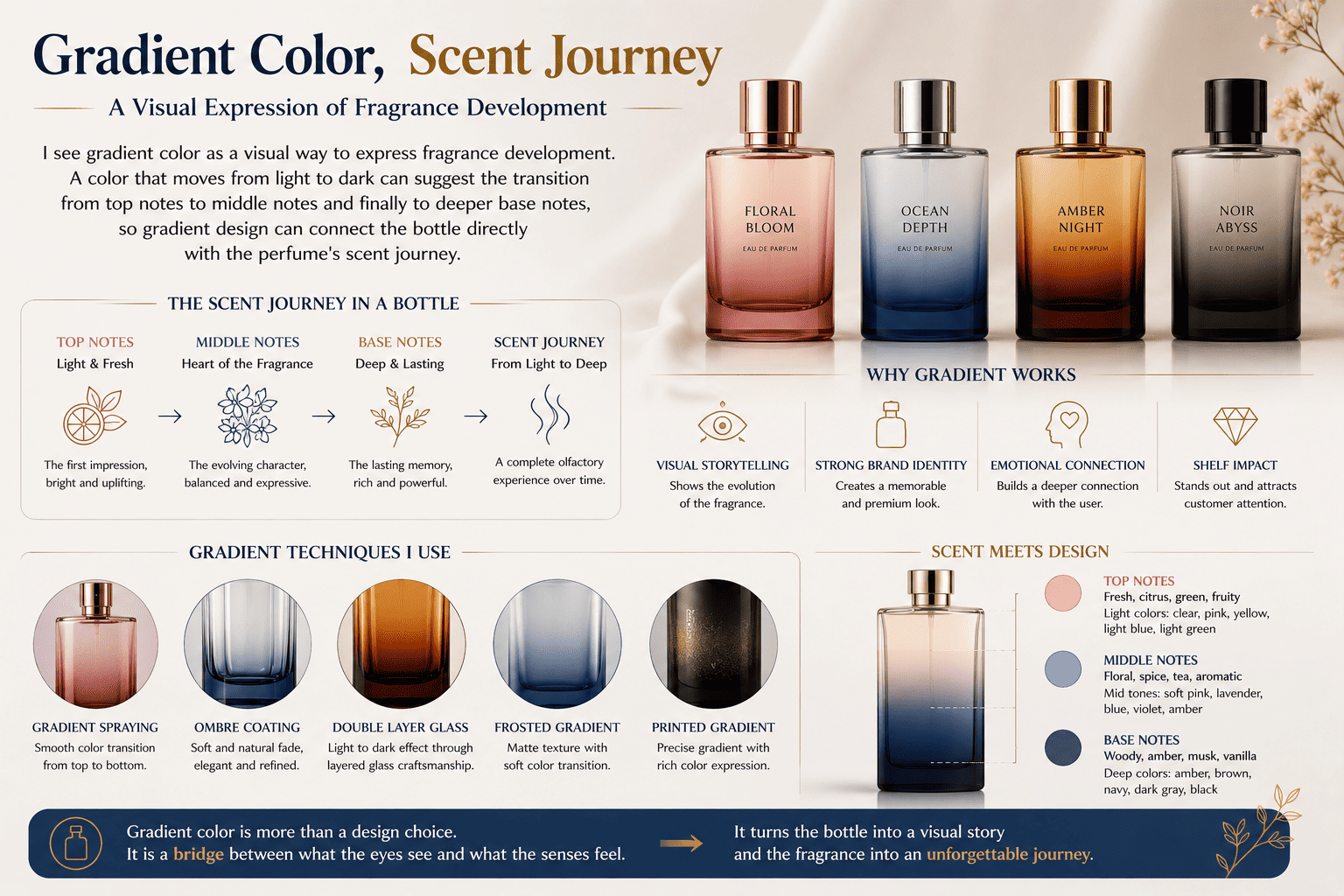
I see gradient color as a visual way to express fragrance development. A color that moves from light to dark can suggest the transition from top notes to middle notes and finally to deeper base notes, so gradient design can connect the bottle directly with the perfume's scent journey.
Perfume Is a Process, Not a Fixed Smell
When a customer first sprays a fragrance, the smell is different from what remains several hours later.
The top notes appear first.
Then the heart develops.
The base stays longer.
I think this is one reason gradient color is so interesting for perfume packaging.
A gradient also has movement.
It changes.
The eye travels from one color level to another.
That makes it possible to connect the bottle design with the fragrance structure.
Light to Dark Can Represent Fragrance Development
For example, I may use a bottle that starts with a very light color at the top.
The color slowly becomes darker toward the bottom.
The light area can suggest the brighter top notes.
The middle transition can suggest the heart of the perfume.
The darker base can suggest deeper and longer-lasting base notes.
This idea can work especially well when the perfume itself develops from fresh to deep.
A fragrance may open with citrus.
Then it moves into floral notes.
Finally, it ends with woods, musk, amber, or vanilla.
The bottle can visually tell the same story.
The Color Choice Still Matters
I would not create a gradient only because it looks attractive.
The colors should still relate to the fragrance.
A fresh perfume may move from clear to blue.
A rose fragrance may move from pale pink to dark red.
An amber fragrance may move from light honey to dark brown.
A woody fragrance may move from smoky gray to black.
This gives the gradient a reason.
It becomes part of storytelling instead of random decoration.
Production Stability Also Matters
A beautiful rendering is only the first step.
Gradient coating must also be produced consistently.
I need to control where the transition begins.
I need to control how dark the final color becomes.
I need to compare the production bottles with the approved sample.
If the gradient position changes too much from one bottle to another, the final product can look unstable.
This is why I always connect creative ideas with production control.
A concept has value only when I can reproduce it consistently.
How Should a Perfume Brand Choose the Right Bottle Color Process?
Small perfume brands need unique packaging, but they also need realistic minimum quantities, stable production, and a reasonable development budget.
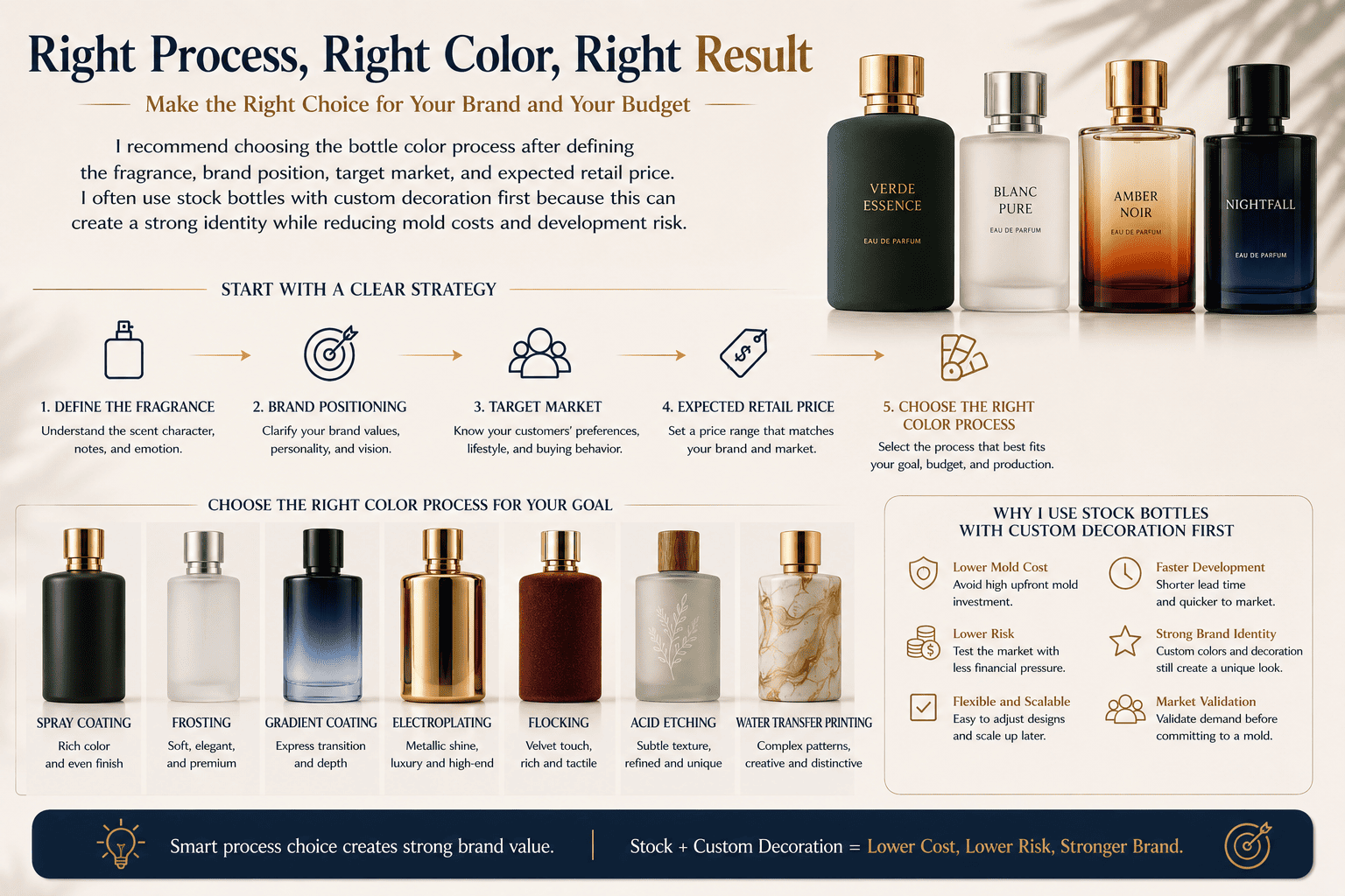
I recommend choosing the bottle color process after defining the fragrance, brand position, target market, and expected retail price. I often use stock bottles with custom decoration first because this can create a strong identity while reducing mold costs and development risk.
I Do Not Start With the Process
A customer may tell me, "I want electroplating."
Another customer may tell me, "I want flocking."
My first question is usually not about production.
I want to understand why.
What does the fragrance smell like?
Who is going to buy it?
How much will it sell for?
Where will it be sold?
What should customers feel when they see it?
These questions help me understand whether the requested process actually fits the project.
Sometimes the customer's first idea is already suitable.
Sometimes another process can create the same effect with lower cost or better production stability.
Stock Bottles Can Be a Good Starting Point
For many new perfume brands, I recommend starting with an existing glass bottle.
At Hongyan, we have more than 500 stock perfume bottle models.
A brand can choose a suitable bottle shape first.
Then we can change its identity through spray coating, frosting, electroplating, flocking, decal, printing, gradient coating, and other decoration methods.
This can be a very practical way to develop a new perfume.
The brand can create a custom appearance without immediately investing in a completely new glass mold.
Custom Development Makes Sense at the Right Stage
A custom bottle mold becomes more useful when the bottle shape itself is part of the brand identity.
At that point, we can also support 3D sampling for a new bottle shape.
This helps the brand check the form and proportion before moving further into production.
I believe this is especially important when the brand has already validated its market and wants to create stronger visual ownership.
I Always Think About Production Stability
Design is only one side of packaging development.
Production is the other side.
A beautiful design is not useful if it cannot be produced consistently.
When I review a project, I think about several practical questions.
Can the process work on this bottle shape?
Can the color remain stable in mass production?
Can the decoration pass normal handling?
Will the logo position stay consistent?
Can the cap, collar, bottle, and box match each other?
Is the process suitable for the required quantity?
Can the factory repeat the approved sample?
These questions are very important.
| Development Question | Why I Check It |
|---|---|
| Is the idea technically possible? | Avoid impossible designs |
| Can it be mass-produced? | Control production risk |
| Is the color stable? | Keep batch consistency |
| Is the process suitable for the MOQ? | Control budget |
| Does the bottle match the cap? | Keep visual consistency |
| Can the finish survive handling? | Protect final quality |
| Can future orders repeat the effect? | Support long-term supply |
I believe a packaging supplier should not simply say yes to every idea.
Sometimes I need to tell the customer that a design needs adjustment.
That is part of development.
How Can Hongyan Help Develop a Custom Perfume Bottle Concept?
A packaging idea can look perfect in a mood board, but turning it into stable mass production usually requires many practical decisions.
At Hongyan, we do more than supply perfume bottles. I help brands turn packaging ideas into solutions that are practical, manufacturable, stable, and suitable for mass production. I can also provide reference cases, stock bottle options, decoration suggestions, and 3D sampling for new bottle development.
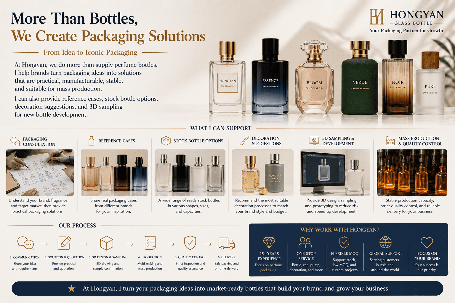
I See Our Role as Development, Not Only Production
This is an important difference for me.
I do not want our work to be only:
You give me a drawing.
I produce it.
That is too simple.
When I work with a perfume brand, I prefer to look at the project from a development angle.
The customer may have a very clear idea.
My job is to help check whether that idea can actually work.
I look at operability.
I look at feasibility.
I look at manufacturability.
I look at production stability.
I also look at cost.
Then I give suggestions based on what we can realistically produce.
Sometimes the Best Solution Is Not the Original Solution
For example, a customer may want one specific surface process because they saw it on another perfume bottle.
After reviewing the bottle shape and target quantity, I may find that another process gives a similar visual effect with better stability.
In that case, I will explain the difference.
I may recommend spray coating instead of developing colored glass.
I may recommend a metallic cap instead of electroplating the entire bottle.
I may recommend frosting with a dark gradient instead of using several separate decorative processes.
The goal is not to change the customer's idea.
The goal is to make the idea easier to produce.
We Can Provide Reference Cases
If a brand is still exploring ideas, reference cases can be very useful.
A brand may know that it wants a "cold woody" feeling but may not know whether to choose silver electroplating, black frosting, gunmetal, or black-and-white contrast.
A brand may know that it wants a warm floral direction but may not know whether spray coating, flocking, or a warm gradient works better.
This is where previous development experience can help.
We can discuss different options.
We can look at similar surface effects.
Then we can narrow the direction before spending too much money on sampling.
We Support the Full Perfume Packaging Direction
Hongyan accepts custom perfume glass bottle orders.
We also offer more than 500 stock perfume glass bottle designs.
We can support spray coating, frosting, electroplating, decal decoration, printing, flocking, and other finishing processes.
We can also help with perfume packaging components and provide a more complete packaging solution.
For new bottle development, we support 3D sampling.
Our goal is to help small and medium perfume brands find packaging that fits both their brand idea and their budget.
If you are looking for perfume bottle color references or you already have an idea but are not sure how to produce it, you can contact us at Hongyan.
You do not need to come to us with a perfect technical solution.
You can come with the idea.
I can help you work through the materials, color, process, feasibility, production stability, and the final way to make that idea real.
Conclusion
I believe perfume bottle color should express the fragrance, brand, and market together. My job is not only to make a bottle, but to make the idea manufacturable.
[[1]]: https://en.wikipedia.org/wiki/Visual_language "visual language"
[[2]]: https://hydromer.com/coatings-glossary/spray-coating/ "Spray coating "
[[3]]: https://en.wikipedia.org/wiki/Flocking_(texture) "Flocking"