
A [cologne bottle][1] is more than a container. Its shape can change how customers judge the fragrance before they smell it.
Cologne bottle shape affects brand identity because customers connect visual form with personality, price, gender, quality, and emotion. A square bottle may feel strong and modern, while a rounded bottle may feel softer and more artistic. I treat bottle shape as part of the brand message, not only packaging.
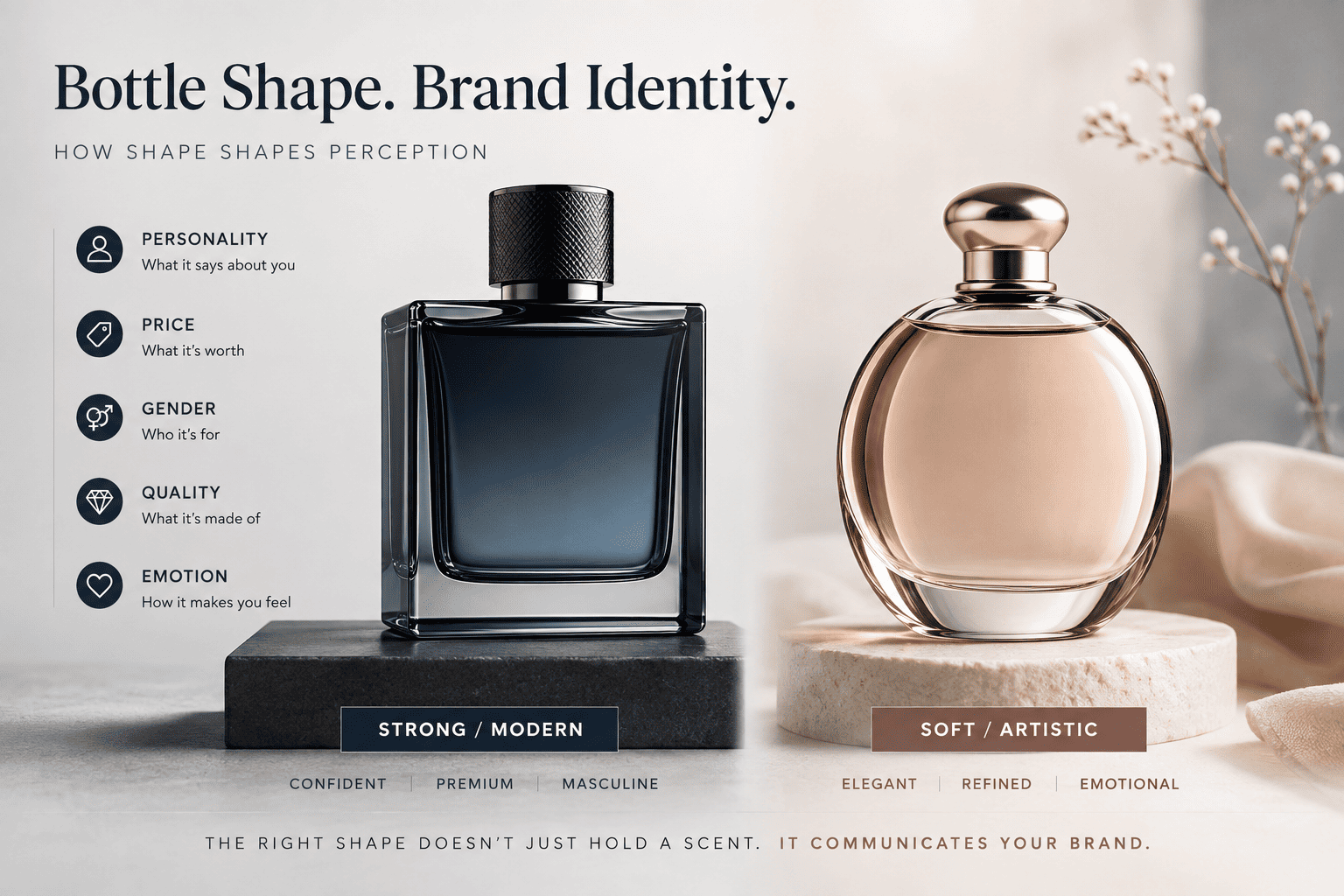
When I help fragrance brands choose glass bottles, I often notice that founders first focus on the perfume formula, logo, and box. The bottle shape sometimes comes later. I think this order can create problems. The bottle is one of the first things a customer sees and touches. Its shape can support the whole brand story, or it can work against it.
Why does cologne bottle shape matter for brand identity?
A customer often forms an opinion before opening the bottle. Shape gives immediate signals about the brand's style, target customer, and price position.
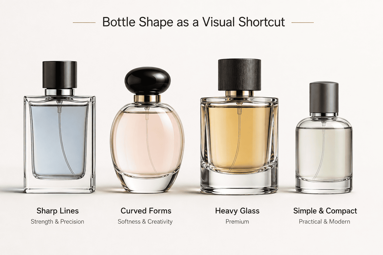
I see bottle shape as a visual shortcut. Sharp lines can suggest strength and precision. Curved forms can suggest softness and creativity. Heavy glass can feel premium, while a simple compact bottle can feel practical and modern. The right shape helps customers understand the brand faster.
Shape communicates before the fragrance does
When I look at a new cologne project, I usually ask the customer what feeling the brand wants to create.
Do they want the fragrance to feel masculine and strong?
Do they want it to feel clean and minimal?
Do they want something luxurious?
Do they want a young and playful image?
These questions matter because the glass bottle already communicates before anyone sprays the perfume.
| Bottle shape | Common visual feeling | Brand direction |
|---|---|---|
| Square | Stable, strong, clean | Modern or masculine |
| Rectangular | Professional, structured | Premium or classic |
| Round | Soft, friendly, elegant | Lifestyle or artistic |
| Oval | Refined, smooth | Feminine or unisex |
| Tall and slim | Light, fashion-focused | Modern or youthful |
| Short and wide | Heavy, powerful | Luxury or masculine |
| Irregular custom shape | Distinctive, expressive | Niche or statement brand |
I do not think these rules are absolute.
A square bottle can still be used for a soft floral fragrance. A round bottle can still work for a men's cologne.
But the brand needs to understand the message created by the shape.
For example, if a brand story is about architecture, discipline, and clean lines, I may recommend a square or rectangular bottle. The shape supports the story naturally.
If the brand talks about nature, movement, or softness, I may look at curved glass.
I see this as visual consistency.
The bottle, label, cap, color, and fragrance story should all move in the same direction.
When they do, the brand feels more complete.
When they do not, customers may not know exactly why something feels wrong, but they can still feel the mismatch.
Do square and rectangular cologne bottles look more masculine?
Square and rectangular bottles are often used for men's cologne because they can create a sense of strength, order, and stability.
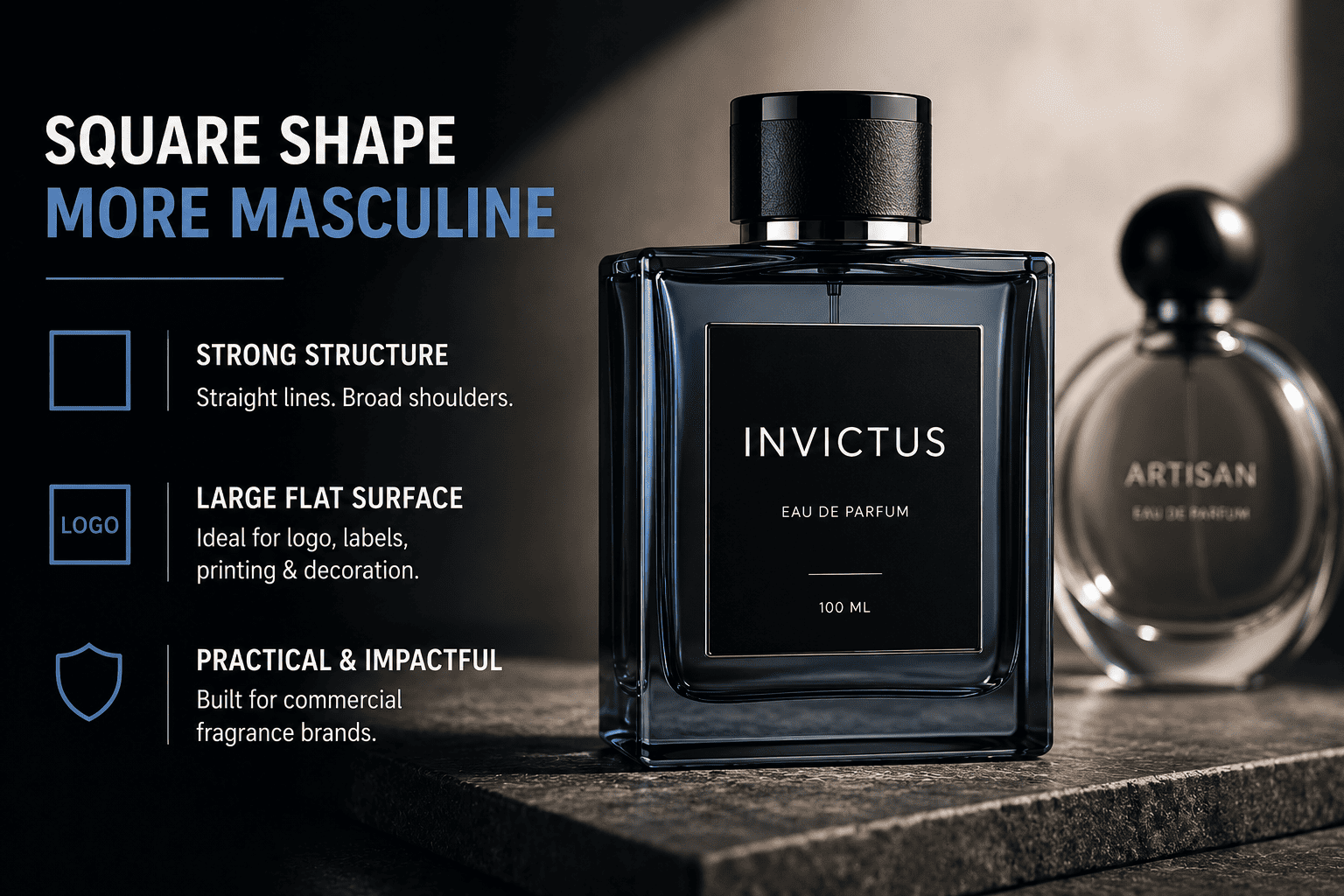
In my experience, square and rectangular cologne bottles often feel more masculine because straight lines and broad shoulders create a strong visual structure. They also provide large flat surfaces for logos, labels, printing, and decoration, which makes them practical for many commercial fragrance brands.
Why straight lines are so common in men's fragrance packaging
I see square and rectangular bottles very often in men's fragrance projects.
There is a practical reason and a branding reason.
From a branding point of view, straight lines look controlled.
The bottle can feel solid and serious.
A thicker base can make it feel even heavier and more premium.
From a production point of view, flat surfaces are also useful.
They give us more room for decoration.
| Design feature | Effect on brand image | Practical benefit |
|---|---|---|
| Flat front | Clean and professional | Easy logo printing |
| Wide shoulders | Strong appearance | Good visual balance |
| Thick base | Premium feeling | Adds perceived weight |
| Sharp corners | Modern and precise | Strong shelf presence |
| Compact width | Masculine and solid | Easy to hold |
When a customer wants a strong men's fragrance image, I often start by showing this type of bottle.
But I also pay attention to proportion.
A square bottle can look expensive or cheap depending on its details.
If the walls look too thin and the base is very light, it may not create the premium feeling the customer expects.
If the bottom is too thick, the bottle can become heavy and increase shipping costs.
The cap also changes the final impression.
A square bottle with a plastic cap can feel very different from the same bottle with a weighted metal-look cap.
This is why I do not evaluate the glass shape alone.
I look at the complete package.
For smaller fragrance brands, I often recommend using an existing square or rectangular stock bottle and then creating differentiation through coating, frosting, screen printing, hot stamping, decals, or a custom cap.
This usually gives a better balance between brand identity and cost.
How do round and curved perfume bottles change customer perception?
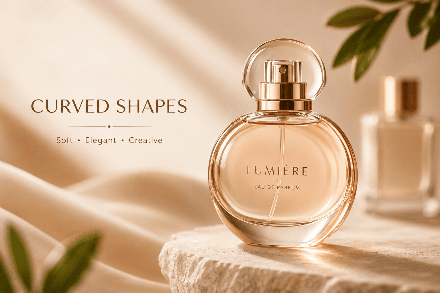
Curved bottles usually feel softer and more fluid. They can make a fragrance brand look more emotional, artistic, relaxed, or approachable.
I use round or curved bottle shapes when a brand wants to express softness, movement, elegance, or creativity. Curves can reduce the visual sense of stiffness and make the bottle feel more organic. They also work well for unisex, lifestyle, boutique, and artistic fragrance concepts.
Curves can make a brand feel more emotional
Straight lines often feel controlled.
Curves feel more natural.
This difference is small, but it changes how people react to a bottle.
I have seen customers choose a rounded bottle because they want their fragrance to feel more personal and less corporate.
This can work well for niche fragrance brands.
| Curved design | Possible impression |
|---|---|
| Perfect round | Friendly and simple |
| Soft oval | Elegant and refined |
| Rounded shoulders | Smooth and premium |
| Curved side profile | Artistic and modern |
| Asymmetrical curve | Niche and expressive |
I also think curved bottles can create stronger tactile value.
Customers do not only look at perfume packaging.
They hold it.
A bottle that fits naturally in the hand can create a better user experience.
This matters more than many founders expect.
At the same time, curves can create production challenges.
A very round surface may be more difficult for a large flat label.
Screen printing can also need more control depending on the curvature.
If the design needs a large logo or detailed text, I check whether the decoration area is practical before confirming the bottle.
This is one reason I like to discuss branding and production together.
A bottle can look excellent in a rendering and still create problems when we need to print on it.
I prefer to solve this before mass production.
Does a tall or short cologne bottle change the brand image?
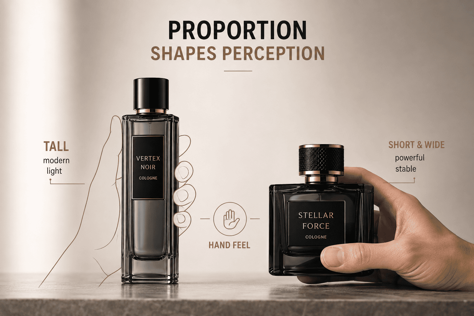
Bottle proportion can change the personality of a fragrance. Tall bottles usually feel slimmer and more elegant, while short wide bottles often feel heavier and stronger.
A tall cologne bottle can make a brand feel modern, light, and fashion-focused. A short wide bottle can feel more powerful, stable, and premium. I choose the proportion based on the brand story, target customer, shelf display, shipping needs, and the way the customer will hold the bottle.
Proportion changes the whole visual character
Two bottles can hold the same 100 ml volume and still look completely different.
One can be tall and narrow.
The other can be short and wide.
The capacity is the same, but the brand message changes.
| Bottle proportion | Common feeling | Possible use |
|---|---|---|
| Tall and slim | Elegant, modern | Fashion fragrance |
| Very tall | Dramatic, distinctive | Niche brand |
| Short and wide | Strong, solid | Men's cologne |
| Compact square | Practical, premium | E-commerce brand |
| Wide shoulders | Bold, masculine | Statement fragrance |
I always look at proportion from both a branding and commercial angle.
A very tall bottle may look beautiful, but it can create a taller gift box.
That increases packaging volume.
It can also increase shipping cost.
For e-commerce brands, this becomes important.
A short bottle may fit better inside a compact shipping box.
It can also feel more stable during transportation.
This is why I do not think bottle design should only follow aesthetics.
The founder may love a very tall bottle, but the business also needs to pay for the box, foam insert, carton, shipping, and storage.
For small and growing brands, these costs matter.
I usually try to find a bottle that gives the right visual effect without creating unnecessary packaging cost.
Can bottle weight make a cologne brand feel more luxurious?
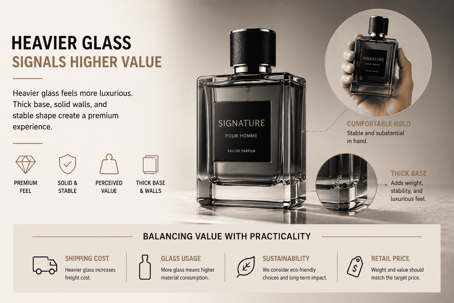
Yes. Weight strongly affects how customers judge perfume packaging. A heavier bottle often creates a stronger premium impression.
I find that customers often connect heavier glass with higher value. A thick base, solid walls, and stable shape can make a cologne bottle feel more luxurious. But I also balance weight with shipping cost, glass usage, sustainability goals, and the brand's actual retail price.
Heavy glass can help, but more weight is not always better
When customers ask me how to make a bottle feel more premium, one common answer is a thicker glass base.
It works because weight changes the physical experience.
When a customer lifts the bottle, a heavier package often feels more valuable.
But I do not think heavier always means better.
| Glass choice | Benefit | Trade-off |
|---|---|---|
| Thick base | Premium feeling | More weight |
| Heavy walls | Strong hand feel | Higher material cost |
| Compact heavy shape | Luxury impression | Higher shipping cost |
| Lightweight glass | Lower logistics cost | Less premium feel |
| Balanced medium weight | Good commercial balance | Less dramatic |
I usually consider the target retail price.
If the fragrance sells at a high price, the packaging needs to support that position.
A very light bottle may create a mismatch.
But if the brand is selling affordable perfume online, using extremely heavy glass may not make commercial sense.
The customer pays for shipping.
The brand pays for cartons.
The warehouse handles more weight.
The business has to look at the complete cost.
I often tell customers that premium design is not only about adding more material.
Good proportion, clean decoration, cap quality, and surface finishing can also create value.
A well-designed standard bottle with frosting and a high-quality cap can sometimes look more premium than a heavy custom bottle with poor decoration.
How can bottle shape help a cologne stand out on the shelf?
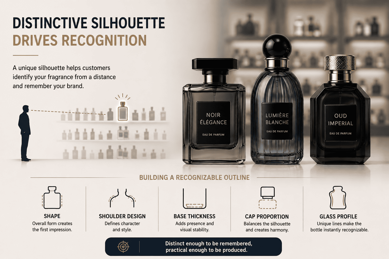
[A unique silhouette][2] can help customers recognize a fragrance even before they read the label. Shape becomes a visual signature.
A distinctive bottle silhouette helps brand recognition because customers can identify the product from a distance. I use shape, shoulder design, base thickness, cap proportion, and glass profile together to create a recognizable outline. The goal is to be different enough to be remembered without making production unnecessarily difficult.
Recognition can come from silhouette, not only logos
Many brands focus heavily on logo design.
I think silhouette can be even more powerful.
If I cover the logo and the customer can still recognize the bottle, the shape is doing real branding work.
This is especially important in a crowded fragrance market.
| Design element | How it helps recognition |
|---|---|
| Unique shoulder | Creates a distinct profile |
| Unusual base | Makes bottle memorable |
| Custom side curve | Adds identity |
| Special cap ratio | Changes silhouette |
| Strong color coating | Improves visual recall |
I do not think every brand needs a completely [custom glass mold][3].
For many small and medium fragrance brands, this can be expensive.
A custom bottle may require higher minimum quantities, mold cost, longer development time, and more testing.
Instead, I often start with a stock bottle that has a strong shape.
Then I change the surface.
We can spray a custom color.
We can frost the glass.
We can add gold or silver decoration.
We can use decals.
We can change the cap.
We can also change the collar.
These steps can make one standard bottle look very different.
At Hongyan Glass Bottle, we keep more than 500 perfume glass bottle styles in stock. This gives smaller brands more options without forcing them into a large custom glass order from the beginning.
For many new perfume brands, I think this is a practical way to build visual identity while controlling cost.
Should a small perfume brand use a stock bottle or create a custom shape?
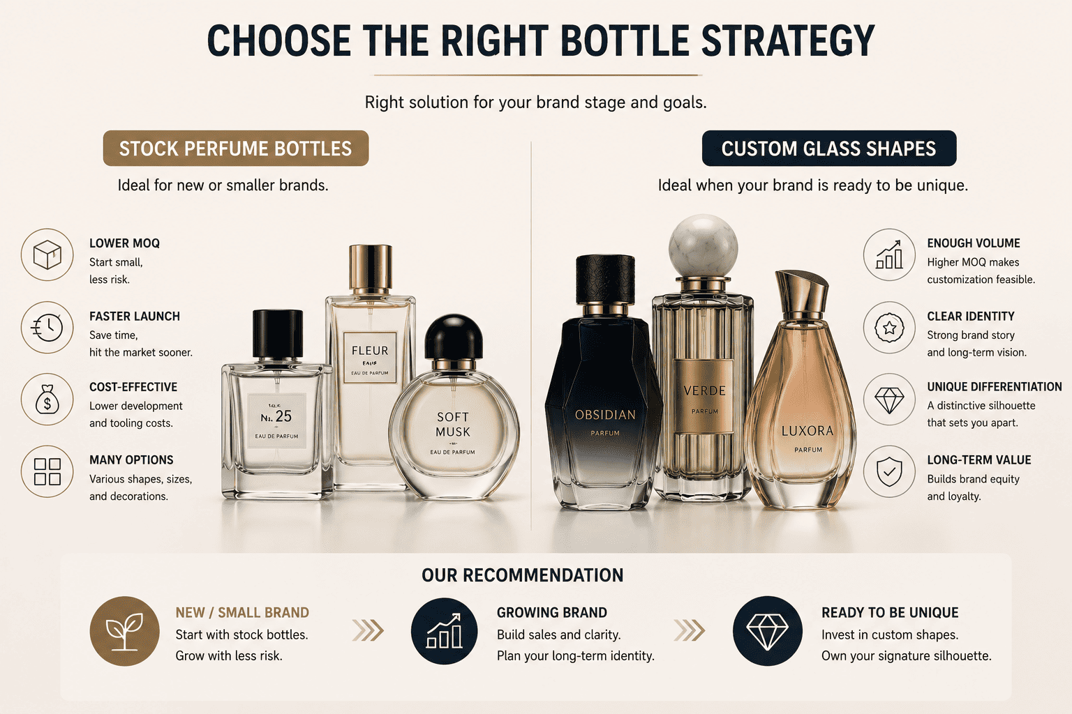
A custom glass bottle can create stronger exclusivity, but it also requires more budget, development time, and order volume. Stock bottles are often more practical for growing brands.
I usually recommend stock perfume bottles for new or smaller brands that want lower minimum order quantities and faster launches. I recommend custom glass shapes when the brand has enough volume, a clear long-term identity, and a strong reason to own a unique silhouette.
I do not think custom glass is always the first step
Many founders come to me and say they want a completely unique bottle.
I understand this.
A unique bottle feels like a strong branding asset.
But I normally ask about the order quantity, launch plan, sales channel, and budget first.
| Option | Main advantage | Main limitation |
|---|---|---|
| Stock bottle | Lower MOQ | Other brands may use same shape |
| Decorated stock bottle | Good balance | Shape is not exclusive |
| Custom cap + stock bottle | Strong differentiation | Added tooling cost |
| Full custom glass bottle | Unique identity | Higher MOQ and development cost |
| 3D sample development | Tests idea early | Still requires final tooling |
For a new e-commerce fragrance brand, cash flow matters.
I often think it is better to spend money on the perfume formula, brand content, advertising, and distribution instead of putting too much money into a glass mold too early.
A stock bottle can still look very different after decoration.
For example, the same clear bottle can look minimal with transparent glass, premium with black frosting, artistic with a gradient spray color, or luxurious with gold decoration.
This is why I see decoration as part of bottle design.
Later, when the brand has stable sales, a custom bottle can make more sense.
If a customer wants to develop a new shape, we can also support 3D sampling before moving into full glass production.
I like this process because it lets the customer see the scale, proportion, and hand feel before committing to the final mold.
How should the bottle shape match the cap, sprayer, and decoration?
A good perfume bottle shape does not work alone. The cap, atomizer, collar, decoration, and label need to support the same visual direction.
I treat the cologne bottle as one complete packaging system. The glass shape creates the base identity, while the cap, pump, collar, color, logo, and decoration strengthen it. When these parts have the same visual language, the finished fragrance feels more professional and more valuable.
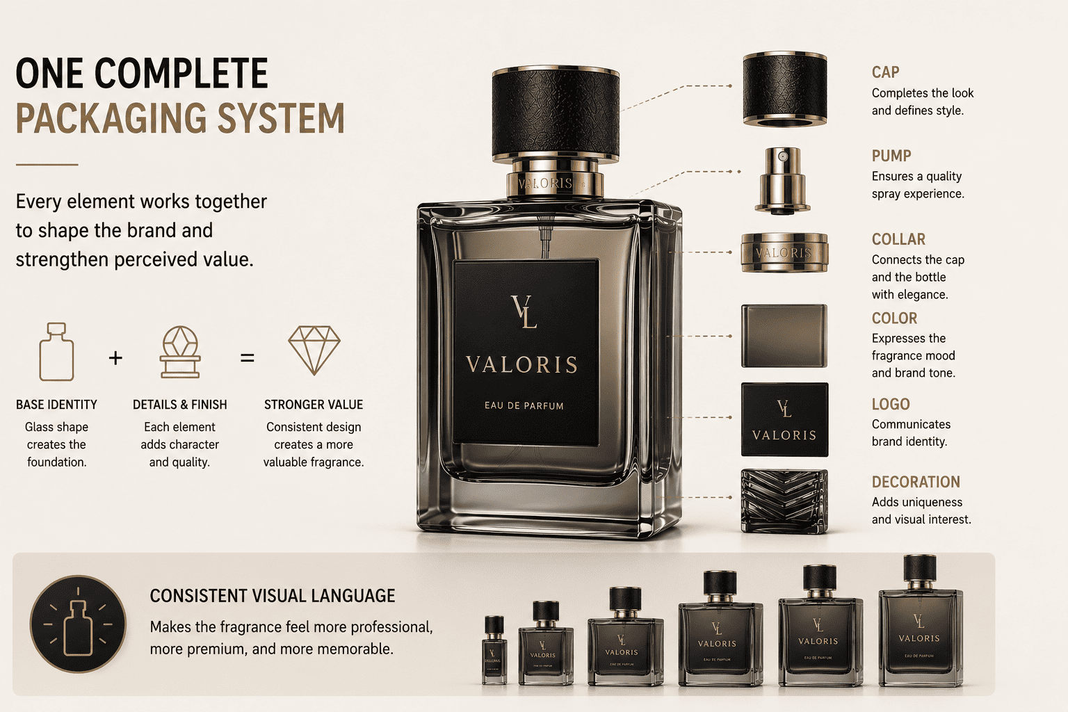
I always evaluate the complete package
I have seen attractive glass bottles become much weaker after the wrong cap is added.
The opposite also happens.
A simple stock bottle can suddenly look premium when the right cap and decoration are used.
| Component | What it changes |
|---|---|
| Glass bottle | Main silhouette |
| Cap | Top proportion and style |
| Atomizer | Functional quality |
| Collar | Transition between bottle and cap |
| Spray coating | Main color identity |
| Frosting | Texture and softness |
| Gold decoration | Luxury feeling |
| Decal or printing | Logo and storytelling |
For a strong masculine bottle, I may use a wider cap with a solid visual weight.
For a minimal fragrance, I may choose a clean cylindrical cap and simple printing.
For a premium concept, I may combine heavy glass with frosting and metal-look decoration.
I also check physical compatibility.
The cap needs enough internal clearance so it does not press the actuator.
The pump needs to match the glass neck.
The decoration should not interfere with assembly areas.
These details may sound technical, but they affect the brand experience.
A beautiful bottle that leaks or cannot spray is not good packaging.
For me, design and function are always connected.
Conclusion
Cologne bottle shape affects how customers see the brand before smelling the fragrance. I choose shape, weight, proportion, decoration, and components together to create a clear and practical brand identity.