Many new perfume founders spend too much on packaging because they trust drawings, photos, and supplier words too early. I want to help you avoid that.
I customize my perfume bottle by starting with brand position, budget, scent direction, and real-use testing first. Then I match the bottle, pump, cap, and decoration into one system that actually works.
When I help a beginner brand develop packaging, I do not start with surface decoration alone. I start with what the bottle needs to express and how it needs to perform. It must fit the brand story. It must fit the scent mood. It must fit the budget. It must also work safely in real use, not only in product photos.
What should I decide before I design my perfume bottle?
Many beginners want a unique bottle first. I understand that feeling. But a unique bottle without a clear plan often becomes an expensive mistake.
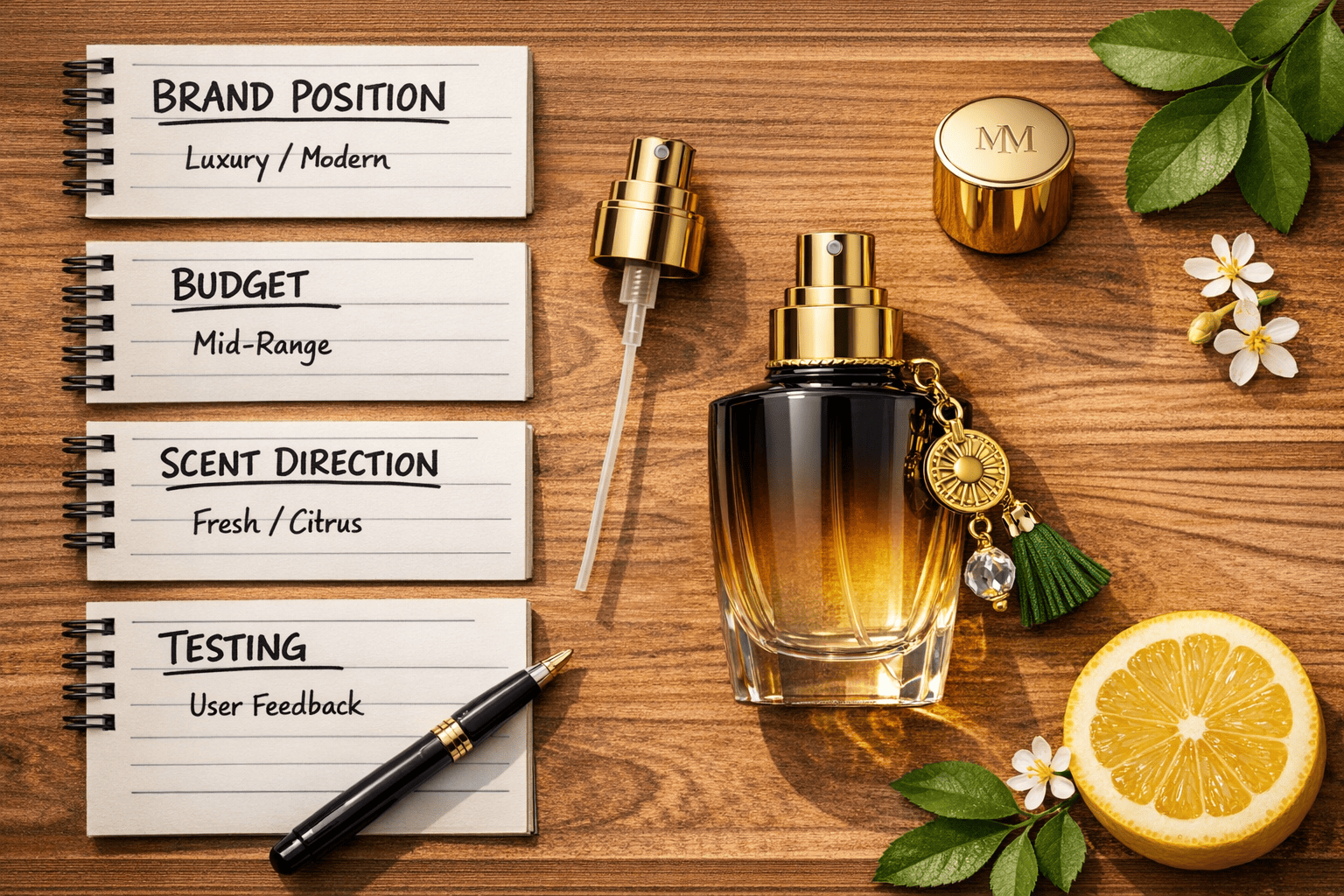
Before I design any bottle, I decide who I want to sell to, what price I want to reach, what scent mood I want to express, and how I will sell it. These choices shape every packaging decision.
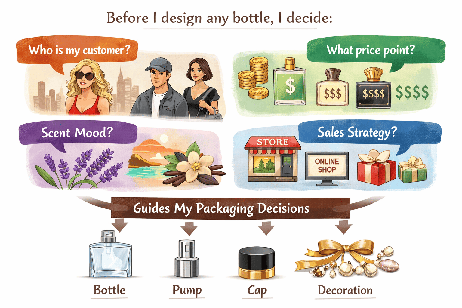
I start with customer, price, and usage scene
When I build a packaging plan, I first ask who will buy this perfume. I do not ask this only for branding. I ask it because packaging must match the customer’s expectation. A daily online perfume needs a different bottle from a niche gift perfume. A low-risk launch needs a different package from an established brand extension. If I ignore this step, I may choose packaging that looks beautiful but does not fit the business.
I also decide my retail price early. This matters more than many beginners think. If my perfume will sell at an entry price, I should not build the whole package around heavy custom molds, metal caps, and too many complex finishes. The cost structure becomes unhealthy very fast. I have seen young brands try to look ultra luxury before their sales are stable. Many of them lose margin before they gain loyalty.
I also think about usage scenes very early. Will my customers keep the bottle on a dressing table? Will they carry it in a handbag? Will they buy it as a gift? These questions affect the size, weight, closure type, and decoration choice. A bottle is not just a visual object. It is a product people touch, carry, and live with.
I lock the practical basics before visual details
I always confirm the bottle size, neck finish, spray type, cap type, and outer box direction before I go deeper into color or decoration. This helps me reduce confusion later. It also makes supplier communication much easier. I do not want to discuss hot stamping or frosting while I am still unsure whether I need a 30ml travel item or a 100ml signature product.
Here is the planning frame I like to use first:
| Item | What I decide first | Why it matters |
|---|---|---|
| Target customer | Daily user, gift buyer, niche lover | It shapes the bottle image |
| Retail price | Entry, mid-range, premium | It controls packaging cost |
| Bottle size | 30ml, 50ml, 100ml | It changes filling and shipping |
| Sales channel | Online, retail, custom service | It affects durability needs |
| MOQ plan | What I can really sell | It reduces stock pressure |
| Scent mood | Fruity, woody, floral, clean | It guides color and material |
| Brand story | What feeling I want to show | It keeps the whole package coherent |
I make the story and mood clear in simple words
I try to describe the brand story in plain words. I do not only say “elegant” or “premium.” Those words are too wide. I say things like “clean fruity freshness for young office women,” “warm woody calm for a niche men’s line,” or “soft floral romance for gift buyers.” Once the story becomes specific, the bottle choices become easier too. I can decide whether I need clear glass or deep glass, a thick base or a lighter body, bright gold or matte black.
In my own work, I have noticed that clear direction saves more money than endless creativity. A beginner does not need to solve everything with one perfect bottle. A beginner needs a bottle system that can launch, sell, and reorder with less risk.
How can I design the bottle around the scent profile?
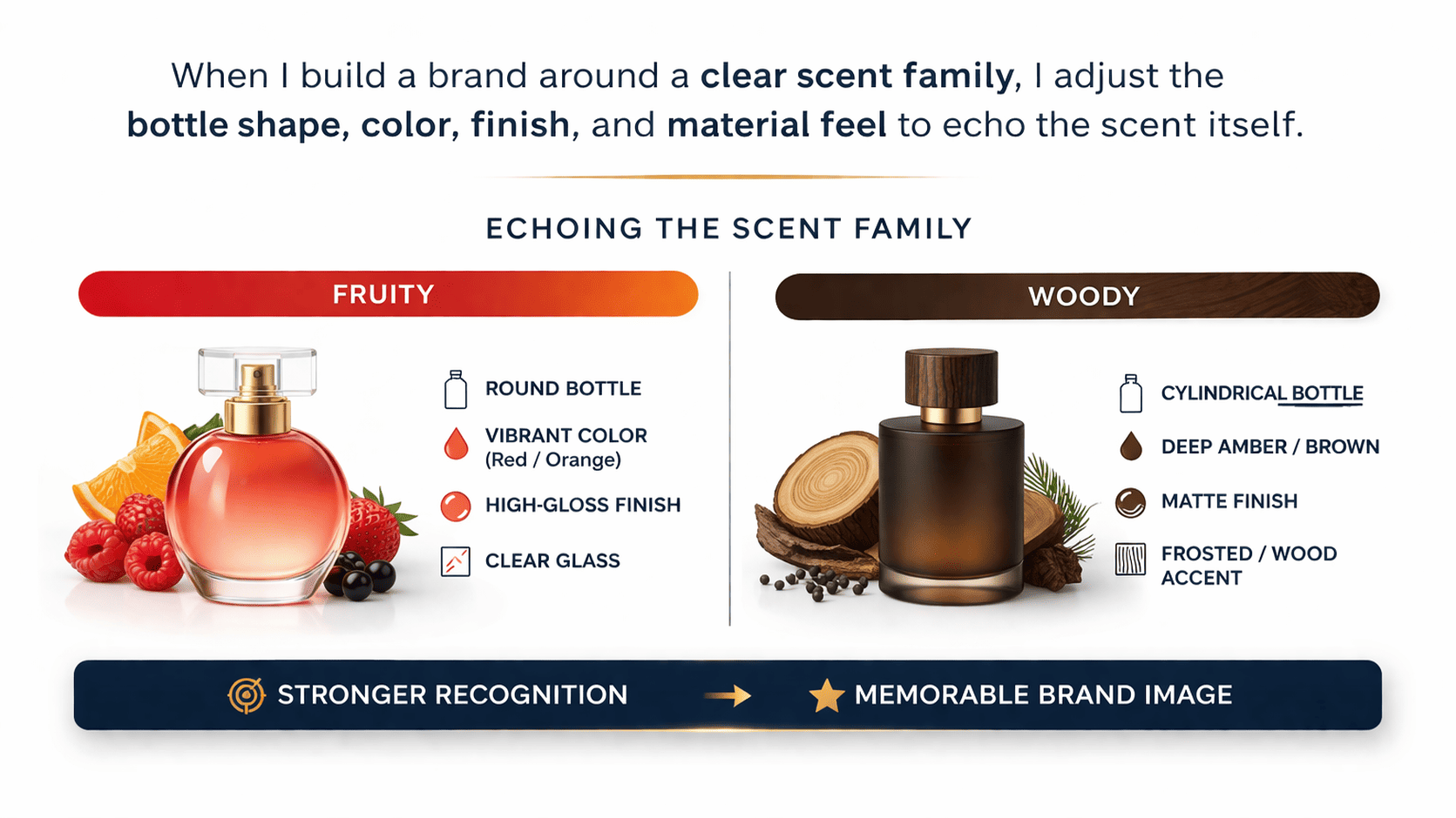
For brands that focus on clear scent identities, packaging should not sit apart from the fragrance. I think the bottle should help explain the scent before the customer even sprays it.
When I build a brand around a clear scent family like fruity or woody, I adjust the bottle shape, color, finish, and material feel to echo the scent itself. This creates stronger recognition and a more memorable brand image.
I let the packaging speak the scent mood
This is one of the most useful personal insights I can share. If I am creating a brand with a strong fruity direction, woody direction, or another clear olfactory style, I do not treat packaging as a separate visual exercise. I treat it as part of the fragrance language. The bottle should support the scent mood. The color should support the scent mood. The material feel should support the scent mood. When all these parts move in the same direction, the brand becomes easier to recognize.
For example, if my fragrance is fruity, I usually think about freshness, brightness, movement, and transparency. I may use clearer glass, lighter colors, softer gradients, or more lively details. The bottle can feel cleaner and more open. The overall look should suggest energy and easy pleasure.
If my fragrance is woody, I go in a very different direction. I think about calm, restraint, texture, and depth. I may prefer simpler shapes, deeper tones, thicker visual weight, matte surfaces, or details that feel more grounded. The bottle does not need to shout. It needs to feel stable and confident.
I match visual signals to the scent family
When I align packaging with scent, I am not trying to make the bottle too literal. I am not saying every fruity perfume must be pink or every woody perfume must be brown. That would be too shallow. What I want is emotional consistency. The customer should feel the atmosphere of the fragrance through the packaging before they even test it.
This is how I often think about it:
| Scent family | Visual direction I prefer | Feeling I want to create |
|---|---|---|
| Fruity | Bright, clear, fresh, lively | Youthful and easy to remember |
| Woody | Simple, calm, weighty, textured | Mature and grounded |
| Floral | Soft, elegant, refined, fluid | Romantic and graceful |
| Clean musk | Minimal, airy, light, neat | Pure and modern |
| Oriental / warm | Deep, rich, layered, glossy or metallic | Sensual and strong |
I use packaging to create memory before the first spray
I think this matters a lot for young brands. Many small perfume brands compete in crowded digital markets. In that situation, the customer may see the bottle before they smell the fragrance. So the packaging becomes the first emotional contact point. If the visual atmosphere already hints at the scent world, the customer forms a stronger early impression.
For a fruity line, I may choose a more transparent bottle, cleaner label space, and brighter accent tones. For a woody line, I may use heavier visual proportion, darker caps, or a more restrained outer carton. When packaging and scent echo each other, I do not need to explain the brand so much with words. The product starts speaking by itself.
This approach also strengthens the brand tone over time. When customers look at the bottle, they already begin to imagine the smell. That visual memory makes the perfume more memorable. For me, this is not decoration for decoration’s sake. This is a practical branding strategy.
How do I avoid bottle, pump, and cap mismatch?
This is one of the most painful problems in glass packaging. Many parts look the same on paper, but they do not work together in real assembly.
I avoid mismatch by testing the real bottle, pump, and cap together before bulk production. The same diameter number or similar appearance does not mean the parts are truly compatible.
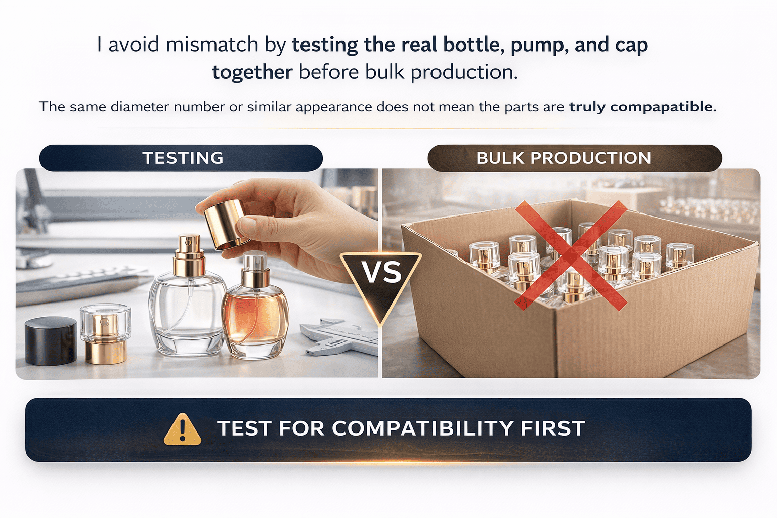
I never trust size labels alone
In real projects, I often see clients assume that parts can be mixed because the specification looks close enough. This is very risky. I once worked with a client who bought caps from one supplier and pumps from another supplier. Both were marked as 15mm. The photos looked almost the same too. But after assembly, the caps were very loose. When the client lifted the bottle, the cap came off right away. The whole batch could not be used. In the end, all those caps became waste.
This case taught a very direct lesson. The same neck size number does not mean direct interchangeability. Small details can change everything. Thread depth can be different. The inner wall shape can be different. The snap position can be different. Even tiny structure changes can affect tightness and user feel.
This is why I always tell clients that “looks similar” is not a technical standard. A photo cannot prove compatibility. A size label cannot prove compatibility either. Only real matching can do that.
I have also seen failure even from one supplier
Some beginners think the risk disappears when they buy the full set from one supplier. I wish that were always true, but it is not. I also had one client who bought the glass bottle, cap, and pump as a full set from the same supplier in one order. On paper, this should have been safe. But during use, the inner insert inside the cap kept getting stuck. End users could not pull it out smoothly. The experience was bad, and the problem happened often.
The core issue was simple. The project did not go through enough fitting tests before production. Small tolerance differences built up across the bottle, pump, and cap. That small accumulation later became a real assembly failure.
This case reminded me that a complete set order is not the same as a tested set order. Even when one supplier provides everything, I still need to verify real assembly, not just trust the purchase list.
I always test fit, pull, press, and seal in real samples
Because of these cases, my rule is very strict. No matter whether the parts come from one supplier or several suppliers, and no matter how similar they look, I always ask for real physical matching tests first. I test tightness. I test how smooth the cap goes on and off. I test how the pump feels. I test whether the cap stays secure in transport. I test whether the package leaks after movement.
This is the matching checklist I use:
| Check point | What I test | What may go wrong |
|---|---|---|
| Neck and pump fit | Assembly accuracy | Pump sits badly or leaks |
| Cap tightness | Pull-off force | Cap too loose or too tight |
| Inner insert movement | Repeated open and close | Insert gets stuck |
| Seal condition | Rest and shake test | Liquid leakage |
| Visual alignment | Straightness and finish | Poor shelf look |
I always tell clients the same thing. Appearance is only the first step. Real use is the real standard. If I skip this test stage, I am not saving time. I am only moving the risk to bulk production, where the cost becomes much higher.
How can I customize a perfume bottle with a small budget and low MOQ?
Many new founders want a custom bottle, but they also need low risk and low MOQ. I think that is normal. I build many beginner projects in this way.
I customize with a small budget by using stock bottles, simple but focused decoration, and the right cap and pump combination. I do not push a full custom mold too early.
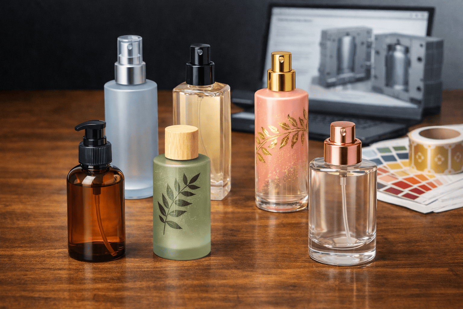
I treat stock bottles as a smart starting point
I do not think stock bottles are a weak choice. I think they are often the best beginner choice. A stock bottle helps me save mold cost, speed up launch, and reduce MOQ pressure. Then I can still create brand identity through spray color, frosting, silk screen printing, hot stamping, decals, labels, or cap color changes.
For many small brands, success does not come from inventing a bottle shape nobody has seen before. Success comes from making the total package feel clear, usable, and branded. A simple bottle can still look premium if the finish, cap, and outer box work well together.
For example, I may use one bottle shape for several scents, then create distinction through color language and small material changes. This works very well for beginner brands with limited cash flow. I can keep the structure efficient and let the visual system carry the brand mood.
I put the money where the customer feels it most
When the budget is limited, I do not try to customize every part. I choose one or two points that the customer will notice first. Sometimes that is the glass finish. Sometimes that is the cap texture. Sometimes that is the printed box. This way, I control cost but still create a strong first impression.
Here is how I usually think about cost priority:
| Part | Low-risk choice | Why I like it |
|---|---|---|
| Bottle shape | Existing stock model | No mold cost |
| Decoration | One strong finish only | Better cost control |
| Branding | Silk screen or label | Clear identity at lower cost |
| Cap | Standard cap with custom color | Good visual change |
| Box | Printed outer carton | Strong story support |
| Sample stage | Small trial run | Less bulk risk |
The key is focus. I do not need ten details fighting for attention. I need two or three strong details that fit the scent and the brand story.
I build in stages, not all at once
I think this is very important for beginners. The first version does not need to carry every dream. I do not need custom glass, custom cap, custom insert, and custom box in one step. If I force everything into version one, MOQ grows, lead time grows, and the launch becomes heavy.
I prefer a staged plan. First, I launch with a strong stock-based package. Next, I collect market feedback and sales data. After that, I upgrade the package only where the market proves it is worth the cost. This path is more stable. It also gives me more room to adjust brand direction.
I often remind young founders that customers buy the whole experience. They buy scent, story, presentation, and usability together. That means I do not need to solve every brand problem with glass shape alone. I only need a package that fits the market and supports repeat sales.
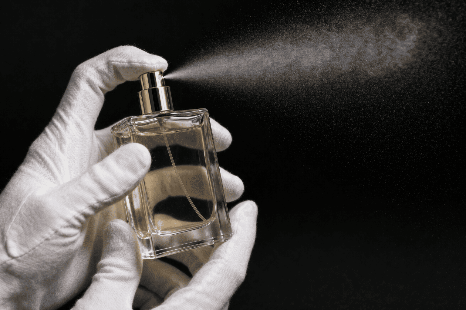
How do I test for leakage and real use before mass production?
A perfume bottle may look perfect in the sample room and still fail in actual use. This is why I care so much about real-life testing.
I test leakage and usability by checking fit, sealing, movement, heat exposure, and daily carrying conditions. For hot markets, I pay special attention to crimp bottles and transport stress.
I think about how customers really carry perfume
Perfume contains a high percentage of alcohol. It is volatile by nature. This matters even more in Southeast Asia and other tropical markets, where many customers carry perfume in their bags every day. In that situation, the bottle is not only standing on a shelf. It is exposed to heat, shaking, pressure, and repeated movement. Under constant high temperature and bag compression, leakage problems can become much more frequent.
Because of that, I never judge a bottle only by how it looks on a desk. I ask how it will behave after transport, after daily carrying, and after repeated handling. I think this practical view protects both the brand and the final user experience.
I usually prefer crimp bottles for stronger sealing
From my packaging experience, crimp bottles usually perform better than screw bottles in overall sealing. For markets with heat, movement, and daily carrying, this is often a safer direction. A good crimp structure can reduce leakage risk and give more stable performance in rougher use conditions.
But I also remind clients of one important point. Even a good crimp bottle should not stay in a very hot place for a long time. Extreme heat can still create leakage risk. So I always tell clients to guide their customers as well. Try not to leave perfume under direct sun, inside a very hot car, or in a closed overheated space. Good packaging helps a lot, but correct storage still matters.
I treat testing as a business protection step
Before bulk production, I want to see more than one nice sample. I want to know how the package behaves after real handling. I check sealing performance. I check spray function. I check cap security. I check whether the bottle still feels stable after movement and repeated use. I also review how the units are packed for transport, because scratches and pressure damage can start there too.
This is the test routine I like to follow:
| Test | What I check | Why it matters |
|---|---|---|
| Fit test | Bottle, pump, cap compatibility | Prevents assembly failure |
| Leak test | Seal after standing and shaking | Reduces claims and waste |
| Pull test | Cap holding force | Prevents accidental opening |
| Heat condition check | Short-term warm environment response | Finds risk early |
| Carry simulation | Bag movement and pressure | Reflects real user habits |
For me, this is not extra work. This is part of responsible product development. A beginner brand cannot afford preventable packaging loss. So I would rather spend more care in the sample stage than pay for a painful lesson after mass production.
Conclusion
I start with clear planning, let packaging echo the scent, test every part in real samples, and scale only after it works in real life.