
Choosing a perfume bottle is easy. Choosing its finish is harder. A wrong process can increase costs and make a good bottle look much cheaper than expected.
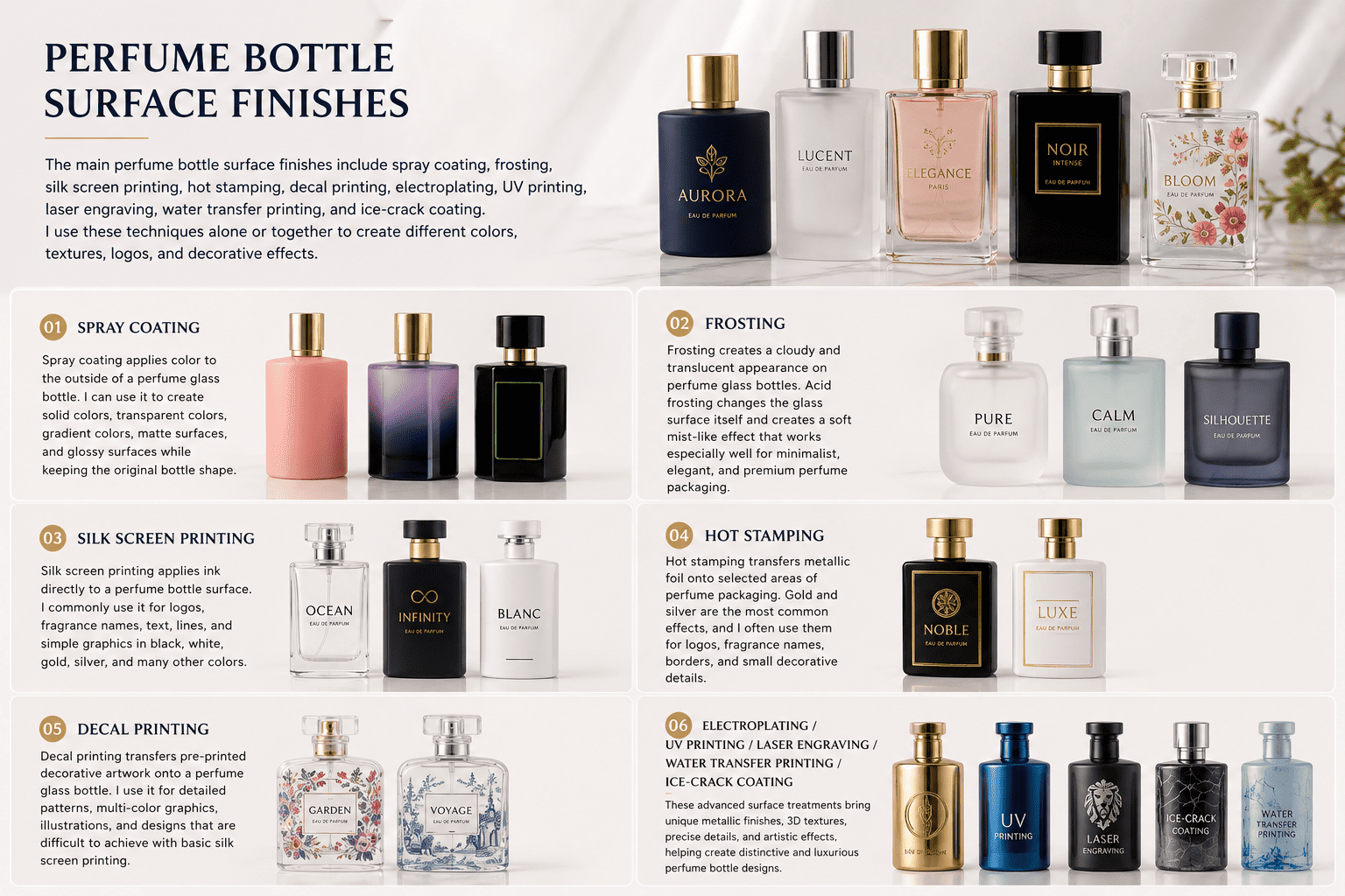
The main perfume bottle surface finishes include spray coating, frosting, silk screen printing, hot stamping, decal printing, electroplating, UV printing, laser engraving, water transfer printing, and ice-crack coating. I use these techniques alone or together to create different colors, textures, logos, and decorative effects.
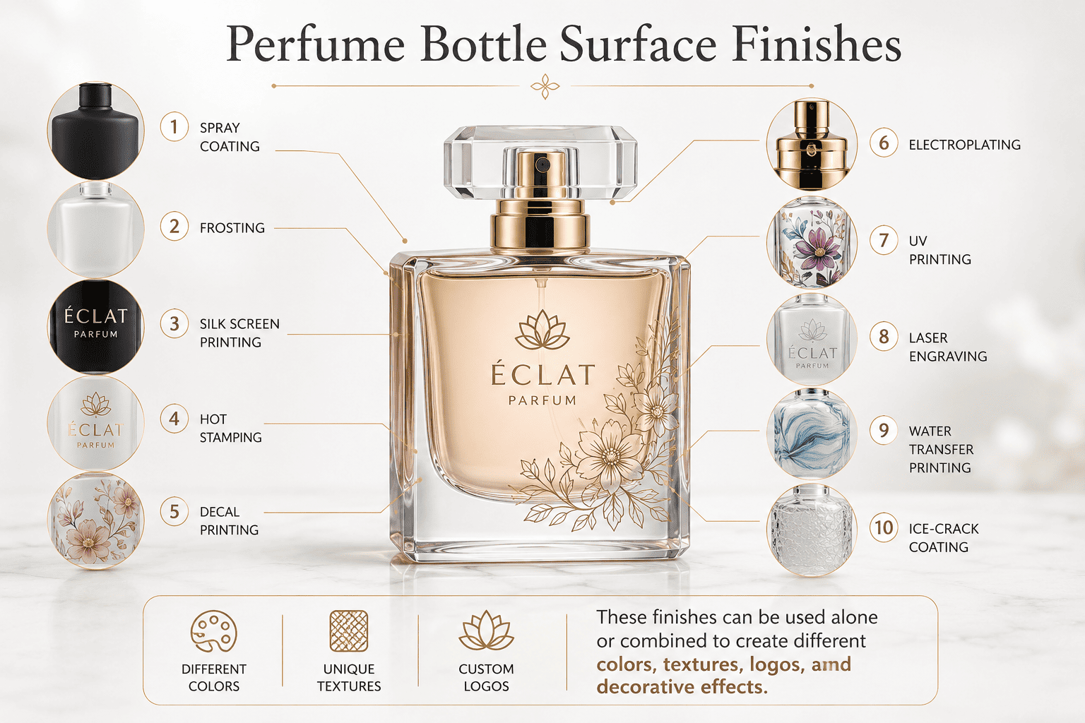
When I talk with perfume brand owners, I find that surface finishing is one of the packaging areas they understand the least.
Most brand owners already know what bottle shape they like. They know their brand color. They know whether they want the perfume to feel luxurious, young, natural, feminine, masculine, or niche.
The difficult part comes later.
They see terms such as spraying, frosting, electroplating, silk screen printing, hot stamping, and UV printing, but they may not know what these processes actually do to a glass bottle.
They also may not know that the final appearance of one perfume bottle often comes from two or three different processes instead of one.
I think perfume brand owners do not need to become glass-processing engineers. But I think they should understand the basic logic behind these finishes.
This knowledge helps a brand communicate with suppliers. It helps the brand evaluate samples. It also helps the brand understand why two bottles that look similar in a rendering may have very different production costs and quality risks.
In this guide, I will explain ten common perfume bottle decoration techniques and share some of the production details that I pay attention to when I develop packaging with my clients.
What Is Spray Coating for Perfume Bottles?
A stock bottle may have the right shape but the wrong color. Developing another mold is often unnecessary when I can change its appearance through spraying.
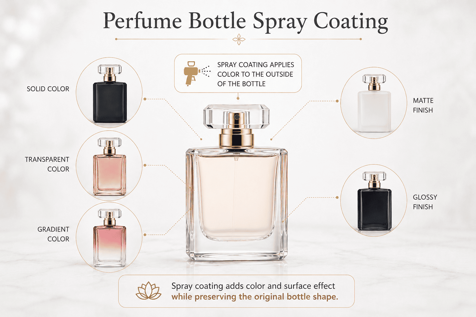
Spray coating applies color to the outside of a perfume glass bottle. I can use it to create solid colors, transparent colors, gradient colors, matte surfaces, and glossy surfaces while keeping the original bottle shape.
What Effects Can I Create with Spray Coating?
Spray coating is one of the surface treatments I use most often for perfume bottles.
I like this process because it gives a brand a lot of visual freedom without requiring a new glass mold.
For example, I can take one clear stock perfume bottle and create several products from it. I can spray one bottle black for an intense fragrance. I can spray another bottle transparent pink for a floral perfume. I can create a blue-to-clear gradient for a fresh fragrance.
The bottle shape stays the same, but the customer sees three different products.
I normally divide spray colors into several main groups.
A solid color gives stronger coverage. The original clear glass becomes much less visible.
A transparent color keeps the see-through character of the glass. I often use this effect when the brand wants color but still wants customers to see the perfume liquid.
A gradient color changes gradually across the bottle. The transition can go from dark to light, from color to clear, or from one color into another color.
I can also control whether the surface looks glossy or matte.
| Spray Finish | Appearance | Good Choice For | What I Check |
|---|---|---|---|
| Solid color | Strong and uniform | Bold perfume brands | Color consistency |
| Transparent color | Colored but see-through | Fresh and elegant fragrances | Glass and liquid color |
| Gradient color | Smooth color transition | Modern and premium brands | Gradient consistency |
| Matte coating | Soft and low-gloss | Minimalist brands | Surface resistance |
| Glossy coating | Bright and smooth | Commercial fragrance lines | Scratches and fingerprints |
Why Does Glass Cleaning Matter Before Spray Coating?
This is one production detail that I think perfume brands should understand.
Spraying does not hide every problem on the original glass bottle.
Sometimes it makes those problems easier to see.
Before spraying, I need the bottle surface to be clean. Small dust particles, oil marks, fingerprints, or other contamination can affect the final appearance.
For example, a very small particle may be difficult to notice on a clear bottle.
If that particle stays on the surface during spraying, the paint covers the particle.
After the coating dries, I can see a small bump or an uneven point under the color.
The finished bottle may then look slightly dirty even though the color itself is correct.
This is why I do not judge spray-coating quality only by the color.
I also check the original glass, surface cleaning, coating consistency, curing, and final inspection.
For a perfume brand, this is important because customers usually look at fragrance bottles from a very short distance.
A small defect that seems unimportant during production can become obvious when the customer holds the bottle under strong light.
I therefore recommend making physical samples before mass production.
I also recommend checking samples under normal room light and strong light instead of checking only photographs.
What Is Frosting for Perfume Bottles?
Clear glass can sometimes look too bright or ordinary. I use frosting when a perfume brand needs a softer and more understated glass appearance.
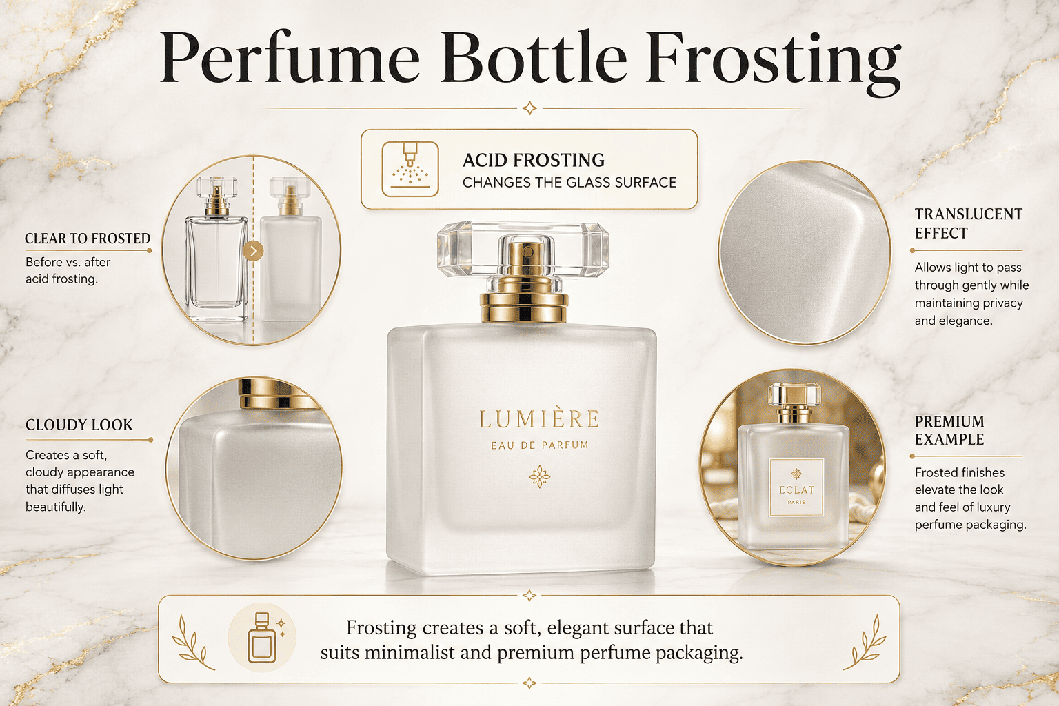
Frosting creates a cloudy and translucent appearance on perfume glass bottles. Acid frosting changes the glass surface itself and creates a soft mist-like effect that works especially well for minimalist, elegant, and premium perfume packaging.
How Does Frosting Change a Perfume Bottle?
I usually describe frosted glass as clear glass covered by a permanent soft mist.
The bottle can still transmit light, but the surface no longer looks completely transparent.
This change can make a simple bottle look much more refined.
[Acid frosting][[1]] is different from simply applying a matte paint to the outside of the bottle.
The acid works with the glass surface and creates the hazy appearance.
For this reason, I usually see acid frosting as a treatment of the glass itself rather than only a colored layer sitting on top of it.
I can use frosting on the full bottle or only on selected areas.
Full frosting creates one consistent matte appearance.
Partial frosting creates contrast between clear and frosted glass.
That contrast can become part of the design.
| Frosting Option | Appearance | Good Choice For |
|---|---|---|
| Full frosting | Soft and uniform | Minimal perfume brands |
| Partial frosting | Clear and matte contrast | Design-focused packaging |
| Light frosting | More transparent | Fresh fragrance concepts |
| Strong frosting | More opaque | Premium and niche perfumes |
What Should a Perfume Brand Consider Before Choosing Frosting?
I first look at the perfume concept.
Frosting works very well for brands that want a calm and premium appearance.
It also works well with simple logos.
For example, I can combine a frosted bottle with black silk screen printing. The result is clean and modern.
I can also combine frosting with gold or silver decoration. The contrast between a soft matte glass surface and a reflective metallic logo often makes the bottle look more expensive.
I also pay attention to the perfume liquid.
If the liquid has an attractive color and the brand wants customers to see it, heavy frosting may not be the best choice.
I may use a lighter frosting or keep part of the bottle clear.
I also consider consistency.
A brand normally wants all bottles in one production batch to have a similar level of frosting.
If the frosting effect varies too much, bottles can look different when placed next to each other on a retail shelf.
For me, frosting is not simply a way to make glass matte.
It is a design tool that controls how much light, transparency, and visual softness the customer sees.
What Is Silk Screen Printing for Perfume Bottles?
A beautiful bottle can still look generic without a clear logo. I use [silk screen printing][[2]] when brands need simple and reliable decoration directly on the glass.
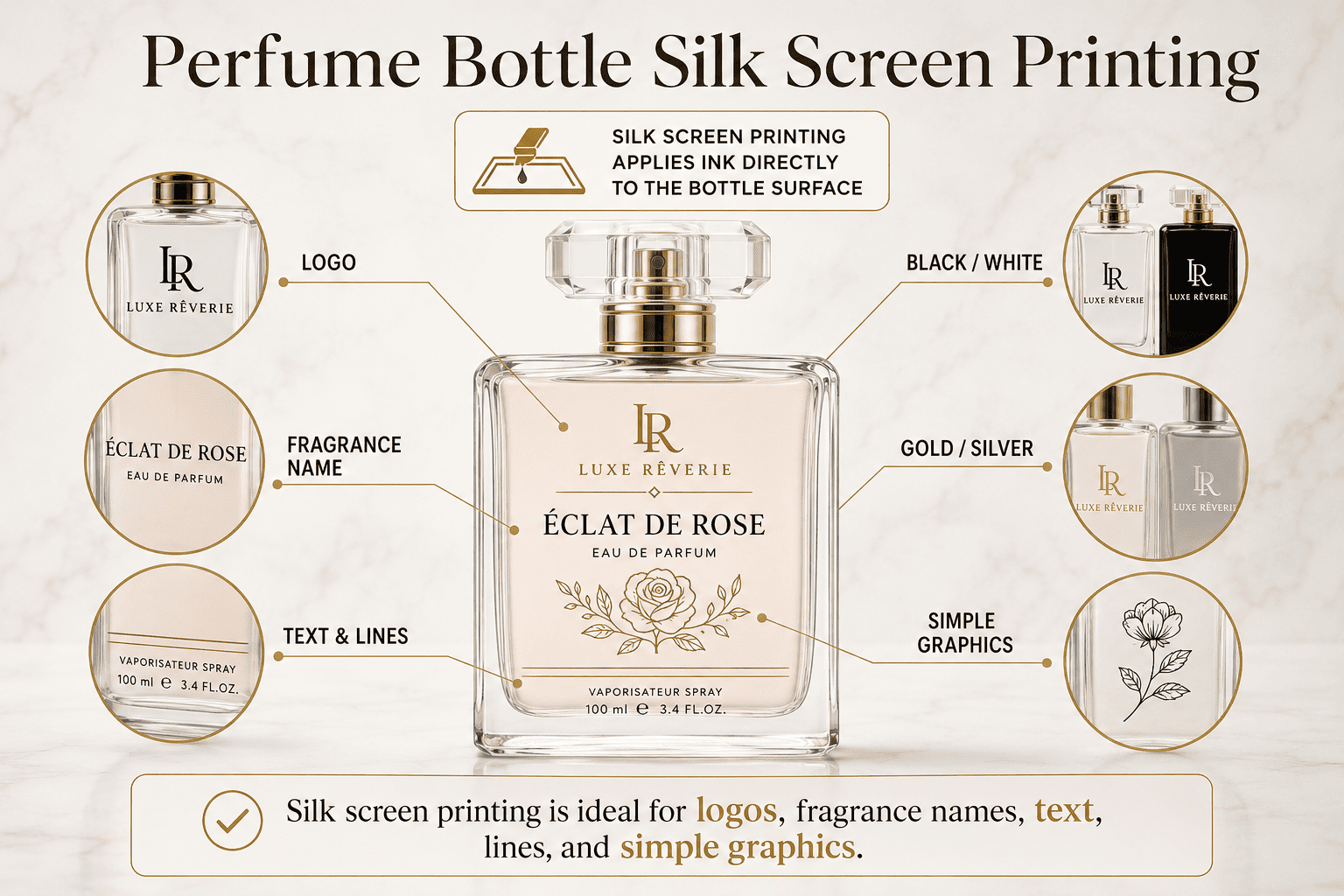
Silk screen printing applies ink directly to a perfume bottle surface. I commonly use it for logos, fragrance names, text, lines, and simple graphics in black, white, gold, silver, and many other colors.
What Can I Print with Silk Screen Printing?
Silk screen printing is one of the most common decoration processes I use in perfume packaging.
The process works especially well for clear logos, text, simple lines, and blocks of color.
For many new perfume brands, a one-color screen-printed logo is enough to turn a stock glass bottle into branded packaging.
I can print a black logo on clear glass.
I can print white text on a dark sprayed bottle.
I can also use other colors when the artwork needs them.
The design can use more than one color, but every added color creates more production work.
This is important for brand owners to understand.
A logo that looks simple on a computer may require several printing steps when every part uses a different color.
| Printing Design | Result | Suitable For |
|---|---|---|
| One-color logo | Clean and simple | Startup perfume brands |
| Two-color artwork | More brand identity | Growing fragrance lines |
| White printing | Strong contrast | Dark sprayed bottles |
| Black printing | Minimal appearance | Clear or frosted bottles |
| Colored printing | More personality | Lifestyle perfume brands |
What Artwork Works Best for Silk Screen Printing?
I always check the artwork before I recommend this process.
Silk screen printing works best when the design has clear lines and solid areas.
It is not my first choice for photographic images or very complex gradients.
Very small text can also cause problems.
A logo may look sharp when it is 20 centimeters wide on a computer screen, but the same logo may become only 20 millimeters wide on a perfume bottle.
At that size, thin lines can disappear or become difficult to reproduce consistently.
Bottle shape also matters.
A simple flat or cylindrical printing area is easier to control than a complicated curved surface.
I also think about the process that comes before printing.
If I print on a sprayed bottle, I need the coating to be stable and suitable for the printing step.
If I print on frosted glass, I need to consider how the ink looks against the matte surface.
This is another reason why I prefer to think about the whole decoration sequence rather than selecting each process separately.
For many small perfume brands, silk screen printing gives a very good balance between cost, visual quality, and brand recognition.
What Is Gold or Silver Hot Stamping on Perfume Bottles?
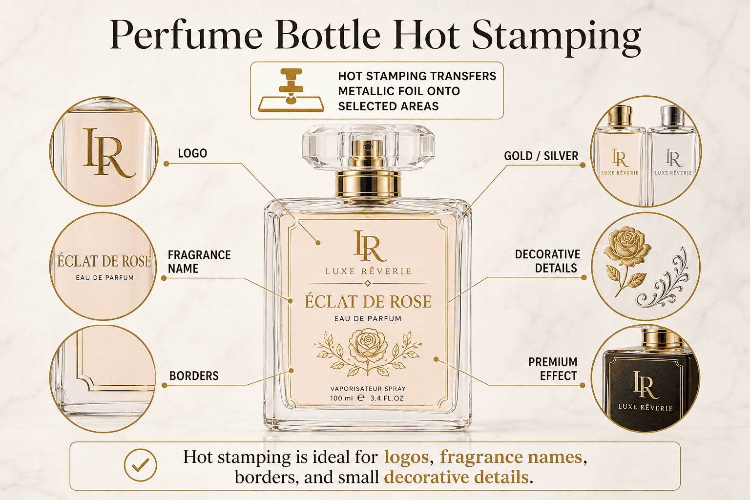
A normal printed logo may look clean but still lack visual contrast. I use hot stamping when a perfume brand wants a brighter metallic detail.
Hot stamping transfers metallic foil onto selected areas of perfume packaging. Gold and silver are the most common effects, and I often use them for logos, fragrance names, borders, and small decorative details.
Why Do Perfume Brands Use Hot Stamping?
[Hot stamping ][[3]]creates a reflective metallic effect that normal ink usually cannot reproduce in the same way.
A small amount of foil can change the feeling of the whole bottle.
I often use gold hot stamping on black, white, dark green, red, or frosted packaging.
Gold creates a warm and classic luxury feeling.
Silver works well for blue, grey, black, white, and many modern perfume designs.
Silver usually feels cooler and cleaner.
Rose gold can work well for softer concepts.
Other foil colors may also be possible depending on the design and production setup.
| Foil Effect | Brand Feeling | Common Combination |
|---|---|---|
| Gold | Classic and luxurious | Black, white, green |
| Silver | Modern and clean | Blue, grey, black |
| Rose gold | Soft and premium | Pink, white, clear |
| Colored foil | Creative | Fashion-led packaging |
What Should I Check Before Using Hot Stamping?
I always check the logo structure.
Very thin lines and very small details can be difficult to transfer cleanly.
The decoration area also matters.
Hot stamping needs good contact between the working surface and the foil-transfer system.
If the bottle shape changes sharply in the stamping area, production becomes more difficult.
I also pay attention to the base surface.
A brand may want to spray a bottle first and then add metallic decoration.
That means the first process needs to be stable enough for the next process.
This is a good example of why one finished perfume bottle may need several connected production steps.
I do not recommend adding metallic details everywhere just because they look luxurious.
I normally prefer to use them as an accent.
A small gold logo on a clean bottle often looks more premium than a bottle that uses gold on every component.
I think good perfume packaging needs balance.
The bottle, cap, collar, pump, logo, and box should work together instead of competing for attention.
What Is Decal Printing for Perfume Bottles?
Some perfume brands want detailed illustrations and many colors. I use decal printing when simple direct printing cannot reproduce enough detail.
Decal printing transfers pre-printed decorative artwork onto a perfume glass bottle. I use it for detailed patterns, multi-color graphics, illustrations, and designs that are difficult to achieve with basic silk screen printing.
When Do I Recommend Decal Printing?
I recommend decal printing when a perfume bottle needs to carry more visual information.
A brand may want flowers, illustrations, traditional patterns, complex borders, or many colors on the glass.
These elements can become difficult or expensive when I try to reproduce them through several separate screen-printing steps.
Decal printing gives me another option.
The artwork is prepared first and then transferred onto the bottle.
This process can create a more decorative appearance.
I often see it work well for gift collections, niche fragrances, limited editions, and perfumes that use cultural or artistic storytelling.
| Design Requirement | Silk Screen Printing | Decal Printing |
|---|---|---|
| Simple logo | Excellent | Possible |
| One or two colors | Excellent | Good |
| Detailed illustration | Limited | Very good |
| Complex pattern | Limited | Very good |
| Multi-color artwork | More difficult | Better suited |
Why Should Brands Think About the Whole Design?
A detailed bottle is not always a better bottle.
I tell clients to look at the artwork together with the bottle shape, cap, and box.
If the bottle already contains a strong illustration, I may keep other packaging components simple.
This makes the artwork easier to notice.
I also pay attention to the physical sample.
Digital artwork can look very bright because a computer screen produces its own light.
Glass does not behave in the same way.
The original glass color, bottle wall thickness, perfume liquid, and surrounding light can all change how the decoration appears.
This is why I think sampling is especially important for detailed decorative work.
Decal printing can make a stock bottle look very customized without creating a completely new bottle mold.
For growing perfume brands, that can be a practical way to create a stronger brand story while keeping the basic glass development cost under control.
What Is Electroplating for Perfume Bottles?
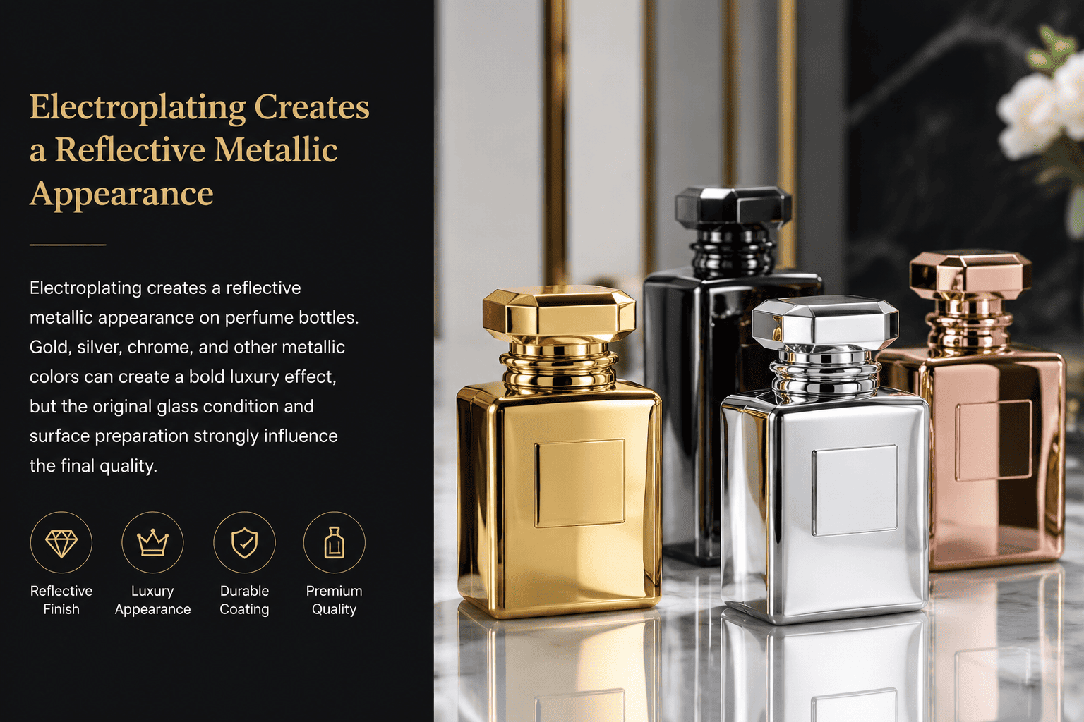
A normal color coating cannot create a true mirror-like metallic appearance. I use electroplating when a perfume bottle needs much stronger reflection and shelf impact.
Electroplating creates a reflective metallic appearance on perfume bottles. Gold, silver, chrome, and other metallic colors can create a bold luxury effect, but the original glass condition and surface preparation strongly influence the final quality.
What Does Electroplating Do to a Perfume Bottle?
[Electroplating][[4]] can completely change the visual character of a clear glass bottle.
After treatment, the bottle can look much closer to polished metal than transparent glass.
I often see this type of appearance used for premium perfume collections, gift packaging, Arabic perfume brands, and other products that want a strong luxury signal.
Gold creates a rich and warm effect.
Silver and chrome create a cooler mirror-like appearance.
Other metallic colors can create more fashion-driven packaging.
| Electroplating Effect | Appearance | Good Choice For |
|---|---|---|
| Gold | Rich and luxurious | Premium fragrances |
| Silver | Bright and modern | Contemporary brands |
| Chrome | Strong mirror effect | Bold packaging |
| Colored metallic | Fashion-focused | Trend-led collections |
Why Do I Check the Clear Bottle Before Electroplating?
This is one of the production details that I think is easy for perfume brands to miss.
The electroplating process does not begin with a perfect metallic bottle.
It begins with the original glass bottle.
For this reason, I first look at the quality of that transparent bottle.
I check whether the glass itself has obvious surface problems.
I also check whether the surface has oil marks, fingerprints, dust, or tiny particles.
The cleaning step matters a lot.
A tiny particle may be difficult to notice on a transparent bottle.
After the bottle receives a reflective metallic surface, that same particle may become much easier to see.
The electroplated surface can highlight small bumps, uneven areas, and other defects.
A brand may look at the finished bottle and think the electroplating process created the defect.
Sometimes the problem actually started with the original bottle or surface preparation.
This is why I pay attention to the condition of the glass before decoration.
Why Is Final Inspection Important for Electroplated Bottles?
Reflective packaging is unforgiving.
Strong reflection makes scratches, particles, color differences, and surface marks easier to notice.
For this reason, final inspection becomes very important.
In some projects, we need workers to check bottles individually.
They look at the surface from different angles and under suitable lighting.
They check for visible particles, marks, uneven finishes, scratches, and other appearance problems.
This inspection requires labor, but perfume packaging is a visual product.
A customer may hold the bottle only 20 or 30 centimeters away from their eyes.
The customer may also photograph the bottle under bright lighting.
Small defects can become very obvious in these situations.
I therefore tell perfume brands to consider both the decoration effect and the quality-control requirements when they choose a highly reflective finish.
What Is UV Printing for Perfume Bottles?
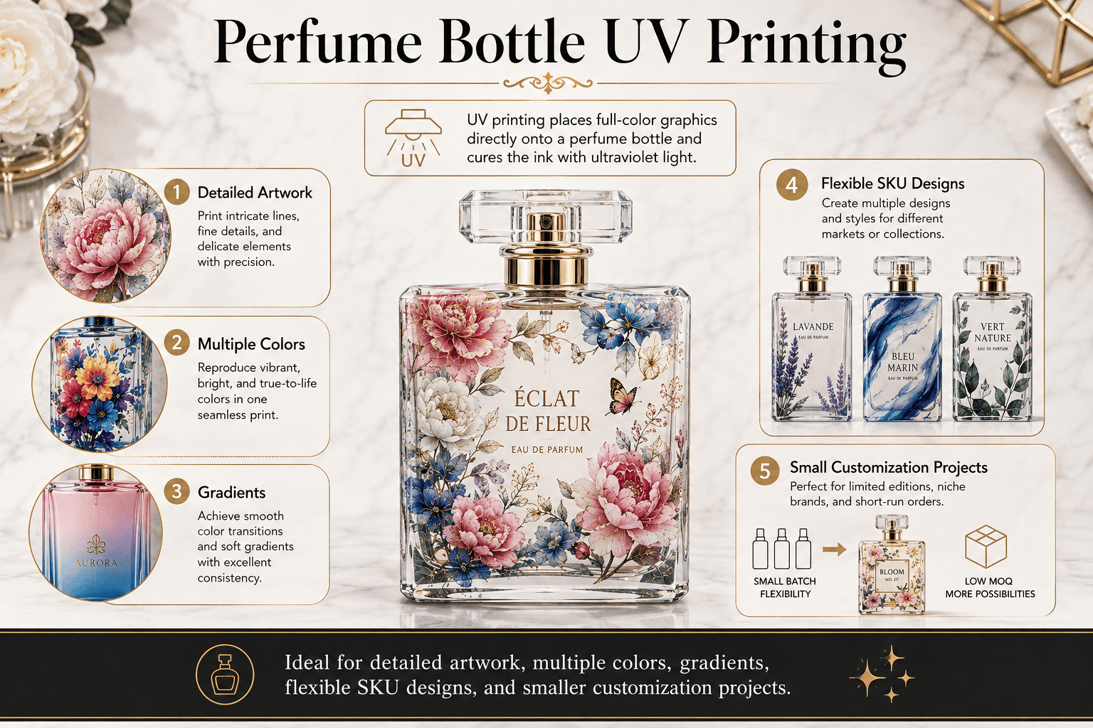
Modern perfume brands often need more colors and smaller graphic details. I use UV printing when traditional printing gives the design too many limits.
UV printing places full-color graphics directly onto a perfume bottle and cures the ink with ultraviolet light. I use it for detailed artwork, multiple colors, gradients, flexible SKU designs, and some smaller customization projects.
Why Is UV Printing Useful for Growing Perfume Brands?
I think UV printing is especially useful when a brand needs flexibility.
A growing perfume company may use the same bottle for several fragrances.
The bottle shape can stay the same while each fragrance uses a different graphic design.
This can help the brand build a consistent product family without making a different glass mold for every SKU.
UV printing also gives designers more freedom with color.
It can handle more detailed graphics than a very simple silk screen design.
It can also work for artwork with more color variation.
| UV Printing Benefit | Why It Matters |
|---|---|
| Full-color graphics | More design freedom |
| Fine details | Suitable for complex artwork |
| Flexible artwork changes | Useful for multiple SKUs |
| Direct printing | No paper label needed |
| Custom design options | Helpful for market testing |
When Should a Brand Choose UV Printing?
I normally consider UV printing when the design is too complex for basic silk screen printing.
A brand may have small illustrations, gradients, several colors, or graphics that change between different fragrances.
UV printing can make these projects easier.
I still look at the bottle surface carefully.
The ink needs to work with the surface underneath it.
A clear bottle, sprayed bottle, and frosted bottle do not always behave in exactly the same way.
I also think about abrasion during transportation and filling.
A beautiful sample is not enough if the decoration cannot survive normal handling.
This is why I like to evaluate actual samples before large production.
I also remind brands that design freedom does not mean they need to use every available color.
A complicated print can quickly make a bottle look busy.
I prefer to start with the brand story and then use UV printing only when the extra detail supports that story.
What Is Laser Engraving for Perfume Bottles?
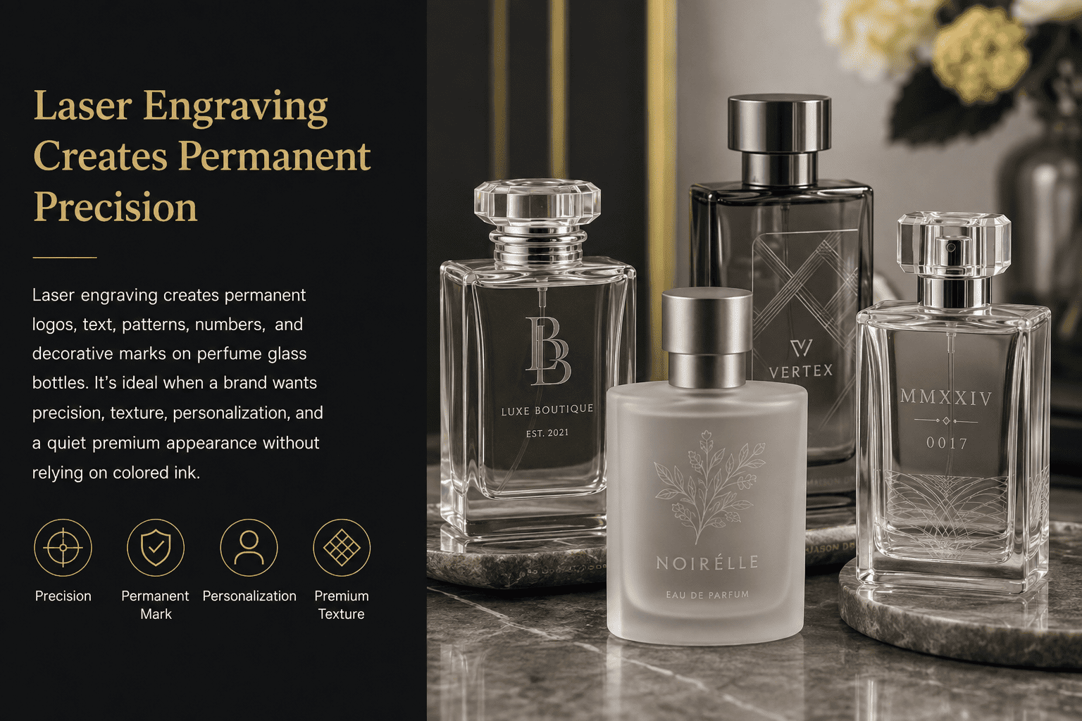
Printed decoration sits on the surface. I use laser engraving when a brand wants a permanent and more subtle mark directly connected to the glass.
Laser engraving creates permanent logos, text, patterns, numbers, and decorative marks on perfume glass bottles. I use it when a brand wants precision, texture, personalization, or a quiet premium appearance without relying on colored ink.
Why Does Laser Engraving Feel Different?
Laser engraving normally looks more subtle than a bright spray color or reflective metallic finish.
I think that subtle appearance is exactly what makes it attractive for certain perfume brands.
The mark feels like part of the bottle instead of something that was simply printed on top.
I can use laser engraving for a logo, signature, pattern, short message, number, or other small detail.
Limited-edition perfumes can also use engraved numbers to create a stronger feeling of exclusivity.
| Engraving Use | Possible Brand Benefit |
|---|---|
| Logo | Permanent brand mark |
| Signature | More personal story |
| Serial number | Limited-edition feeling |
| Pattern | Added surface texture |
| Short text | Subtle information |
When Do I Recommend Laser Engraving?
I recommend laser engraving when the brand wants detail without strong color.
It works well for niche, minimalist, craft-focused, and premium fragrance concepts.
I do not normally recommend it when the whole design depends on bright graphics.
The artwork also needs to suit the process.
A very complicated pattern is not automatically better.
I usually prefer clean lines and intentional placement.
Bottle shape matters too.
I need to consider where the laser can work effectively and how the mark will look on the actual glass surface.
I sometimes combine laser engraving with another finish.
For example, a brand may use a simple sprayed color and then add an engraved detail.
Another project may use frosting with a small engraved mark.
This again shows why perfume bottle decoration should not always be considered as one isolated process.
The best result may come from a carefully controlled combination.
What Is Water Transfer Printing for Perfume Bottles?
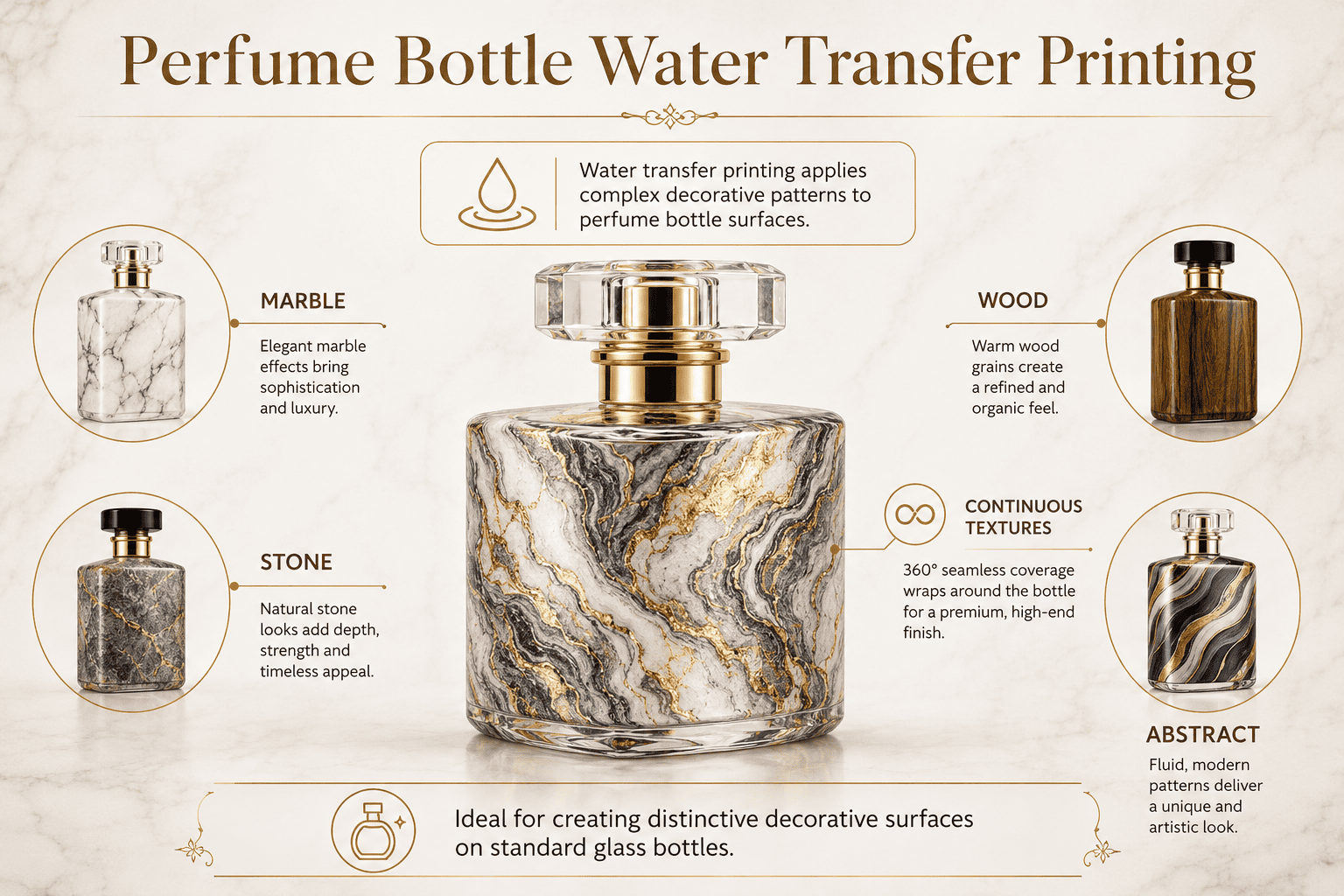
Marble, stone, wood grain, and abstract patterns are difficult to create with basic logo printing. I use water transfer printing when the whole surface needs more visual texture.
Water transfer printing applies complex decorative patterns to perfume bottle surfaces. I can use it to create marble, stone, wood, abstract, and other continuous textures that make a standard glass bottle look more distinctive.
What Effects Can Water Transfer Printing Create?
Water transfer printing gives me another way to decorate a larger area of the bottle.
Marble is a common example.
A normal glass bottle can gain a stone-like appearance without actually using stone.
Wood textures can support warm, natural, or woody fragrance concepts.
Abstract patterns can support artistic and fashion-focused brands.
| Pattern | Possible Brand Position |
|---|---|
| Marble | Premium and elegant |
| Stone | Natural and artistic |
| Wood grain | Warm and organic |
| Abstract pattern | Creative and modern |
| Custom texture | Distinctive brand identity |
What Should Perfume Brands Know About Pattern Consistency?
I tell brands that water transfer printing can behave differently from a simple logo print.
The pattern may not sit in exactly the same position on every bottle.
Small differences can happen.
Some brands like this because each bottle can feel slightly more individual.
Other brands prefer very strict repetition.
Neither choice is wrong, but I want the brand to understand the difference before approving production.
I also think about the rest of the packaging.
If the bottle has a strong marble or abstract pattern, I may recommend a simpler cap and box.
The eye needs somewhere to rest.
I do not want every component to compete for attention.
Water transfer printing can be a useful way for a smaller perfume brand to create a highly distinctive bottle without investing in a very complicated custom glass shape.
But I always ask whether the pattern has a reason to exist.
If it connects with the fragrance story or brand identity, it can be powerful.
If it is only added because it looks different, it may lose its value quickly.
What Is Ice-Crack Coating for Perfume Bottles?
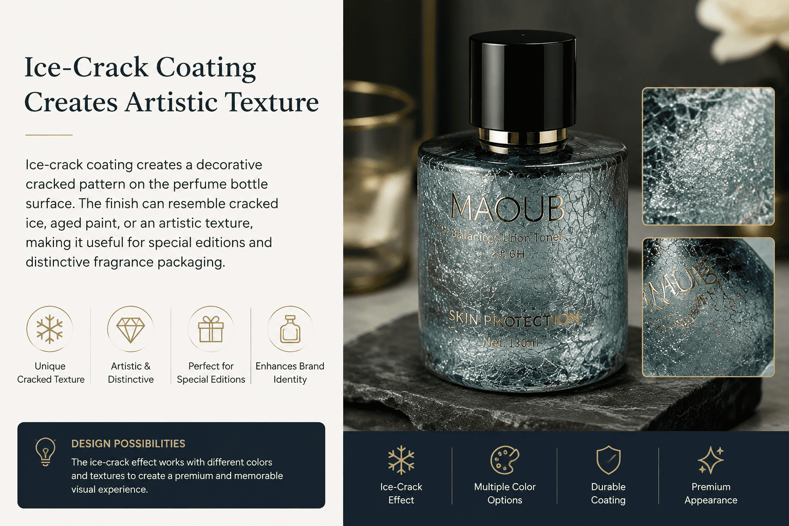
Most perfume bottles have smooth surfaces. I use ice-crack coating when a brand wants texture, visual irregularity, and a more artistic bottle appearance.
Ice-crack coating creates a decorative cracked pattern on the perfume bottle surface. The finish can resemble cracked ice, aged paint, or an artistic texture, making it useful for special editions and distinctive fragrance packaging.
What Kind of Appearance Does Ice-Crack Coating Create?
Ice-crack coating is not as common as ordinary spray coating or silk screen printing.
That can make it interesting for brands that want something less standard.
The crack effect creates texture and visual depth.
A fine crack pattern can feel subtle.
A stronger crack pattern can feel more artistic and dramatic.
The base color also changes the final result.
| Ice-Crack Style | Appearance | Good Choice For |
|---|---|---|
| Fine crack | Subtle texture | Premium collections |
| Strong crack | Bold texture | Statement fragrances |
| Dark base | Dramatic | Luxury concepts |
| Light base | Softer | Artistic fragrance lines |
| Metallic combination | Rich and decorative | Gift collections |
When Should a Perfume Brand Use Ice-Crack Coating?
I use this finish carefully.
I do not think every perfume bottle needs a special effect.
Ice-crack coating works best when the texture connects with the product concept.
For example, a perfume inspired by winter, frozen landscapes, minerals, vintage objects, art, or natural surfaces may have a real reason to use this treatment.
The texture then becomes part of the fragrance story.
If a brand has a very clean and minimal identity, a strong crack pattern may work against that identity.
In that case, I may choose a much more subtle effect or another process.
I also pay attention to consistency.
The visual character of a crack pattern is different from a simple solid color.
Brands should understand how much variation is normal and what appearance standard they expect before mass production.
For me, the main goal is not to add the most unusual process.
The goal is to find a surface finish that makes the finished perfume packaging feel intentional.
Can One Perfume Bottle Use More Than One Surface Finishing Technique?
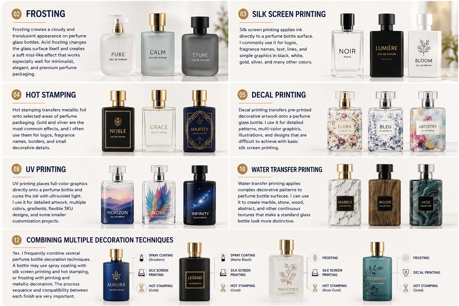
A finished bottle may look like one design, but I often use two or three processes to create that final appearance.
Yes. I frequently combine several perfume bottle decoration techniques. A bottle may use spray coating with silk screen printing and hot stamping, or frosting with printing and metallic decoration. The process sequence and compatibility between each finish are very important.
Why Do I Combine Several Decoration Processes?
This is one point that I especially want perfume brand owners to understand.
The ten techniques in this guide are not ten completely separate choices.
A brand does not always need to select only one.
In real perfume packaging production, I often combine two or three techniques to achieve the final design.
For example, I can start with a clear perfume bottle.
First, I spray the bottle in the brand color.
Then I use silk screen printing to add the perfume name.
After that, I add a small gold detail.
The customer sees one finished bottle.
The factory sees several connected production steps.
Another bottle may start with acid frosting. I may then print the logo on the frosted surface and add another metallic detail.
| Process Combination | Possible Result |
|---|---|
| Spray coating + silk screen printing | Custom color with clear branding |
| Spray coating + metallic decoration | Colored bottle with premium logo |
| Frosting + silk screen printing | Soft glass with clean text |
| Frosting + metallic decoration | Matte bottle with bright details |
| Spray coating + printing + metallic detail | More complete premium appearance |
| Electroplating + printing | Metallic surface with brand information |
Why Does the Process Order Matter?
I cannot simply apply processes in any random order.
One surface treatment becomes the base for the next treatment.
This means the quality of the first step can affect the second and third steps.
The surface also needs to remain suitable for the next process.
This is why I prefer to know the full bottle design before mass production begins.
If a client tells me only that they want a blue bottle, I may suggest one solution.
If I know they also want white printing and a metallic logo, I can think about the whole production sequence from the beginning.
This can reduce unnecessary trial and error.
It can also help control quality and cost.
I always tell brands that more processes do not automatically make the packaging more premium.
Sometimes two well-chosen finishes create a much stronger result than five decorative processes placed together.
I prefer to use each process for a clear reason.
The bottle should still look like one design.
Customers should not feel that the factory simply added every possible decoration.
Why Does Surface Preparation Affect the Final Perfume Bottle Quality?
A beautiful rendering cannot show dust, oil, or tiny particles. In production, these small details can decide whether the finished bottle looks premium or defective.
I treat surface preparation as part of the decoration process. Dust, oil, fingerprints, particles, and defects on the original glass can become more visible after spraying or electroplating, so cleaning and inspection directly affect the final appearance.
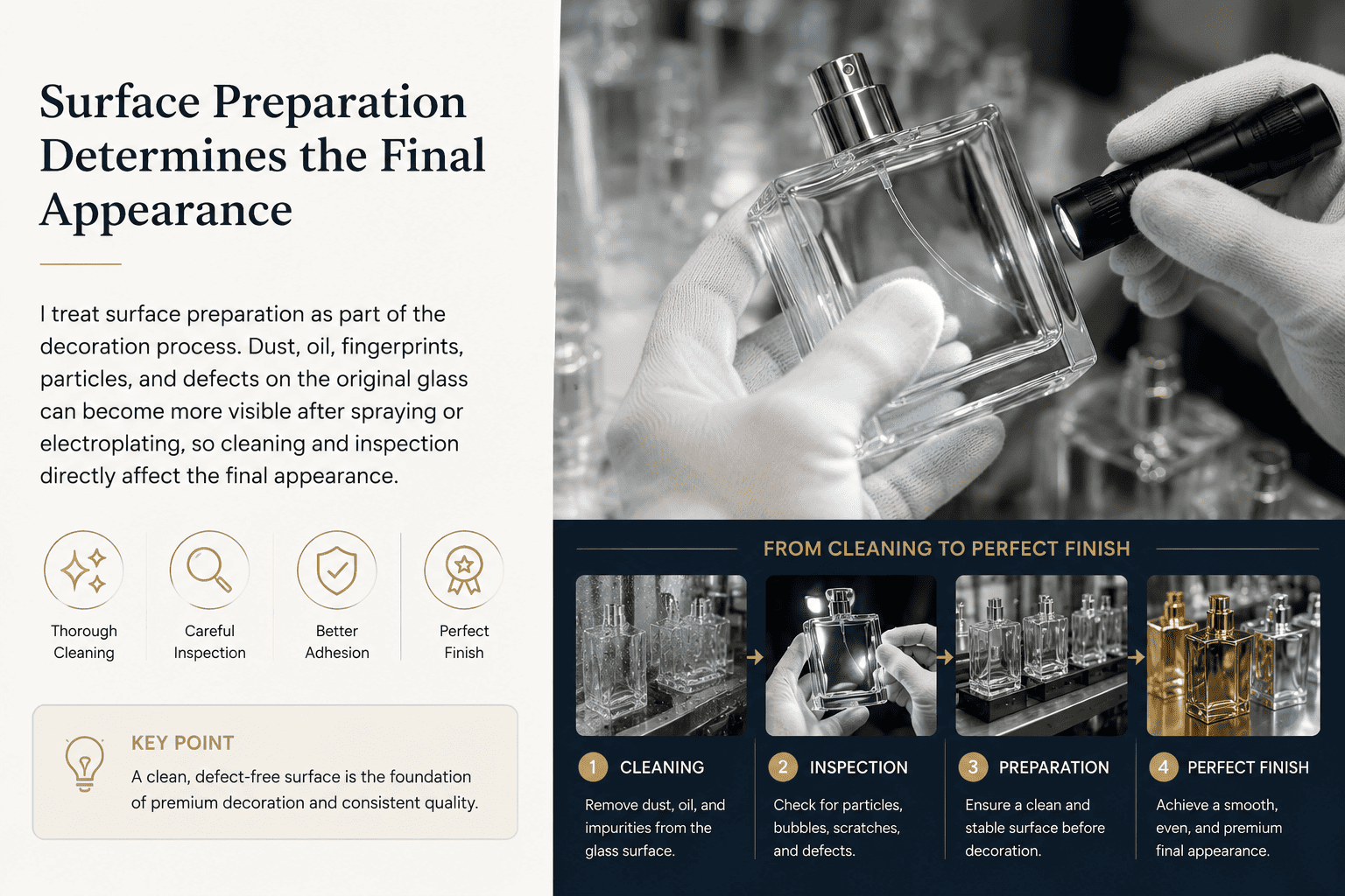
Small Particles Can Create Big Visual Problems
This is something I learned from actual production.
A transparent glass bottle can look clean when I look at it quickly.
But if I inspect it closely, I may find a tiny piece of dust, an oil mark, a fingerprint, or another small particle.
If I decorate the bottle without dealing with that problem first, the next process can make it much easier to see.
Spray coating is one example.
The paint covers the bottle surface.
If there is a small particle on the glass, the coating can cover that particle too.
After the coating dries, I may see an uneven dot or small raised area.
The bottle can look dirty even when the spray color itself is correct.
Electroplating can make this issue even more obvious because the finished surface reflects light.
A small surface problem can become a visible defect after the metallic treatment.
| Problem Before Decoration | Possible Result After Decoration |
|---|---|
| Dust | Visible dots or bumps |
| Fine particles | Uneven surface |
| Oil marks | Poor appearance or adhesion |
| Fingerprints | Visible marks under finishing |
| Glass defects | More visible after decoration |
| Poor cleaning | Lower overall surface quality |
Why Can Final Quality Control Require Manual Inspection?
Perfume bottles are appearance-focused packaging.
For that reason, I cannot rely only on basic production data to judge quality.
I also need to look at the bottle.
For some projects, especially sprayed and electroplated bottles, we need to inspect the bottles one by one.
Workers check the surface visually.
They look for particles, coating problems, scratches, uneven colors, marks, and other obvious defects.
This type of inspection takes time and labor.
But I think it is necessary when customers expect the packaging itself to communicate quality.
A perfume customer often holds the bottle close to the eyes.
Retail lighting can also be strong.
Social media photography makes glossy and metallic surfaces even more visible.
A small defect that looks minor on a production table can become easy to see in a product photo.
This is why I tell perfume brands not to judge a surface finish only by asking, "Can you make this effect?"
The better question is, "How will you control this effect across the full production batch?"
That question moves the conversation from decoration to real manufacturing quality.
How Should a Perfume Brand Choose the Right Bottle Surface Finish?
There is no single best bottle decoration process. I choose the finish according to the brand position, design, quantity, bottle shape, budget, and quality expectations.
I normally evaluate perfume bottle finishes through five points: brand positioning, visual effect, bottle shape, production quantity, and budget. I also consider process compatibility and quality-control requirements when several techniques need to work together.
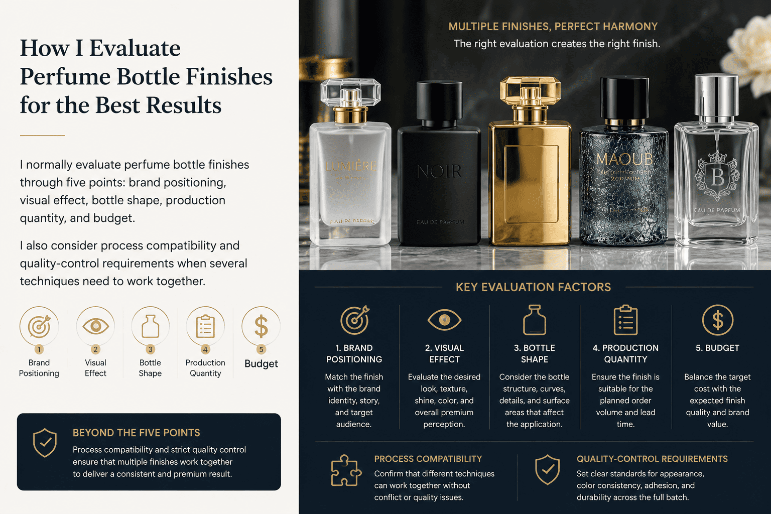
Compare the 10 Perfume Bottle Surface Finishing Techniques
I use this simple comparison when a perfume brand is not sure where to start.
| Process | Main Effect | Design Flexibility | Typical Brand Style |
|---|---|---|---|
| Spray coating | Changes bottle color | High | Almost all perfume brands |
| Frosting | Soft matte glass | Medium | Minimal and premium |
| Silk screen printing | Logo and text | Medium | Most perfume brands |
| Hot stamping | Metallic detail | Medium | Premium and luxury |
| Decal printing | Detailed graphics | High | Artistic and decorative |
| Electroplating | Metallic surface | Medium | Luxury and bold |
| UV printing | Full-color graphics | Very high | Modern and flexible |
| Laser engraving | Permanent surface mark | Medium | Niche and minimalist |
| Water transfer printing | Complex pattern | High | Creative and artistic |
| Ice-crack coating | Cracked texture | Medium | Special collections |
I Start with the Brand Position, Not the Process Name
I first ask what the customer should feel when they see the perfume bottle.
If the brand wants a clean and minimal look, I may start with frosting, a simple spray color, silk screen printing, or laser engraving.
If the brand wants a stronger luxury image, I may consider deep color spraying, metallic details, electroplating, or a controlled combination of these processes.
If the brand wants an artistic bottle, I may consider decal printing, UV printing, water transfer printing, or ice-crack coating.
I also look at the order quantity.
A small or growing perfume brand does not always need a completely new glass bottle mold.
I often prefer to start with an existing bottle shape and use surface finishing to create the brand identity.
This gives brands another way to manage development cost.
The same bottle can also support several fragrances through different colors or decoration.
I Never Choose the Bottle Finish Separately from the Cap and Box
I think about perfume packaging as one complete system.
The bottle finish needs to work with the cap, collar, pump, logo, and outer box.
For example, imagine a bottle with full gold electroplating.
If I also use a highly reflective gold cap, gold collar, large gold logo, and a fully gold box, the packaging may become too visually heavy.
Sometimes removing one metallic element makes the whole product feel more expensive.
The same principle applies to complex patterns.
If I use water transfer printing across the whole bottle, I may keep the box cleaner.
If I use a strong gradient spray color, I may keep the logo simple.
I do not believe good perfume packaging comes from using the largest number of finishing processes.
I believe it comes from choosing the right process in the right place.
I Also Consider the Quality Standard Before I Quote the Project
A brand should also think about how strict its appearance requirements are.
Highly reflective electroplating can show small surface problems more clearly.
A dark glossy spray color can also make certain defects easier to notice.
A handmade or artistic effect may allow more natural variation.
These differences influence quality inspection and production cost.
This is why I like to discuss expectations early.
I want the client to know what effect we are trying to create, what level of consistency is realistic, and what details we need to inspect during production.
When the brand and supplier agree on these points before mass production, the whole project usually becomes easier to manage.
For me, this is the real value of understanding perfume bottle surface finishes.
The goal is not to learn technical words.
The goal is to make better packaging decisions.
Conclusion
I use perfume bottle finishes as a system, not separate tricks. The best result comes from the right process combination, clean preparation, careful production, and strict final inspection.
[[1]]: https://en.wikipedia.org/wiki/Glass_etching "Acid frosting"
[[2]]: https://www.infinitysandp.com/?utm_source=google&utm_medium=wix-smart-campaign&utm_campaign=custom-brand-merchandise-2026-6-19-25d1d8d3&gad_source=1&gad_campaignid=23955841634&gbraid=0AAAABCzxlf_sF8MP-k4_HWAN71dwmY6zZ&gclid=CjwKCAjwyuDTBhB-EiwANCQhLDheSjth-PPFhLTT2Bk9PCx4wGShLAXqcJDmfo5N3MYa9pPUsKCd5xoCtkoQAvD_BwE "silk screen printing"
[[3]]: https://www.google.com/search?q=Hot+stamping+&biw=1920&bih=911&sca_esv=2734240c07732aec&sxsrf=APpeQnuWjTzYaig40WuhExn_8SE59lFzfw%3A1786261518214&ei=DjB4arLTDKrQkPIPy--cmQI&ved=0ahUKEwiykpPahpOWAxUqKEQIHcs3JyMQ4dUDCBA&uact=5&oq=Hot+stamping+&gs_lp=Egxnd3Mtd2l6LXNlcnAiDUhvdCBzdGFtcGluZyBI0QNQAFgAcAB4AZABAJgBAKABAKoBALgBA8gBAPgBAvgBAZgCAKACAJgDAJIHAKAHALIHALgHAMIHAMgHAIAIAQ&sclient=gws-wiz-serp "Hot stamping "
[[4]]: https://www.elpochem.com/en?gad_source=1&gad_campaignid=23636159216&gbraid=0AAAAADtD7gbV_f_vERUnsdkyRZ6pzvoco&gclid=CjwKCAjwyuDTBhB-EiwANCQhLLbTkljQRL2UeCztJJHP9xmgF9-WIqimto7ZOP-jl4DaJCuP44a_IxoC48MQAvD_BwE "Electroplating"